You don’t need a ton of typefaces to create a great design.
Actually fewer typefaces can actually be better. By keeping typography simple, it allows you (and users or readers) to focus on other parts of the design.
Designers can get a lot of extra mileage out of type by using type families for projects and taking advantage of the different variances within. Another option is to add subtle effects to just one or two typefaces to get more use out of just a handful of fonts.
Here we will discuss what makes a type family and how to make them work for your projects, using specific type effects, creating logos with type and even a few free font suggestions to get you started.
What is a Type Family?
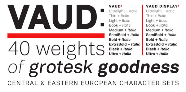
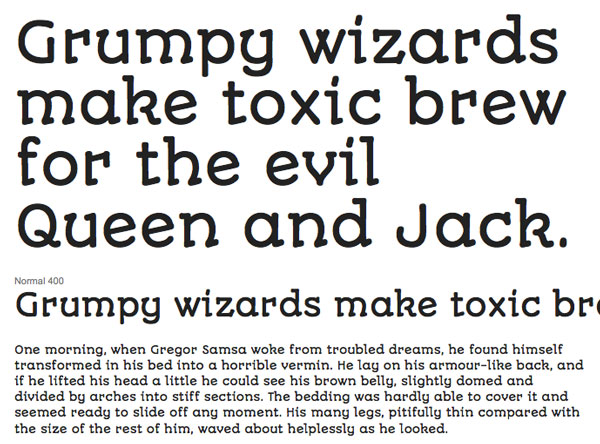
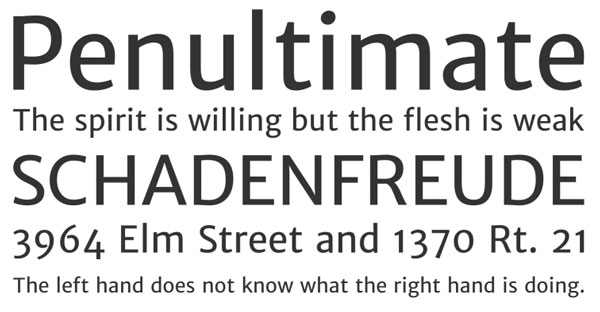
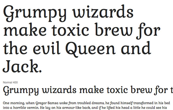
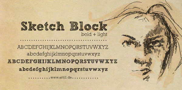
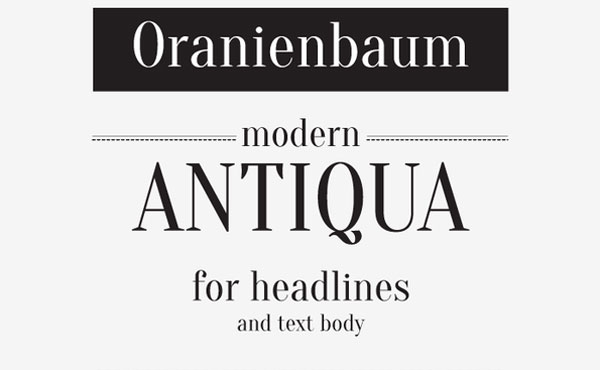
A type family is a group of typefaces that share common design characteristics. A family is recognizable by its name, such as Helvetica or Arial or Impact. Every typefaces and style in a family shares common attributes such as stroke weight, x-height and overall look and feel.
Using a single type family for a design project can help designers create and use consistent and matching typography with ease. All variances of a single type family will always match the other versions, making it easy to create a type palette that works.
The variations included with each type family can vary y typeface. Almost every typeface includes regular, bold and italic – styles almost everyone who has ever touched a keyboard is comfortable with – but some families extend well past that and might include, bold italic, condensed, hair, light, ultra, compressed, semi bold, black and others.
The names refer to widths and styles of each typeface in the family. These naming conventions are rather universal in scope. Ultra, for example, is always a light, thin variant and black is the boldest, thickest style in the type family.
One consideration: Typically, type families with more variances are more expensive out of the box than those with limited options. Free typefaces are often even more limited in scope and may not offer any variances or only one or two, such as bold and italic.
Using Effects
Once typefaces have been determined, type effects com into play. Many designers use little extras.
The use of some type effects is greatly debated among typographers, which often argue that effects are unnecessary on type. But it would be naïve to ignore the fact that much of the typography we see online and in print includes some sort of added effect.
The most common effects include drop shadows, strokes and fills, embossing and color.
Drop shadows: From subtle to dark and bold, drop shadows are one of the most used (and possibly overused) effects in typography. A drop shadow is supposed to add a subtle shadow to “life†text off the background. Done well, and the shadow is hardly visible. The effect can be felt rather than seen and a good drop shadow almost always follows the pattern of natural light. The most common problem with drop shadows comes when designers add a shadow using default preferences – these shadows are often too dark, too large and always follow the same directional pattern.
Strokes and fills: Additions to lettering, or outlines added will add weight to letters. This additional stroke can help add emphasis to characters but should be created carefully, so that text does not end up looking too tight or become difficult to read. A stroke works best on large type and rarely works on small type (such as that used for body copy). Fills work in very much the same way. Adding any sort of pattern or gradient to lettering can add weight and emphasis to words, but should be used with caution so that text remains readable.
Embossing: The raising or sinking of type in print is a great way to create emphasis in lettering without ink or coloring. This technique of embossing is often used in print processes to create classic and letterpress style materials. It is quite popular with invitations, business cards and small booklets. An embossed effect can also be created for digital design projects as well. The technique works best with large type and unlike the printing process, which uses stamping rather than coloring, for digital works embossing requires shading to get the desired effect.
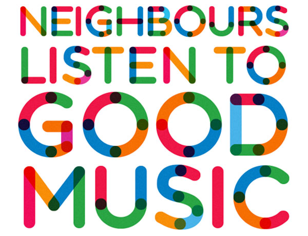
Color: While not something many designers think of as an effect, color is the most common and popular alteration to type. Color can add emphasis or make type fade into the background. It can create emotional and brand associations in just a glance. Color is an important tool when it comes to creating typography and lettering, especially pieces that will be used repeatedly, such as a logo.
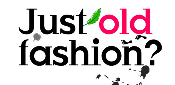
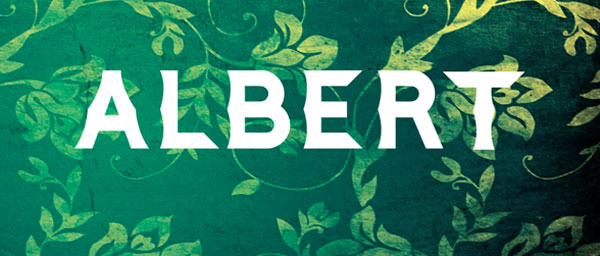
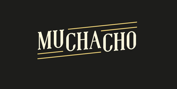
Type and Logos
![]()
![]()
![]()
![]()
![]()
Type can make or break almost any logo. Consider Coca-Cola, for example. The typeface used for the soft drink is iconic, so much so that if the word “Pepsi†was used in place of “Coca-Cola,†you would still associate Coke’s brand.
That’s the essence of a good typography-based logo. The name and brand is recognizable from the type alone, even if the words or colors are altered.
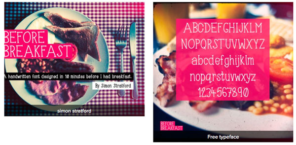
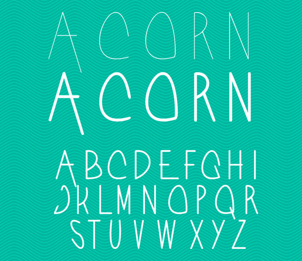
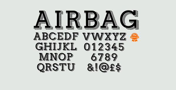
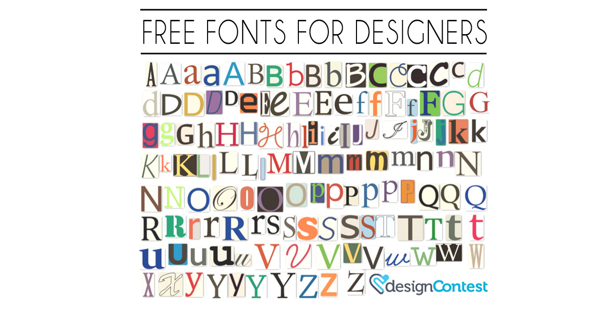
Free Fonts
Playing with type can be an expensive venture. For commercial and personal projects, you need to obtain the proper font license for projects involving a number of typefaces.
Another option is to consider free typefaces. While these typefaces will have fewer style and weight options that paid typefaces, there are some great fonts out there. When choosing a free typeface, make sure to carefully read the license and abide by usage guidelines.
And we’re sharing a baker’s dozen of free typefaces to help you get started. (Some of these typefaces are part of larger families that are available for purchase.)