This topic is locked
Just in case you want to see all the entries in once place, you can find them in this flickr album.
All the registered members of DC community can vote and post comments about the entries and anything related to the contest.
The poll will be open for 1 week.
I want to mention that this contest should not be taken too seriously. It is just our was to show that idependent designers can do things sometimes even better than acclaimed design companies with huge bugdets. I would also recommend to visit the portfolio websites of our finalists to see their other works.
Here are the entries:
#2 by onesummer
#16 by Beanhead Logos
#20 by jarguez82
#22 by iTwin

#41 by andrendhiq

#55 by cincytodd
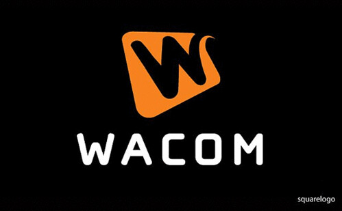
#57 by squarelogo
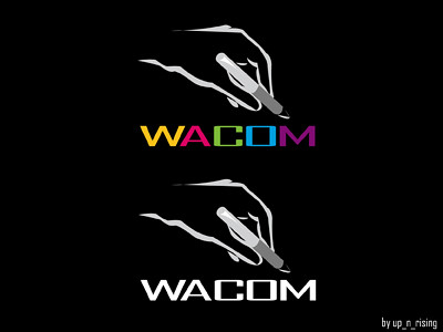
#61 by up_n_rising
#63 by aurellius