This contest will end on March 7/2005, 12AM EST, looking forward to seeing all of your designs, jojomarie


Ready for your call :)
Mon — Fri, 2am — 8pm (EST)
US & EU support teams
We are back in: 1h 20m
Mon — Fri, 2am — 8pm (EST)
US & EU support teams
 This topic is locked
Banned

Posted 22 February 2005 - 02:25 PM
Elite Designer

Posted 23 February 2005 - 07:20 AM
Apprentice Designer

Apprentice Designer

Posted 24 February 2005 - 10:43 PM
Banned
Posted 24 February 2005 - 10:48 PM
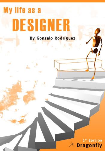
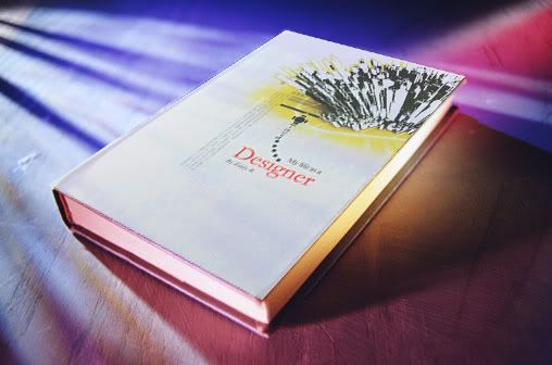
Here is my entry
Banned
Posted 25 February 2005 - 01:25 AM
jojomarie
Junior Member

Posted 26 February 2005 - 07:57 AM


0 members, 1 guests, 0 anonymous users