
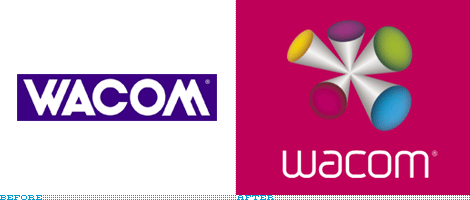
If you follow big events in the design industry, then you may have noticed the new Wacom identity among this year's other re-brandings. The company is celebrating its 15th anniversary this year and that’s what made them think about refreshing their look.
Many DC members agree that this redesign (done by celebrated Wolff Olins) was not a success. Wacom tablets and displays are used by design professionals, but the new identity does very little to project that message. In fact, in my personal opinion it doesn't project anything at all, less a few awful colors and a random shape.
My suggestion for this contest is to try and create a new logo for the Wacom brand. While creating your entries, try to think about the design field and about the products that Wacom offers. Please avoid being too literal in your designs (i.e. don’t incorporate any of their products into the logo). Remember, the users of Wacom are graphics professionals - designers, artists, engineers, architects, etc - so your designs should be clean and professional, just like their work.
Important Notice:
This is a DesignContest.net community contest and, as such, it is not affiliated in any way with Wacom Inc. The purpose of this contest is to display the skills of independent designers and to show that they can often produce work of better quality than acclaimed design studios with world-famous names. All participants will retain copyrights to their work. The winner will be given the option of donating his/her work to Wacom Inc.
Deadline: January 1st, 2008
As usual, your work must be original, so no third party images can be used in your design. The work should be done in vector format. Designs should NOT be presented on the DC logo canvas; apart from that, all other background canvas formats will be acceptable.
All regirsted members of DesignContest.net forums can take part in this contest.
Everybody can post comments about other entries. Criticism should be provided in a constructive and professional manner.
The entries are limited to 3 per participant.
Good luck to everyone! Have fun!
Wacom Logo RE-redesign. Deadline January 1, 2008
If you follow big events in the design industry, then you may have noticed the new Wacom identity among...
-
 This topic is locked
&nsbp;
#2

Chung Dha
-

- Designer
- 1439 posts
Guru
Posted 17 December 2007 - 08:56 PM
This is going to be a very important contest to show your skills and talent in designing. Will be 1 of the 3 wins to get into the Design team.
Also a very great contest for people to see what you would have made if you were the designing the logo for such a big and famous company such as Wacom.
Not only the DC forum is talking about this logo just search Wacom logo on google and you will find site/blogs with comments. Might bring up people looking here to see your idea for a new Wacom logo. And you might never know that someone from Wacom searched something and come across here.
I might join too even while I am already in the design team, cause I want to improve that logo too. Best luck to all and hope to see allot of cool designs.
Remember there are only 3 entries per participant so choose them carefully. You might even want to use work in progress section to help you when you got a problem or just want opinion.
#3
onesummer
-

- Designer
- 804 posts
Guru
Posted 17 December 2007 - 09:22 PM
actually, i'm not so sure that the shape, while very ugly and ridiculous, isn't totally "random". if you notice it's reminiscent of the 'w' and 'm' of the old logo via the fact that the shape has three protruding "legs" on top and two "legs" on bottom, positioned similar to the 'w' in the old logo. and obviously as with the old type, the new type's 'w' and 'm' are inverses of each other.
though, I could be reading too much into it lol. it does stink..badly. not sure how wolf olins can go from the new unilever logo to that crap they call a wacom logo. I may enter this community contest myself too.
though, I could be reading too much into it lol. it does stink..badly. not sure how wolf olins can go from the new unilever logo to that crap they call a wacom logo. I may enter this community contest myself too.
- onesummer (paul)
visit my portfolio website at: www.pauljobson.com
visit my portfolio website at: www.pauljobson.com
#4
hackdesign
-

- Designer
- 95 posts
Apprentice Designer
Posted 18 December 2007 - 05:25 AM
Did anyone see the movie labrynth with billy idol, there are some funny looking dancing characters that remind me of that new logo. I dont get it, if i wrote that name in pencil on a napkin it would look better than that. Nice contest. Good luck to all.
#5
Guest_sandman6665_*
Guest_sandman6665_*
-

- Guests
Posted 18 December 2007 - 04:39 PM
great contest.. i'll enter if i have time to make even one.. 
#6
Tainted
-

- Designer
- 33 posts
Apprentice Designer
Posted 18 December 2007 - 05:03 PM
I may enter, but I may not even be able to start till the day before the dead line.
My portfolio in Progress... http://CtripleCthrea...ooglepages.com/
Fav. Quotes: "Don't look to far for happiness." + "Creativity Takes Courage."
Fav. Quotes: "Don't look to far for happiness." + "Creativity Takes Courage."
#8
Chung Dha
-
- Designer
- 1439 posts
Guru
Posted 19 December 2007 - 03:48 PM
I think it fits parker pens more or any brand that makes fountain pens. Maybe change the pen with more to the pens Wacom uses. And remove the small white space under the W.
#9
onesummer
-
- Designer
- 804 posts
Guru
Posted 19 December 2007 - 07:54 PM
.
- onesummer (paul)
visit my portfolio website at: www.pauljobson.com
visit my portfolio website at: www.pauljobson.com
#10
serafima
-
- Designer
- 19 posts
Apprentice Designer
Posted 19 December 2007 - 08:06 PM
yeah. about white space you totally right, but about the pen. I used drawing-pen advisedly. It's like 'we always remember the first steps and first success OR always comes time when we need to back to basics, to simplicity'. It's my IMHO :-)
#11
-
- Guests
Posted 19 December 2007 - 08:36 PM
A very good beginning!
serafima, it is simple, but simplicity is often the highest sophistication, you know Your first entry, though it is already better that Wolff Olins logo  , could still be improved. I am not very convinced by the pen you used in your design. It's clearly "analog" and wacom products are digital. Besides I would again recomend to avoid being too literal. Speking about tipography the white space in the "w" is the weakest point - it is barely visible, but it's still there.
onesummer, great start! Very interesting interpretation of the tablet! Almost abstract, but clearly a tablet
(all the above is my personal opinion, other members are encouraged to post their thoughts about any entries in this contest)
serafima, it is simple, but simplicity is often the highest sophistication, you know
Your first entry, though it is already better that Wolff Olins logo , could still be improved. I am not very convinced by the pen you used in your design. It's clearly "analog" and wacom products are digital. Besides I would again recomend to avoid being too literal. Speking about tipography the white space in the "w" is the weakest point - it is barely visible, but it's still there.onesummer, great start! Very interesting interpretation of the tablet! Almost abstract, but clearly a tablet
(all the above is my personal opinion, other members are encouraged to post their thoughts about any entries in this contest)
#13
eapdesign
-

- Designer
- 102 posts
Apprentice Designer
Posted 19 December 2007 - 09:40 PM
olins is responsible for that hideous london 2012 olympic logo. not surprised that this came from them. i very much like the wordmark, but can do without the bizarre shape.
it's been awhile since i've been on this forum and i think i'll give this one a go! thanks for starting it. great idea!
liz
it's been awhile since i've been on this forum and i think i'll give this one a go! thanks for starting it. great idea!
liz
#15
Chung Dha
-
- Designer
- 1439 posts
Guru
Posted 19 December 2007 - 10:09 PM
Not sure if Olins in a midlife crisis or got a major Design block. They got impressive list designs but Wacom and London 2012 were really not like the usual. 2012 is worst of all looking at it , I always see 2 person doing something. Not sure how they could had miss seeing that.
Nice design Onesummer. Maybe adding some CYMK to it for more to do with design.
Nice design Onesummer. Maybe adding some CYMK to it for more to do with design.
#16
RockStarNeil
-
- Designer
- 211 posts
Senior Member
Posted 19 December 2007 - 10:58 PM
I can honestly say that I am disgusted...
Yes, Wolf Olins does have some good logos, but for their clients to let them get away with travesties such as the Wacom and London 2012 logo... it simply disgusts me.
There is the slight chance that they purposely made these logos hideous because they knew they would gain lots of attention and publicity (and it has worked so far!). But if that's the case, then it seems they are making fun of design and doing it all for the money.
Btw, for anybody who hasn't visited the Wacom site, I suggest doing so. And witness (in full effect) the tragedy of terrible design.
#17
Tainted
-
- Designer
- 33 posts
Apprentice Designer
Posted 19 December 2007 - 11:14 PM
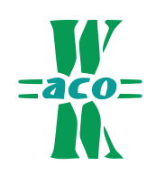
Heres my first entry version thing.
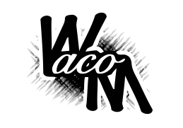
and with color.
next version almost done.
and with color.
next version almost done.
My portfolio in Progress... http://CtripleCthrea...ooglepages.com/
Fav. Quotes: "Don't look to far for happiness." + "Creativity Takes Courage."
Fav. Quotes: "Don't look to far for happiness." + "Creativity Takes Courage."
#18
Tainted
-
- Designer
- 33 posts
Apprentice Designer
Posted 19 December 2007 - 11:23 PM
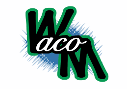
And here is my second version, slightly different placing though.
My portfolio in Progress... http://CtripleCthrea...ooglepages.com/
Fav. Quotes: "Don't look to far for happiness." + "Creativity Takes Courage."
Fav. Quotes: "Don't look to far for happiness." + "Creativity Takes Courage."


#20
~V~
-

- Designer
- 96 posts
Apprentice Designer
Posted 20 December 2007 - 12:14 AM
Let me know what you think.


1 user(s) are reading this topic
0 members, 1 guests, 0 anonymous users
