
SPRING into SPRING POSTCARD DESIGNCONTEST
REQUIREMENTS:
SIZE 4x6 , oneside
may use original illustrations, photos ok(please provide source) no stockart, NO clip art PLEASE!
DEADLINE: MARCH 15
Spring is a great time, a time of newness, life, etc.......try to find a unique, original way to convey Spring in your world. Again, words to inspire, life, flowers, green, birth, light,
color, nature, BIG change. In a sense, your postcard is advertising, selling spring!
Lets have fun, and show what you got:)
As always, keep in clean, no language, nudity, etc!
All entries will receive feedback, so this is a great source for constructive feedback:)
Also, there will be a secret prize(yet to be determined;))
Spring Postcard Contest
SPRING into SPRING POSTCARD DESIGNCONTESTREQUIREMENTS:SIZE 4x6 , onesidemay use original illustrations,...
&nsbp;
#1

rinaldidesigns
-

- Designer
- 2258 posts
Elite Designer


#4
rinaldidesigns
-
- Designer
- 2258 posts
Elite Designer
Posted 05 March 2008 - 07:45 PM
oops, thanks ASLAN for pointing that out;)
DEADLINE posted (march 15)
DEADLINE posted (march 15)
#5
Deavas
-

- Designer
- 27 posts
Apprentice Designer
Posted 06 March 2008 - 10:28 AM
4x6 cm? mm? inch? :S surely not px XD
*Im planning on entering and since this is my first contest I wanna know for sure:P
and what do you mean with original illustrations? illustrations made by yourself or from somewhere on the web? what are phots ? *i feel so dumb * and why the PLEASE! behind clip art?
sorry for the many questions just wanna make sure I don't screw up xD
Thanks
Deavas
*Im planning on entering and since this is my first contest I wanna know for sure:P
and what do you mean with original illustrations? illustrations made by yourself or from somewhere on the web? what are phots ? *i feel so dumb
* and why the PLEASE! behind clip art?sorry for the many questions just wanna make sure I don't screw up xD
Thanks
Deavas
Please check out my portfolio blog!!
<===---- Gerjon-bos ----===>
<===---- Gerjon-bos ----===>
#6
rinaldidesigns
-
- Designer
- 2258 posts
Elite Designer
Posted 06 March 2008 - 01:08 PM
4x6 INCH
original, means by you
phots......that is a typo , fixed. PHOTO
the PLEASE! behind clipart, means do not use it.
GOOD LUCK EVERYONE:)
original, means by you
phots......that is a typo , fixed. PHOTO
the PLEASE! behind clipart, means do not use it.
GOOD LUCK EVERYONE:)
#7
Deavas
-
- Designer
- 27 posts
Apprentice Designer
Posted 06 March 2008 - 03:36 PM
ah thabnk you very much 
It's more clear now
So websites like SXC.hu will be ok to use?
Ill be going at it soon ^^
It's more clear now
So websites like SXC.hu will be ok to use?
Ill be going at it soon ^^
Please check out my portfolio blog!!
<===---- Gerjon-bos ----===>
<===---- Gerjon-bos ----===>
#8
ASLAN
-

- Designer
- 30 posts
Apprentice Designer
Posted 06 March 2008 - 09:37 PM
ok this is my first entry,
im still working on it, but i thought maybe i can get some feedback
before i invest too much time into optimizing it.
voila:
deleted(5.4)
hope it also inspires some of you ?)
feedback is very welcome.
did some changes! (07.03.)
im still working on it, but i thought maybe i can get some feedback
before i invest too much time into optimizing it.
voila:
deleted(5.4)
hope it also inspires some of you ?)
feedback is very welcome.
did some changes! (07.03.)
#9
Chung Dha
-

- Designer
- 1439 posts
Guru
Posted 06 March 2008 - 09:54 PM
It looks good nice shine, but for me the sky looks bit polluted green. Maybe a natural blue sky would be better.
#11
lemieuxster
-

- Designer
- 69 posts
Apprentice Designer
Posted 06 March 2008 - 11:29 PM
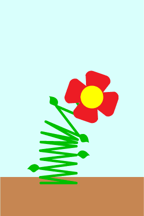
A Spring Flower.
Also, I realize that this really isn't an issue, but in certain parts of the world (Southern Hemisphere) it is actually heading in to Fall.
» lemieuxster , wasting time collecting stamps.
#12
Atronic
-

- Designer
- 42 posts
Member
Posted 06 March 2008 - 11:51 PM
Aslan,
Nice work! I like the hand drawn feel of the birds. And you're getting an interesting effect with the light, too.
I think maybe the typeface you've chosen is out of place, a bit small and the black is very heavy against the illustration.
Otherwise, a good start to the contest!
Nice work! I like the hand drawn feel of the birds. And you're getting an interesting effect with the light, too.
I think maybe the typeface you've chosen is out of place, a bit small and the black is very heavy against the illustration.
Otherwise, a good start to the contest!
#13
contro_versial
-

- Designer
- 7 posts
Apprentice Designer

#14
rinaldidesigns
-
- Designer
- 2258 posts
Elite Designer
Posted 07 March 2008 - 05:26 PM
FEEDBACK
POST #8
ASLAN, I love the birds, rays, great ideas.....I'd like to see some more muted colors(or different colors) and some incorporation of text
POST #11
lemieuxster, very original, :)maybe add some text?.....
POST #13
contro_versial...I love the illustration, and the text...good:)(maybe too light?)
greta entries so far, keep them coming:D
#15
contro_versial
-
- Designer
- 7 posts
Apprentice Designer
Posted 07 March 2008 - 07:12 PM
heres my quick attempt
darker version

#17
bugsjr
-

- Designer
- 21 posts
Junior Member

#19
tomas.brolen
-

- Designer
- 109 posts
Senior Member
Posted 08 March 2008 - 01:41 PM
please check my entry #16
there is one with muted colors and a version with bright colors.
I (personally) liked the 2nd better.
Am a bit undecided bout the text (my spring) if it might look better in front (not behind the bees & butterflies?).


2 user(s) are reading this topic
0 members, 2 guests, 0 anonymous users
