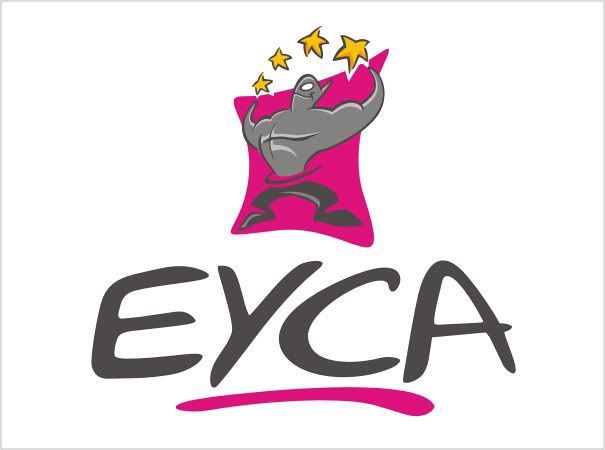
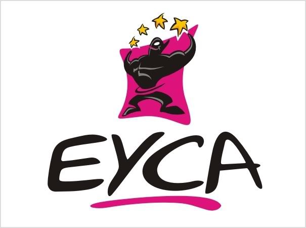
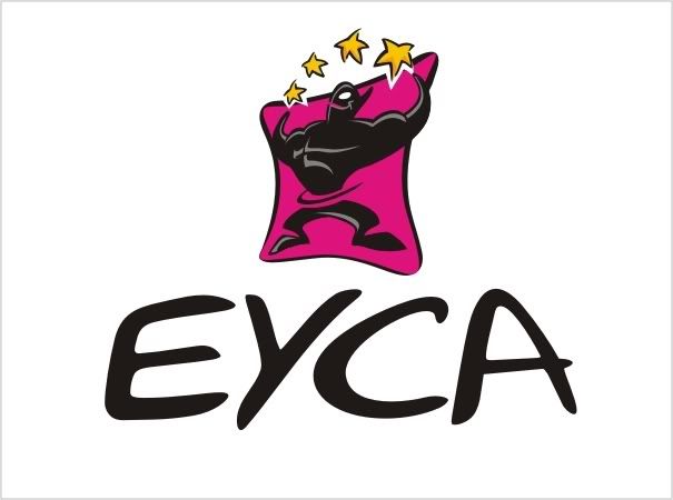
my submitted options...feedback por favor?

which version (if any) do you like best?
does the font work well with the icon?
does it look like it would appeal to people students/young people under 30?

Ready for your call :)
Mon — Fri, 2am — 8pm (EST)
US & EU support teams
We are back in: 1h 20m
Mon — Fri, 2am — 8pm (EST)
US & EU support teams
Senior Member

Posted 31 August 2008 - 06:30 PM
----> Winter's Blogspot!! <----
Member

Posted 01 September 2008 - 10:08 AM


0 members, 1 guests, 0 anonymous users


