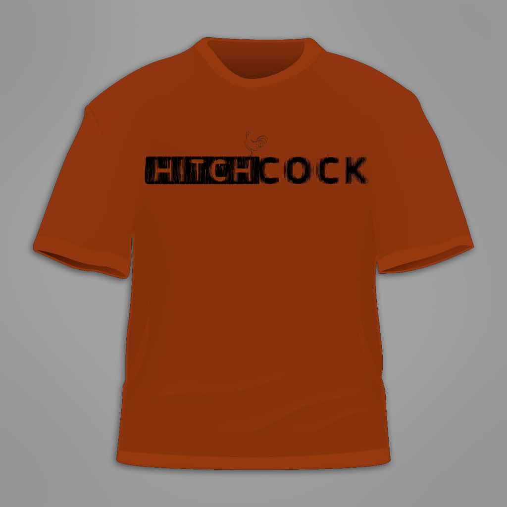
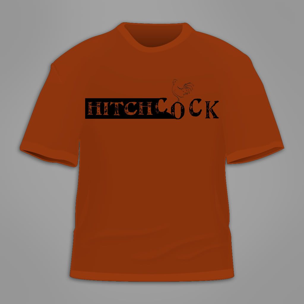
I've seen some cool ambigrams and thought I'd give it a go.
We/he have other ideas about the shirt but thoght this would be a nice way to try something I haven't done before.
Be honest/brutal

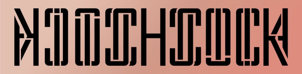
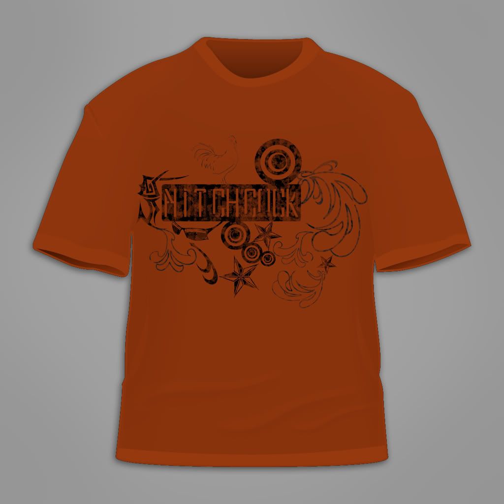
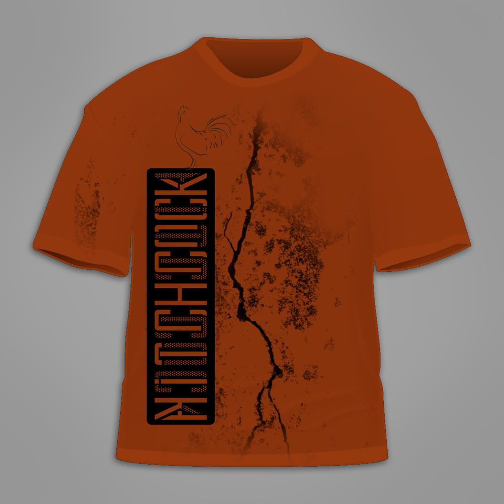
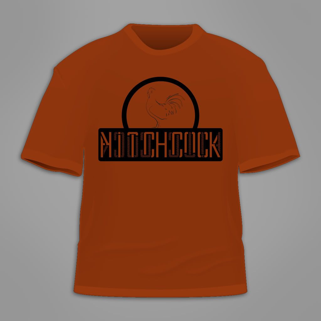
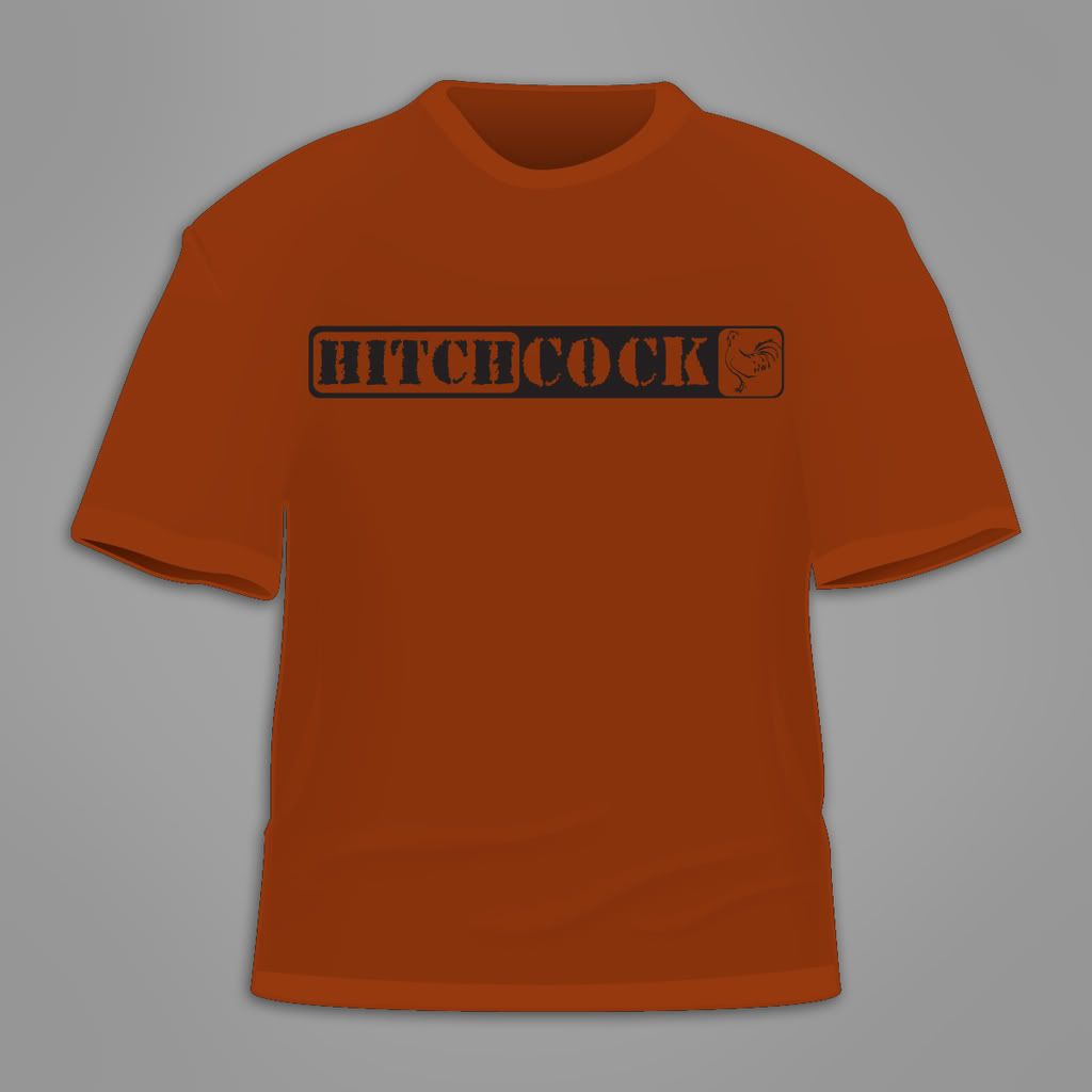
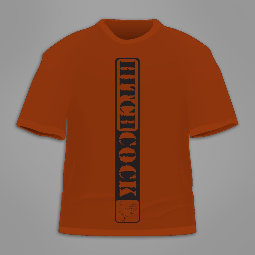
HITCHCOCK

Ready for your call :)
Mon — Fri, 2am — 8pm (EST)
US & EU support teams
We are back in: 1h 20m
Mon — Fri, 2am — 8pm (EST)
US & EU support teams
Elite Designer
Posted 19 December 2008 - 11:46 PM
Guru

Posted 20 December 2008 - 12:04 AM
Elite Designer
Posted 20 December 2008 - 04:25 AM
:LOL:LOL yeah I was wondering the same thing, but a little afraid to ask.Why "hitchcock" ?
Guru
Posted 20 December 2008 - 10:06 PM
Elite Designer
Posted 22 December 2008 - 10:40 PM
Edited by Coy, 22 December 2008 - 10:44 PM.
Elite Designer
Posted 30 December 2008 - 11:06 PM
Apprentice Designer

Posted 08 October 2009 - 01:13 AM
Senior Member

Posted 18 October 2009 - 11:00 PM


0 members, 1 guests, 0 anonymous users


 and the 6th just looks solid
