
New work
Just decided to do for fun a logo/crest thing for a made up entity. Im a Mignola(Hellboy) fan and thats...
&nsbp;


#7

awhipl
-

- Designer
- 62 posts
Member
Posted 07 January 2009 - 10:11 PM
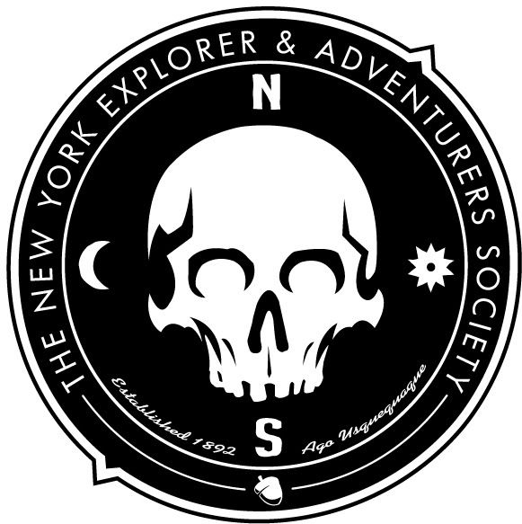
I really like the overall look and feel of the design.
I feel like the fonts for "Established..." and "Periculosus..." are too flowy and fun. I feel like those fonts might be on the menu of a high-class diner.
In my opinion, though I'm not sure what you intended, when I see this I expect Hellboy to run up, punch the wall and have this emblem be there. You want it to look good, but also be intense with more of a solid/stamp look rather than flowy fontish thing.
Hope this helps
P.S. the skull looks sick.
-adam
#8
Ghastly
-

- Designer
- 30 posts
Member
Posted 08 January 2009 - 07:56 AM
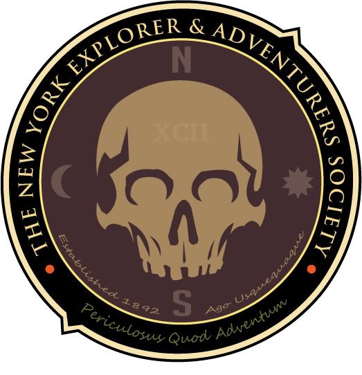
Thanks for the feedback. Yes that font has given me the most trouble. Im not totally happy with it yet so Im sure it will evolve further. In regards to the Hellboy comment I did note in the first post this was inspired by Mignola/Hellboy and Im glad you saw the connect and feel I was going for.
#9
jecrt
-

- Designer
- 432 posts
Junior Guru
Posted 09 January 2009 - 08:23 PM
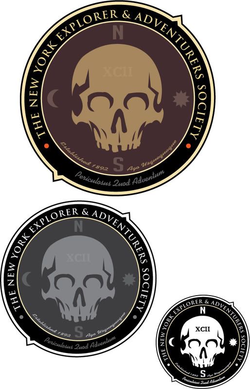
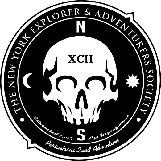
the black & white option is nice. I'm not digging the script-style font, though - doesn't feel very authentic. What about a blackletter font? I think that would match with the sharpness of the serifs better. It'd also be cool to put the "established" year in roman numerals in the blackletter font, too
That's a really fun idea, though - I really like it!
That's a really fun idea, though - I really like it!
#10
willylorbo
-

- Designer
- 23 posts
Junior Member
Posted 15 January 2009 - 01:02 PM
I think that there is a too large amount of fonts!
I'd try to reduce them!
I'd try to reduce them!
#11
rinaldidesigns
-

- Designer
- 2258 posts
Elite Designer
Posted 15 January 2009 - 01:49 PM
lovin' the skull, but the fonts don't fit, I'd explore font options;)
#12
Jochemdv
-

- Designer
- 14 posts
Junior Member
Posted 15 January 2009 - 02:13 PM
He nice W.I.P. thats a fine skull you've drawn.
Some feedback.
Try using less fonts
Try using Quality fonts instead of free fonts.
The way it is now, i dont know where to look.
The way I see this it's an old patch thats ripped from a piece of worn down army clothing, and this is a photo of it lying on a white table. (In my head its pretty cool, haha)
Maybe, just maybe you can play with a texture and some kind of vintage look.
oh well, im just curious about what is going to be the result! with or without using our feedback.
[SIGPIC][/SIGPIC]


#15
Ghastly
-
- Designer
- 30 posts
Member
Posted 16 January 2009 - 02:18 AM
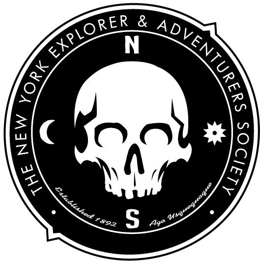
Here is a newer version. I did as suggested and removed some of the text. I dont really like the empty space on the bottom though. Maybe some kinda design ??? I also did a font change of the main text. I also re-drew the skull and added some subtle changes.


1 user(s) are reading this topic
0 members, 1 guests, 0 anonymous users
