

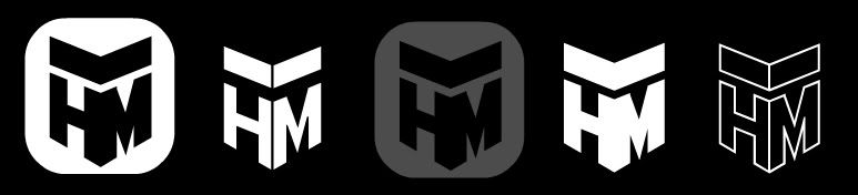
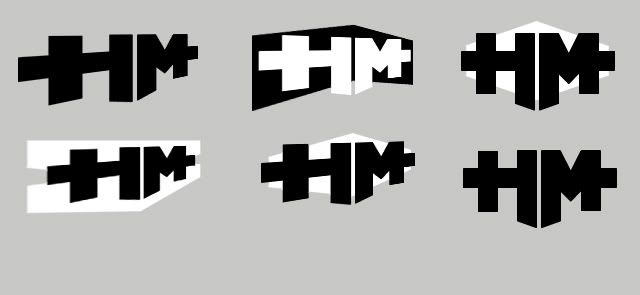
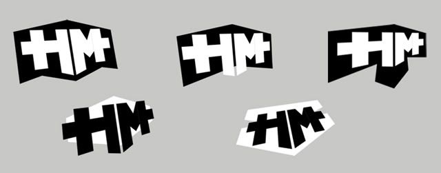
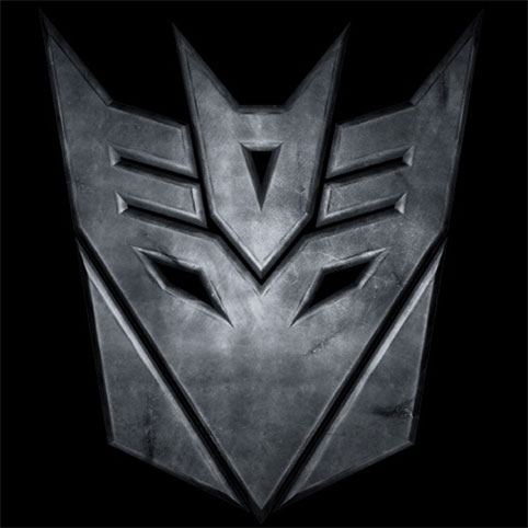
With new intentions to market myself, I've chosen a business name and started to flush out a design. ...I'm aware that it somewhat resembles the transformer icon, and I'm hoping this isn't as bad, or distracting, as it may seem?

any feedback would be appreciated, Thanks!


