Jump to content

  • Free consultations and support
  • Live chatClick Here for Live Chat
  • Call ico 1888-906-1888
    Phone support: Open

    Ready for your call :)

    Our business hours:

    Mon — Fri, 2am — 8pm (EST)

    US & EU support teams

    Phone support: Closed

    We are back in: 1h 20m

    Our business hours:

    Mon — Fri, 2am — 8pm (EST)

    US & EU support teams


Coffee!!

coffee

  • Please log in to reply
&nsbp;

#1 rileyleigh08

rileyleigh08

    Apprentice Designer

  • Designer
  • 17 posts

Posted 21 March 2009 - 02:37 AM

Posted Image

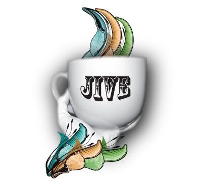
This is something I've been playing around with for a few hours. I'm planning on entering it into a contest that asks you to imagine what mocha is to you. I figured, I like coffee and whenever I think of coffee I think of modern coffee shops like the one I used to go to and sit in front of the fireplace playing on my laptop for hours. So far, this it!

The sad part is, I'm in love with the title of the piece (Jive Java) more than I am the actual piece itself.

Comment away, please =D

Edited by rileyleigh08, 21 March 2009 - 02:39 AM.
forgot information

Cortney
RileyLeighDesigns:p

#2 .:FMD

.:FMD

    Senior Member

  • Designer
  • 188 posts

Posted 21 March 2009 - 03:23 AM

im not really getting the Jive, I think you need to play around with the elements a little more. When I think of jive I think of like movement, and dancing. Maybe get the elements intertwined as if it was like steam from the coffee flowing up dancing around each other.

I do however love the choice of font and the photo is great! Did you take that? Oh as for the photo rotate it a tad or the type.

Overall a great start, cant wait to see what you come up with in the end.

#3 jecrt

jecrt

    Junior Guru

  • Designer
  • 432 posts

Posted 21 March 2009 - 01:52 PM

I like the concept - I think it would have more impact if the colored parts were less rendered - more vector/shape looking. I think I'd scratch the drop shadow, too...it just feels like it's too much. I really like those colored, organic things though.

I'm also not digging the Rosewood font - it's a little tired. It's only four letters, have you considered making your own type? It might make it feel a little more personal.

It's a fun concept and a great start!

#4 Dongerz

Dongerz

    Senior Member

  • Designer
  • 212 posts

Posted 23 March 2009 - 04:07 PM

Hi,
I agree with not getting the JIVE part. I don't feel like the design says "Jive". When I think of jive I think "urban" or "ghetto". I understand jive means to "click" or fit well together but the layout doesn't really emote that to me. I might suggest you work with coffee tones instead of the bright colors and maybe have the steam coming up out of the cup be kind of 70's psychedelic curls reminiscent of the old beatnik coffee houses. Only have the curls in the mocha tones not psychedelic colors. Anyway, I hope this helps and good luck in the contest!

I am currently up for voting into the design team. If you think my reply was helpful please go to http://www.designcon...your-votes.html to vote. Thanks for taking the time:)

Edited by Dongerz, 24 March 2009 - 02:28 AM.


#5 rileyleigh08

rileyleigh08

    Apprentice Designer

  • Designer
  • 17 posts

Posted 24 March 2009 - 01:09 PM

Thanks for all the feedback! I do agree about the colors now that I'm looking at it. The jive thing was also sort of a personal secret among friends which is probably why it doesn't fit here. I'll be loading up a new image shortly and would like more feedback and the redesign.
and thanks again for the tips!
Cortney
RileyLeighDesigns:p

#6 rajkumar.05

rajkumar.05

    Apprentice Designer

  • Designer
  • 8 posts

Posted 24 March 2009 - 02:54 PM

may be you should try changing the shape of the cup

#7 JonnyHoy

JonnyHoy

    Apprentice Designer

  • Designer
  • 18 posts

Posted 24 March 2009 - 05:49 PM

The cup seems out of place with the clean vector lines around it. i'd try and sharpen the cup (or even make one) and then as others said, adjust the colours. designing the cup in illustrator, with a similar stroke to the design you've made would look great, then finish it off with some meshing and added shades with the pen tool.

post up what you come up with!

#8 jecrt

jecrt

    Junior Guru

  • Designer
  • 432 posts

Posted 24 March 2009 - 06:08 PM

The cup seems out of place with the clean vector lines around it. i'd try and sharpen the cup (or even make one) and then as others said, adjust the colours. designing the cup in illustrator, with a similar stroke to the design you've made would look great, then finish it off with some meshing and added shades with the pen tool.

post up what you come up with!


I totally disagree - the mix of vectors and photography are great. The vectors add life to the cup - if you have everything vectored, you lose the intention of the swirls. It becomes just another coffee cup illustration.

#9 .:FMD

.:FMD

    Senior Member

  • Designer
  • 188 posts

Posted 25 March 2009 - 03:19 AM

i totally disagree - the mix of vectors and photography are great. The vectors add life to the cup - if you have everything vectored, you lose the intention of the swirls. It becomes just another coffee cup illustration.


+1

#10 stankov

stankov

    Apprentice Designer

  • Designer
  • 13 posts

Posted 25 March 2009 - 08:34 PM

You can choose better type for the JIVE and maybe try to drop same shadow.


1 user(s) are reading this topic

0 members, 1 guests, 0 anonymous users