discuse...
Edited by Coy, 12 May 2009 - 07:55 PM.

Ready for your call :)
Mon — Fri, 2am — 8pm (EST)
US & EU support teams
We are back in: 1h 20m
Mon — Fri, 2am — 8pm (EST)
US & EU support teams
Apprentice Designer

Posted 24 May 2009 - 08:54 PM

Senior Member
Posted 25 May 2009 - 04:35 PM
Elite Designer
Posted 26 May 2009 - 05:26 PM
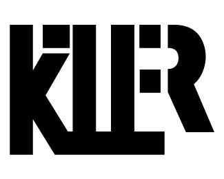
Aesthetically I think I prefer the first one, but I wouldn't have known it represented killer if you hadn't told me.
Seems a little unbalanced on the right side. The left half looks great.
Maybe a subtle graphic element within the design to indicate killer / killing?
maybe this letters needs some red blood effect. i think that will be a good contrast
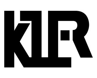
I like the second one. Why don't you try to differentiate the other letters also, as you did with the e and r, by putting some space between them ?
Try to extend the r so that it's baseline is the same as the other letters, and see how that looks like.
Hope that helps !


0 members, 1 guests, 0 anonymous users