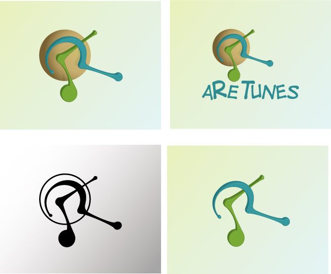
ahahahaha nice title  as for the logo I really like the B&W version... maybe try playing around with flat colors and not the 3-d effect?
Thanks still not getting to many elite in here thought.
I'll try playing w/out the 3d. thanks
I like the black and white version the best - but I don't get a unified feel from it. I get what you were doing with the circle/sphere - kind of creating a visual anchor, but it doesn't really connect with the other two shapes. But - without it - they're really spread out.
Personally, when using a sort of abstract symbol, I try and pull the symbol in as much as possible. I usually think of it like a person - I don't like to have the arms/legs just dangling out there. I prefer it to be all tucked up in a ball.
I'm sure that explanation was a little crazy, but that's what I always thinking about when working through symbols.
It's really not suppose to be unified since "are"tunes is kind of an open question. (if that made any sence I'd be surprised)
great explanation and thanks for the info.
Yeah, forget the 3d effect stuff, go for flat colors. And if you want more than one color in the symbol, put some nice contrast on it.
The font from the last image is pretty terrible, and has nothing to go with the symbol, they have totally different styles.
I still am not right if I get the symbol. I'ts a musical symbol that forms a "R" with that other stroke, right? If that's the case, I think you could draw them more geometricaly (does that word exists?), classy.
Yes the music note and question mark make up an "R" and I think the work is geometrical? (i'm not sure either) lol.
Thanks
I actually like the 3D look of the shapes that make up the R, but I'm wondering how that would look on a flat circle instead of a sphere.
I agree with Gerhard Schlee, the font in the last image really doesn't go with the image.
Just some thoughts...you're off to a good start!
I may just loose the speher all togeather if I stick w/ the 3d version. but so far you're the only fan of it. LOL
Thanks
yahhh.. You SUCK!!! lol. You scared me from head to toe . Now I got your attention too, let me give you a positive criticism.
First, I think that logo is for a mobile content service company selling some ringtones or maybe a company in am music industry selling songs or applications for iTunes.
The pale blue looks like a question mark while the green looks like a clock hand. I know it's a musical note symbol?
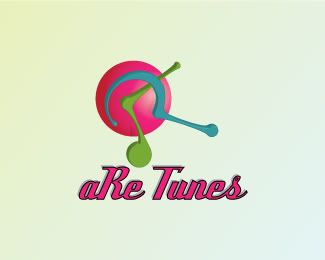
Overall, it doesn't clearly represent the 'R' that you want to portray and the circular background doesn't tune. The color combination at the top is a bit dull, while the pink one is retro, but it reminds me of 'Nyonya' or 'Nonya' cuisines and their ceramic decorations.
never saw the clock hand in there but I can now.. thanks..
I'll look up Nyonya or nonya..
Thanks for your feed back

i liked the last one, coz it is looking very lively! the grayscale one is very simple, so dont finalize it. as far as my choice is concerned i liked 2nd one and last one!
Looks like everyone but one person likes the flat version instead of the 3d..
I made this almost a year ago (10 months maybe), when I started re-learning Illustrator, this self lesson was using 3d, some shading and mask tool. I have some other but thought this one was a little more unique and could get some good discussion going.
Thanks everyone. please feel free to add more to this.

 This topic is locked