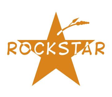
Cute shirt idea. I like the logo but the grass or what ever it is looks odd..does it have a meaning to the logo? The way you reversed the text in and out of the star is nice. What does it look like with the pigtails behind the text rockstar. The font is ok but have you played a bit with some goofy maybe 3dish or outlined fonts, some of those a very redneck looking
I did a logo for guy here in washington state. He produces Redneck wrap. wrapping paper with redneck themes. He wanted the red/white/blue on the logo because "redneck" for the most part is american. Any way it was a fun logo design.
You have a real cute idea here
sharie
I have a cute little girl so it's all her fault. lol
Thanks for the feedback.
I'm still playing with font ideas for the Rockstar part so it doesn't quite get as lost as this one does behind the pig tails. For whatever reason I have to have them in front. I may go w/ something more "rockstar-ish" since the drawn redneck is kinda fun or kid friendly and unorthadox as lettering.
When I think of "redneck" I think of a farmer chewing on a piece of straw driving his tractor through the fields. or a guy w/ a mullet. LOL that's where the straw coming out of the start comes from.
I'm also not sure if I should add a little shading to the face or freckles. It's about time to go home so I'll sleep on it for now.