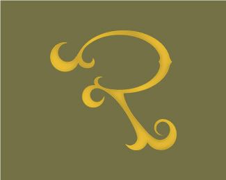
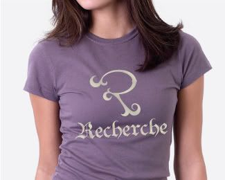
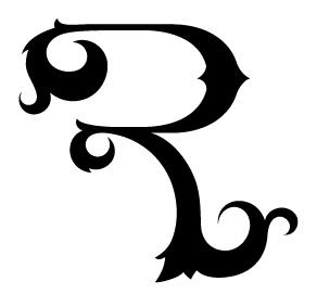
You've got a good mark in your hands, very original and distinctive.
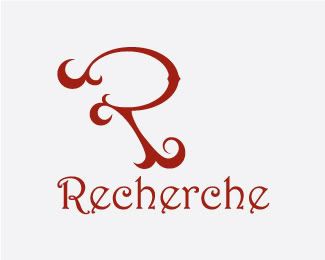
You need to work on the name (doesn't match), and the typeface, that may give you a lot of... recherche... 
Paulo
I'll work on finding or making a type that works better.
I thought I had a good name:(

but I can try and come up with something new as well. There are quite a few R words.

RECHERCHE - pernounced - ruh-shair-shey; ruh-sher-shey
1. sought out with care.
2. very rare, exotic, or choice; arcane; obscure.
3. of studied refinement or elegance; precious; affected; pretentious.
Greetings,
I definitely love fine typography and you may be onto something cool here.
However, the rounded shape on the top left of the letter makes this look like the letter "P" instead of an "R" . If you worked to square off the top left elements of your design it would soon become an "R"....
Think 180º for the top left and keep up the creative work! :-)
Cheers,
Brett
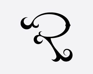
I see what your saying. it may also open up the image to include the vertical pillar if needed.
looks like I have some things to work on
Thanks Paulo and Brett.