1. #1
    Registered User TheDreamer_EJoy is on a distinguished road
    Join Date
    Jun 2008
    Posts
    208

    Dripping Heart Design Thoughts?

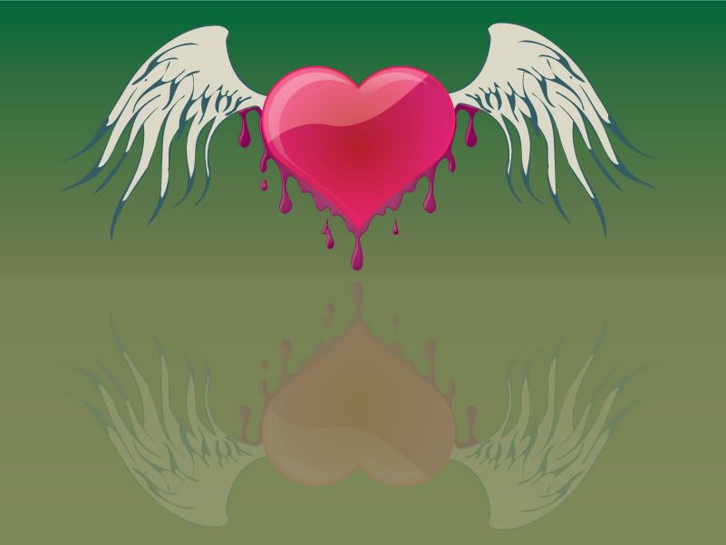
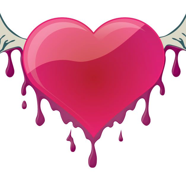
    I did this yesturday in attempts for another valentine t-shirt or something... but i dont know i kinda dont like it.... i like it but i dont I want to add some kinda background or something maybe behidn or instead of the swirls like some of these ..... but i dont know where to start... Ideas?

    Maybe some things like these but not exactly....(these arent mine i repeat) the pink one is lol)


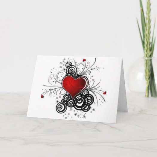
    you know cool background but more retro but i have like NO ideas to go along with it...... or is it good the way it is?
    Last edited by TheDreamer_EJoy; 02-17-2010 at 09:40 AM.

  2. #2
    Registered User TheDreamer_EJoy is on a distinguished road
    Join Date
    Jun 2008
    Posts
    208
    this is plain
    Attached Images  

  3. #3
    Admin sharie has a reputation beyond repute sharie has a reputation beyond repute sharie has a reputation beyond repute sharie has a reputation beyond repute sharie has a reputation beyond repute sharie has a reputation beyond repute sharie has a reputation beyond repute sharie has a reputation beyond repute sharie has a reputation beyond repute sharie has a reputation beyond repute sharie has a reputation beyond repute sharie's Avatar
    Join Date
    Jul 2007
    City, State
    Washington State
    Posts
    3,824
    Just my personal taste on the last two, the dripping look...to me it just looks or has a messy look not professional looking. I would think if the heart is dripping then the dripping should be the color of the heart. the first dripping design looks way too much and very cluttered looking.

    The first two designs...... the first one I like except for the heavy looking circles, if they were less not so dark or maybe a little transpararent? The circles tend to overwhelm the design.

    I am mixed on the second design. I think maybe the hearts don't mix well with the rest of the design, maybe overboard on the effects with the hearts. A heart like the first one might go better maybe?

    Sharie
    Do you need something converted to a vector ?www.ineedavector.com

  4. #4
    Coy
    Coy is offline
    Elite Designer Coy has a brilliant future Coy has a brilliant future Coy has a brilliant future Coy has a brilliant future Coy has a brilliant future Coy has a brilliant future Coy has a brilliant future Coy has a brilliant future Coy has a brilliant future Coy has a brilliant future Coy has a brilliant future Coy's Avatar
    Join Date
    Dec 2008
    City, State
    WA
    Posts
    2,996
    I have to say I like the first two.
    the frist one could use less weight on the circles and I wouldn't do a background on that it's just nice as it is on the white.

    The second even though its busy I like..

    the other two are interesting but I just don't care for them. or the look of them.
    Be sure and check out all the great designs in the Community Contests!
    http://www.designcontest.com/community-contests.html
    "I like simple" "cool"=http://www.designcontest.com/forum/announcements/

  5. #5
    Elite Designer noxieCreative is on a distinguished road noxieCreative's Avatar
    Join Date
    Feb 2010
    City, State
    Raleigh
    Posts
    84
    Well, You have a very good start looking from the research you did. I think what you are trying to achieve is somewhere in the ballpark between the first and third image.

    I think the third image is a little too cartoony.. when I think dripping heart I tend to think of more of a grunge / gestural look.
    I would try to implement that more when you start working on the image.

  6. #6
    Registered User TheDreamer_EJoy is on a distinguished road
    Join Date
    Jun 2008
    Posts
    208
    the first two arent mind lol i wish they were! lol those are just examples maybe i should clean the drips up a little bit make them less careless? more precise a shape?

  7. #7
    Elite Designer noxieCreative is on a distinguished road noxieCreative's Avatar
    Join Date
    Feb 2010
    City, State
    Raleigh
    Posts
    84
    Yes, I figured they were just research pics.

    Clean the drips up and I am sure it will start forming how you want it too.

  8. #8
    Registered User TheDreamer_EJoy is on a distinguished road
    Join Date
    Jun 2008
    Posts
    208
    mk hmmm i dont know i still wnat some bground

  9. #9
    Elite Designer noxieCreative is on a distinguished road noxieCreative's Avatar
    Join Date
    Feb 2010
    City, State
    Raleigh
    Posts
    84
    keep in mind if your making it for a shirt the more colors the more $.. not sure how zazzle does it though to be honest. Havn't looked into the site enough.

  10. #10
    Registered User TheDreamer_EJoy is on a distinguished road
    Join Date
    Jun 2008
    Posts
    208
    And that do you all think of this one? the drips are more drippy lol
    Last edited by TheDreamer_EJoy; 02-17-2010 at 09:40 AM.

  11. #11
    Elite Designer noxieCreative is on a distinguished road noxieCreative's Avatar
    Join Date
    Feb 2010
    City, State
    Raleigh
    Posts
    84
    Getting they're.. the only thing that bothers me are when the "drips" are not connected... like at the bottom of the heart. Realistically they would probably be touching, but then again you also give it some uniqueness by doing that. I think its really coming together man.

  12. #12
    Registered User TheDreamer_EJoy is on a distinguished road
    Join Date
    Jun 2008
    Posts
    208
    WOman! lol any way thanks.... i still cant think of a crazy cool background? maybe i should do some kinda retro circles or something with more drips? i dont know.... i mean do i have to PERFECT the drips? we dont want them toooo perfect! you know?

  13. #13
    Elite Designer noxieCreative is on a distinguished road noxieCreative's Avatar
    Join Date
    Feb 2010
    City, State
    Raleigh
    Posts
    84
    Hmm.. try the circle idea.. not sure how it will come out. I think the color needs to be right no matter what.. try different reds / blacks / pinks!

  14. #14
    Admin sharie has a reputation beyond repute sharie has a reputation beyond repute sharie has a reputation beyond repute sharie has a reputation beyond repute sharie has a reputation beyond repute sharie has a reputation beyond repute sharie has a reputation beyond repute sharie has a reputation beyond repute sharie has a reputation beyond repute sharie has a reputation beyond repute sharie has a reputation beyond repute sharie's Avatar
    Join Date
    Jul 2007
    City, State
    Washington State
    Posts
    3,824
    I thought the first two were yours because I knew you are involved with zazzle..btw how is zazzle doing for you?

    The dripping heart....have you ever put paint on something and tipped to watch how it dripps down?

    This is just me but I would paint the pink heart and paint the outline, making the paint thin so it would drip and another one with thick paint to watch it drip. It is just an experiment to aid in the dripping look
    Do you need something converted to a vector ?www.ineedavector.com

  15. #15
    Coy
    Coy is offline
    Elite Designer Coy has a brilliant future Coy has a brilliant future Coy has a brilliant future Coy has a brilliant future Coy has a brilliant future Coy has a brilliant future Coy has a brilliant future Coy has a brilliant future Coy has a brilliant future Coy has a brilliant future Coy has a brilliant future Coy's Avatar
    Join Date
    Dec 2008
    City, State
    WA
    Posts
    2,996
    Good advice guys.

    I think sharie has suggested a good tool to assist with the drip look.


    I'm just not really diggen the black drips.. maybe try a deep red or drk marroon color then outline the entire thing with a light black outline.
    I agree thinking the dripps should be more fluid looking. I'll see if I have anything with drips on it for reference?
    Be sure and check out all the great designs in the Community Contests!
    http://www.designcontest.com/community-contests.html
    "I like simple" "cool"=http://www.designcontest.com/forum/announcements/

  16. #16
    Registered User TheDreamer_EJoy is on a distinguished road
    Join Date
    Jun 2008
    Posts
    208
    ya that would be nice

  17. #17
    Registered User TheDreamer_EJoy is on a distinguished road
    Join Date
    Jun 2008
    Posts
    208
    here is ANOTHER one (i dont like this one personally and its only a quarter the way done
    Attached Images  

  18. #18
    Coy
    Coy is offline
    Elite Designer Coy has a brilliant future Coy has a brilliant future Coy has a brilliant future Coy has a brilliant future Coy has a brilliant future Coy has a brilliant future Coy has a brilliant future Coy has a brilliant future Coy has a brilliant future Coy has a brilliant future Coy has a brilliant future Coy's Avatar
    Join Date
    Dec 2008
    City, State
    WA
    Posts
    2,996
    I looked through some of my stuff and even though I have others I found this one and just went with it. ?

    Hope this helps with your bleeding. ?


    Close up.
    Be sure and check out all the great designs in the Community Contests!
    http://www.designcontest.com/community-contests.html
    "I like simple" "cool"=http://www.designcontest.com/forum/announcements/

  19. #19
    Coy
    Coy is offline
    Elite Designer Coy has a brilliant future Coy has a brilliant future Coy has a brilliant future Coy has a brilliant future Coy has a brilliant future Coy has a brilliant future Coy has a brilliant future Coy has a brilliant future Coy has a brilliant future Coy has a brilliant future Coy has a brilliant future Coy's Avatar
    Join Date
    Dec 2008
    City, State
    WA
    Posts
    2,996
    it's not the best but it's something.

    maybe someone else could post up an example for Esther
    Be sure and check out all the great designs in the Community Contests!
    http://www.designcontest.com/community-contests.html
    "I like simple" "cool"=http://www.designcontest.com/forum/announcements/

  20. #20
    Registered User TheDreamer_EJoy is on a distinguished road
    Join Date
    Jun 2008
    Posts
    208
    hmmm.... i see i see i get it but i kinda like the non perfect drips i dont know what to do at this point lol

Bookmarks

Posting Permissions

  • You may not post new threads
  • You may not post replies
  • You may not post attachments
  • You may not edit your posts
Follow us on
Become a fan
Subscribe to our feeds
Circle us

© 2012 DesignContest.com
(Formerly DesignContest.net)

Use of this website by both contest holders and designers is subject to acceptance of our Terms of Services and Privacy Policy.
feedback