Design Contest - since 2003 - custom graphic design done affordable

9 AM - 8 PM PST

+ Reply to Thread
Results 1 to 17 of 17
  1. #1
    Elite Designer jecrt has a reputation beyond repute jecrt has a reputation beyond repute jecrt has a reputation beyond repute jecrt has a reputation beyond repute jecrt has a reputation beyond repute jecrt has a reputation beyond repute jecrt has a reputation beyond repute jecrt has a reputation beyond repute jecrt has a reputation beyond repute jecrt has a reputation beyond repute jecrt has a reputation beyond repute jecrt's Avatar
    Join Date
    Jan 2009
    City, State
    Northern Illinois
    Posts
    407

    work in progress - album art

    hey guys - I like to see other artists' processes, so I'm sure others like to as well.

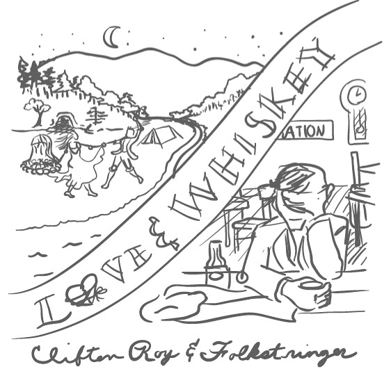
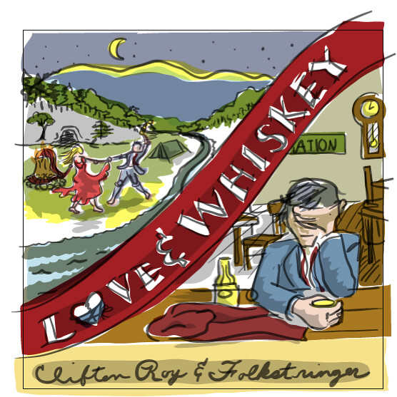
    I'm working on cd packaging layout/design for a folk/americana band. Here's the progression so far:


  2. #2
    Elite Designer jecrt has a reputation beyond repute jecrt has a reputation beyond repute jecrt has a reputation beyond repute jecrt has a reputation beyond repute jecrt has a reputation beyond repute jecrt has a reputation beyond repute jecrt has a reputation beyond repute jecrt has a reputation beyond repute jecrt has a reputation beyond repute jecrt has a reputation beyond repute jecrt has a reputation beyond repute jecrt's Avatar
    Join Date
    Jan 2009
    City, State
    Northern Illinois
    Posts
    407
    Quote Originally Posted by bellafiore View Post
    I really like the second one (:
    yeah - I kinda liked the color study for it, too. I'm kinda pressed for time on it and am wishing I would have went with a less detail-intensive style.

    Here's where I am now - I need to finish up the head/hands on the lower right, add some more depth to the background and then run over the type again. Then I'll probably tweak it (blurs for more depth, adjust some color in photoshop and maybe add some texture to the smooth areas) and it'll be done. Hopefully I can do all that tonight still!


  3. #3
    Admin sharie has a reputation beyond repute sharie has a reputation beyond repute sharie has a reputation beyond repute sharie has a reputation beyond repute sharie has a reputation beyond repute sharie has a reputation beyond repute sharie has a reputation beyond repute sharie has a reputation beyond repute sharie has a reputation beyond repute sharie has a reputation beyond repute sharie has a reputation beyond repute sharie's Avatar
    Join Date
    Jul 2007
    City, State
    Washington State
    Posts
    4,066
    I think you captured the americana colors very well. It looks pretty cool without the added texture, americana art doesn't have a whole lot of texture other than the crackle in some artwork. The texture you have already is pretty close to what I have seen in many americana paintings.

    The added red in the fire or is that part of the dress? Any way the red there kinda distracts from the fire a little.

    I think it is great and hope the artist likes it as well, this looks like quite a bit of work, hope you were paid well!

    Like us on facebook

  4. #4
    Elite Designer jecrt has a reputation beyond repute jecrt has a reputation beyond repute jecrt has a reputation beyond repute jecrt has a reputation beyond repute jecrt has a reputation beyond repute jecrt has a reputation beyond repute jecrt has a reputation beyond repute jecrt has a reputation beyond repute jecrt has a reputation beyond repute jecrt has a reputation beyond repute jecrt has a reputation beyond repute jecrt's Avatar
    Join Date
    Jan 2009
    City, State
    Northern Illinois
    Posts
    407
    well - the red is supposed to be a scarf that will be repeated on the right side...but maybe it isn't that clear...hmmm...I'll have to think about that one.

    yeah - for the texture, I was planning some black crackle texture...I was also thinking of going over some points where the detail is a little foggy with a 1pt black brush set to overprint...depends. The left side feels like it needs a little more dimension as I'm finishing up the right side.

    payment...haha...I've actually been doing work for free or super cheap for this particular band for a couple years now. They helped me build up a decent poster portfolio to get into some pretty good jobs.
    They're kind of my "pro bono" / "pet" client. They aren't signed, so their money really is kinda tight - this is their second self-produced album, but the first time really working with a proper studio/production manager. I just want them to have the best chance possible...I guess I have a soft spot in my heart (or maybe my head - lol) for bands

    thanks for the critique - I'll post some more in a while.


    Quote Originally Posted by sharie View Post
    I think you captured the americana colors very well. It looks pretty cool without the added texture, americana art doesn't have a whole lot of texture other than the crackle in some artwork. The texture you have already is pretty close to what I have seen in many americana paintings.

    The added red in the fire or is that part of the dress? Any way the red there kinda distracts from the fire a little.

    I think it is great and hope the artist likes it as well, this looks like quite a bit of work, hope you were paid well!

  5. #5
    Admin sharie has a reputation beyond repute sharie has a reputation beyond repute sharie has a reputation beyond repute sharie has a reputation beyond repute sharie has a reputation beyond repute sharie has a reputation beyond repute sharie has a reputation beyond repute sharie has a reputation beyond repute sharie has a reputation beyond repute sharie has a reputation beyond repute sharie has a reputation beyond repute sharie's Avatar
    Join Date
    Jul 2007
    City, State
    Washington State
    Posts
    4,066
    I didn't see it as a scarf, I can see it now but it seems to cover the fire to much maybe. Again I think you captured the americana art feel well

    Hey you never know they might be the next zack brown band!

    Like us on facebook

  6. #6
    Elite Designer jecrt has a reputation beyond repute jecrt has a reputation beyond repute jecrt has a reputation beyond repute jecrt has a reputation beyond repute jecrt has a reputation beyond repute jecrt has a reputation beyond repute jecrt has a reputation beyond repute jecrt has a reputation beyond repute jecrt has a reputation beyond repute jecrt has a reputation beyond repute jecrt has a reputation beyond repute jecrt's Avatar
    Join Date
    Jan 2009
    City, State
    Northern Illinois
    Posts
    407
    Quote Originally Posted by sharie View Post
    I didn't see it as a scarf, I can see it now but it seems to cover the fire to much maybe. Again I think you captured the americana art feel well

    Hey you never know they might be the next zack brown band!
    I made it opaque - I think that helps. It definitely helped me on the right side when I had to render it much larger!

    Thanks for the compliment...but now I'm worried that I lost that americana aesthetic on the right side!

    I do think I'm improving on my "painterly" technique in Illustrator, though - this is a lot different from my normal style in AI.

  7. #7
    Admin sharie has a reputation beyond repute sharie has a reputation beyond repute sharie has a reputation beyond repute sharie has a reputation beyond repute sharie has a reputation beyond repute sharie has a reputation beyond repute sharie has a reputation beyond repute sharie has a reputation beyond repute sharie has a reputation beyond repute sharie has a reputation beyond repute sharie has a reputation beyond repute sharie's Avatar
    Join Date
    Jul 2007
    City, State
    Washington State
    Posts
    4,066
    I think the crackle texture will bring back the amricana feel to the right side

    Like us on facebook

  8. #8
    Elite Designer jecrt has a reputation beyond repute jecrt has a reputation beyond repute jecrt has a reputation beyond repute jecrt has a reputation beyond repute jecrt has a reputation beyond repute jecrt has a reputation beyond repute jecrt has a reputation beyond repute jecrt has a reputation beyond repute jecrt has a reputation beyond repute jecrt has a reputation beyond repute jecrt has a reputation beyond repute jecrt's Avatar
    Join Date
    Jan 2009
    City, State
    Northern Illinois
    Posts
    407
    I couldn't come up with a good crackle that I liked, so I might try just a wear pattern...I thought this had a good wood board feel to it.

    After not looking at it for a little while and looking at it now - I need to rework the hands.


  9. #9
    Registered User balanced is a jewel in the rough balanced is a jewel in the rough balanced is a jewel in the rough balanced is a jewel in the rough balanced's Avatar
    Join Date
    Jun 2010
    Posts
    19
    I really like how bright the moon is on the trees. I'm sad to see the script go from "Clifton Roy & Folkstringer" even though I suppose it was hard to read.
    The white shading on "LOVE & WHISKEY" might be too bright.
    Otherwise, this is really pretty and they're lucky to be your "pet" client.

  10. #10
    Admin sharie has a reputation beyond repute sharie has a reputation beyond repute sharie has a reputation beyond repute sharie has a reputation beyond repute sharie has a reputation beyond repute sharie has a reputation beyond repute sharie has a reputation beyond repute sharie has a reputation beyond repute sharie has a reputation beyond repute sharie has a reputation beyond repute sharie has a reputation beyond repute sharie's Avatar
    Join Date
    Jul 2007
    City, State
    Washington State
    Posts
    4,066
    Agree about the script, the font you are using now doesn't have that americana folk art feel or look, i think the white is ok on love and whiskey, this type of outlining is used a lot in folk art. Yep that hand kinda looks like he borrowed it from the incredible hulk LOL I hate hands, I think hands are the hardest for me to do. This is where the saying it will cost you an arm and a leg, in the old days and maybe still today...artist would go to specific artists just to do arms and legs, hands and feet with set prices, so it ended up costing an arm or leg more. But I am guessing everyone already knew that and I am now just blabbering

    Like us on facebook

  11. #11
    Elite Designer jecrt has a reputation beyond repute jecrt has a reputation beyond repute jecrt has a reputation beyond repute jecrt has a reputation beyond repute jecrt has a reputation beyond repute jecrt has a reputation beyond repute jecrt has a reputation beyond repute jecrt has a reputation beyond repute jecrt has a reputation beyond repute jecrt has a reputation beyond repute jecrt has a reputation beyond repute jecrt's Avatar
    Join Date
    Jan 2009
    City, State
    Northern Illinois
    Posts
    407
    here's the front/back cover. I reworked the hand a little bit - I'm happy with it now. It's still not 100% anatomically accurate, but when I redrew the hands to actually be 100% accurate (I took some photos of my hands) it kinda killed some of the whimsy/charm of the image. So I changed them a little, but not that much. They wanted a time piece on the back - so I vectored in one of those, too - and then handlettered the song titles.

    I'm trying to keep everything 100% vector because I plan on using it for their album tour poster - and it will scale well now.

    I also rendered a 30s-style paper cocktail napkin with some whiskey stains, lipstick kisses and a phone number that bleeds out for the insert. The inside will be just a woodgrain/bar tabletop with some various things carved into/spilled onto it. The disc will then look like an old paper beer coaster.

    Everything is due to press by Thursday, so I've been rushing to get it all done!!


  12. #12
    Elite Designer ZukiH has a reputation beyond repute ZukiH has a reputation beyond repute ZukiH has a reputation beyond repute ZukiH has a reputation beyond repute ZukiH has a reputation beyond repute ZukiH has a reputation beyond repute ZukiH has a reputation beyond repute ZukiH has a reputation beyond repute ZukiH has a reputation beyond repute ZukiH has a reputation beyond repute ZukiH has a reputation beyond repute ZukiH's Avatar
    Join Date
    Nov 2009
    Posts
    1,169
    I think you did an excellent work. love it!
    DC COP in DC T-Shirt
    Get one here

  13. #13
    The founder resurepus is a splendid one to behold resurepus is a splendid one to behold resurepus is a splendid one to behold resurepus is a splendid one to behold resurepus is a splendid one to behold resurepus is a splendid one to behold resurepus's Avatar
    Join Date
    Nov 2003
    City, State
    Toulouse
    Posts
    7,181
    great work there, Josh!

    follow DesignContest on twitter

  14. #14
    Admin sharie has a reputation beyond repute sharie has a reputation beyond repute sharie has a reputation beyond repute sharie has a reputation beyond repute sharie has a reputation beyond repute sharie has a reputation beyond repute sharie has a reputation beyond repute sharie has a reputation beyond repute sharie has a reputation beyond repute sharie has a reputation beyond repute sharie has a reputation beyond repute sharie's Avatar
    Join Date
    Jul 2007
    City, State
    Washington State
    Posts
    4,066
    This turned out great and the hand is way better, The texture you did on the right side did the trick, you brought the americana feel back, Love the back cover

    Like us on facebook

  15. #15
    Elite Designer Stev27 has a reputation beyond repute Stev27 has a reputation beyond repute Stev27 has a reputation beyond repute Stev27 has a reputation beyond repute Stev27 has a reputation beyond repute Stev27 has a reputation beyond repute Stev27 has a reputation beyond repute Stev27 has a reputation beyond repute Stev27 has a reputation beyond repute Stev27 has a reputation beyond repute Stev27 has a reputation beyond repute Stev27's Avatar
    Join Date
    Jan 2010
    City, State
    California
    Posts
    405
    I really liked seeing your work in progress. Great color selections and I think your style fits perfect for a Folk band cover. Looks awesome and I bet the band loves it!

  16. #16
    Registered User Chris West will become famous soon enough
    Join Date
    Jul 2010
    City, State
    Gloucester, UK
    Posts
    13
    Turned out really nice, thanks for sharing your progress with us, it's great to see other designers' processes.

  17. #17
    Registered User MasNgabei will become famous soon enough
    Join Date
    Aug 2010
    City, State
    Semarang
    Posts
    11
    I love the details and how you work with lights... that's a great work

Bookmarks

Posting Permissions

  • You may not post new threads
  • You may not post replies
  • You may not post attachments
  • You may not edit your posts
  • Find a contest
  • Participate and win
  • Get cash prize
Designers Join Us