This is a design for a post-modern art gallery in the Netherlands. They have different displays each month.
Currently their visitors are age 35+, and they would like to attract younger visitors.
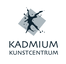
Any tips on how to improve this?
Thanks!

Ready for your call :)
Mon — Fri, 2am — 8pm (EST)
US & EU support teams
We are back in: 1h 20m
Mon — Fri, 2am — 8pm (EST)
US & EU support teams
Junior Member

Posted 14 September 2010 - 08:37 PM
Elite Designer

Posted 15 September 2010 - 06:05 AM
Junior Member
Posted 15 September 2010 - 10:27 AM
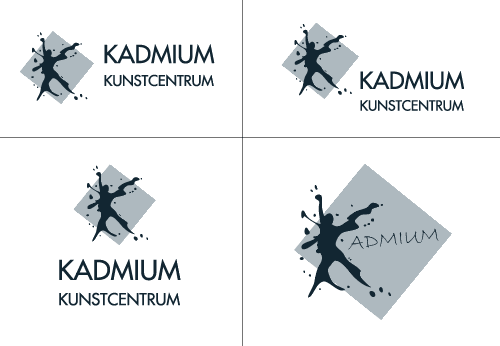
Just one thing from me.
The colours used, were they the colours they gave you to use?
Apprentice Designer
Posted 15 September 2010 - 04:11 PM

Junior Member
Posted 15 September 2010 - 06:25 PM
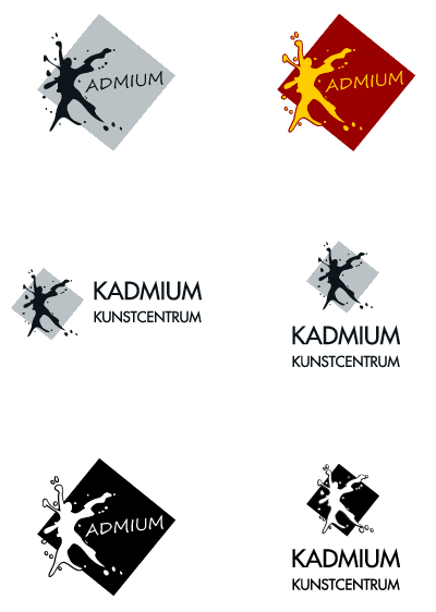
Is it possible to give some abstract look of a human being in the icon? Though it almost took a shape of the same.
Junior Member
Posted 16 September 2010 - 05:29 PM

Junior Member
Posted 16 September 2010 - 07:54 PM
I am new to this site but the first post showed the best logo in my opinion. It gives a sense of seriousness and modernism. We don't want some funky colours for a logo just cause you want to attract young people.A museum is essentially a place where you come out of interest and your first logo is bang on target.
Banned
Posted 17 September 2010 - 01:18 PM
Junior Member

Posted 24 September 2010 - 02:34 PM


0 members, 1 guests, 0 anonymous users


 Brandy


