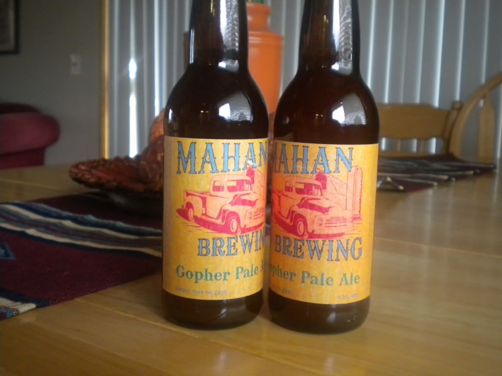
I was going to say something about the truck not being stuck

... but I see you've changed it since that was posted. I like the new one, The angles of the fonts keep your eyes in the center... and since the truck is not dark but a 'close' color to the label, along with the detail of the truck and vibrating colors (red-blue), it makes you see the truck with out it competing with the font and font color as your eyes bounce around the image... hope that made sense lol... nice use of analogous (red,yellow,orange) for the back ground and split complementary colors (red, blue, teal) for the fore-ground gives a good balance... basically... good color choices... and I guess it was a good idea that you didn't change the picture to display a stuck truck


 Brandy


