Autobody shop
#1
Posted 03 February 2009 - 05:43 PM
Then after speaking with him again stated he might like to see something with a kinda wing look similar to another car manufacture and wants a Script font (the script he likes is an LHF font that I can't get at the moment so I just redrew it).
any way look at them and let me know what you think and how I can improve it.
thanks and appreciate any/all comments.
#7
Posted 16 February 2009 - 06:03 PM
Doing this for a friend of mine that has a body shop. When I first spoke to him he was working on a 1940's pickup and said he wanted a "badge" similar to what was on the front fenders. He also stated he wanted flames, maybe a star kinda hit on a few different things. So the first round was 4 compleately different looks then narrowed it down (to the first one here) and wanted to see it in different color set ups.
Then after speaking with him again stated he might like to see something with a kinda wing look similar to another car manufacture and wants a Script font (the script he likes is an LHF font that I can't get at the moment so I just redrew it).
any way look at them and let me know what you think and how I can improve it.
thanks and appreciate any/all comments.
A tip for chrome in vector images. Go with a second layer of gradient to give the design more depth. Also adding two more layers of the text offset inversely, one in blk and one white, will give it a beveled effect and help define the text against the chrome effect. Also if you're doing a simple gradient for the chrome effect I suggest you don't go 100% black at any point unless you have an artificial horizon reflection. The black tend to distract from the text in the foreground.
In the winged version, I would bump up the size of the oval and text to make it more readable at smaller sizes. Also don't be afraid to break the text out of the oval a bit. Try a color fill with a nice thick outline for the Larry's.
Hope this helps.
#9 Guest_Gerhard Schlee_*
Posted 20 February 2009 - 12:12 AM
I like the first option better, flat version (by the way, I would try on the logo that font you used for writing "flat", it's really cool. What font is that?)
#10
Posted 27 February 2009 - 06:51 PM
Gerhard Schlee that font is called american dreams I believe.
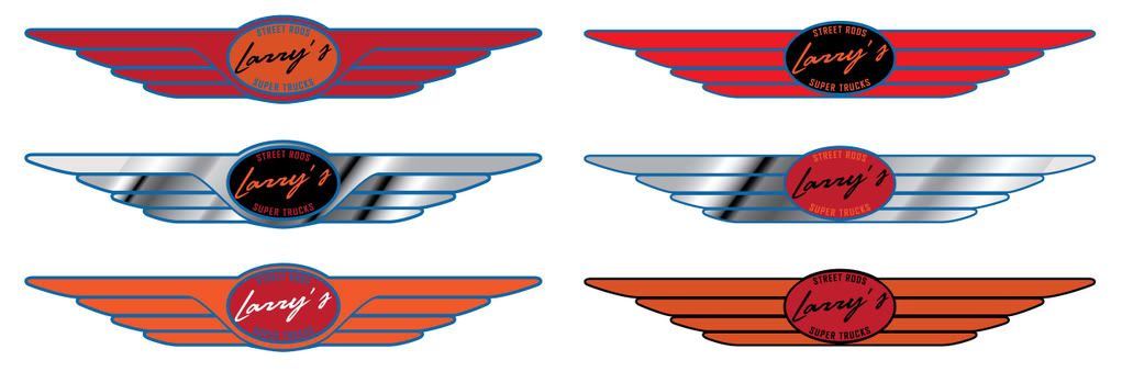
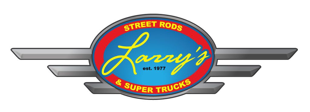
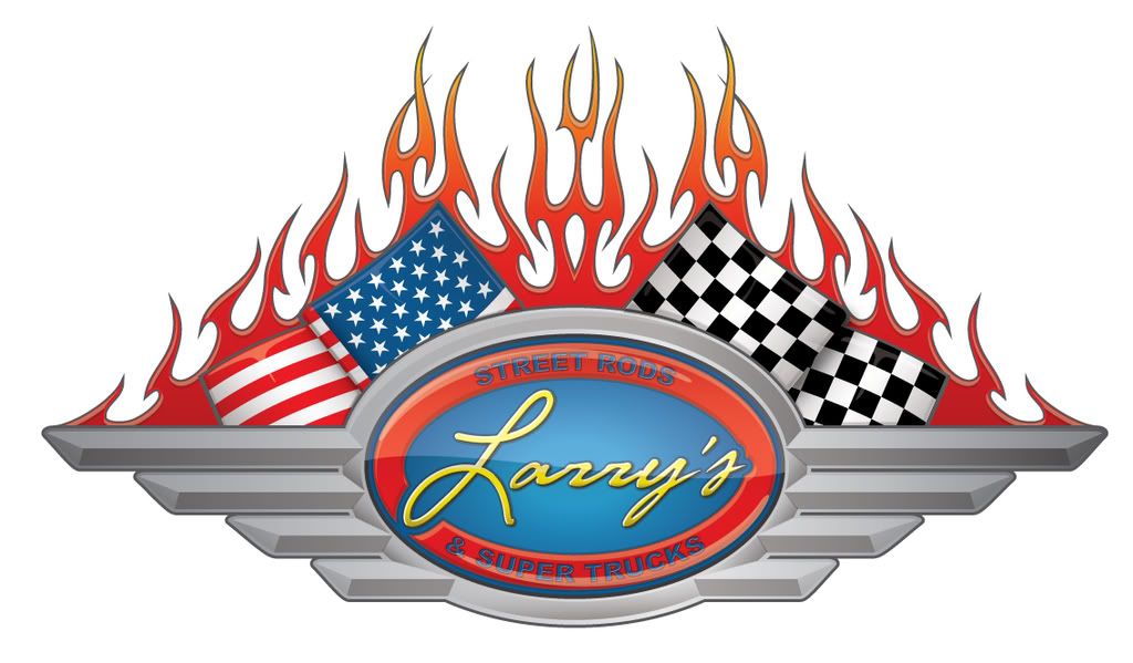
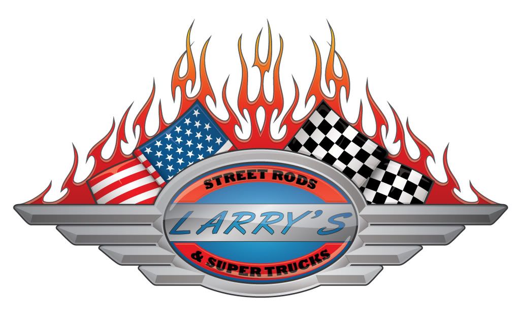
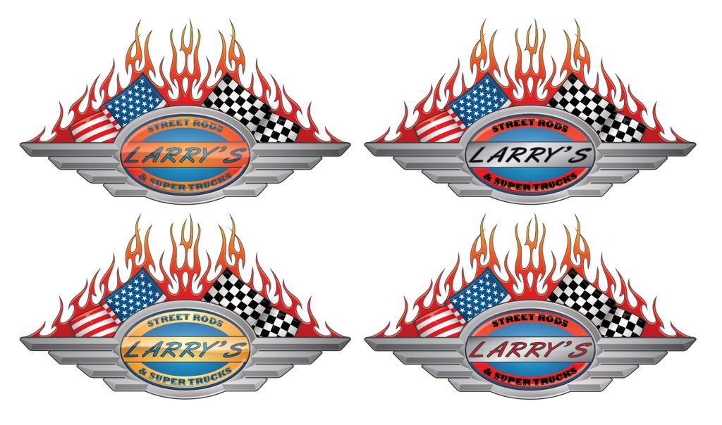
I'm sure you have worked with a "difficult" client before.. Well this is one of them.
I shouldn't say difficult. He just wants a look and doesn't really know exactly what.. He's been really appreciative of my work so far.
We've changed gears and tweeked continuously. This started out as a simple something for a friend and has become a huge project. I won't him to get what he wants but at this point I've spent at least many hours on different looks. so this week I started over and will get approvales for each step as I go.. but I think we are in the final streatch.
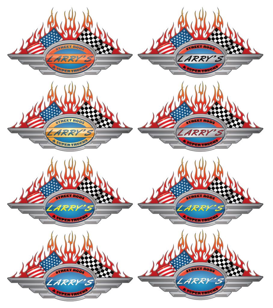
The problem is he keeps seeing parts of logos that he likes and we try it then he doesn't like it on his and so on.
Well enough rambling from me. I appreciate the input.
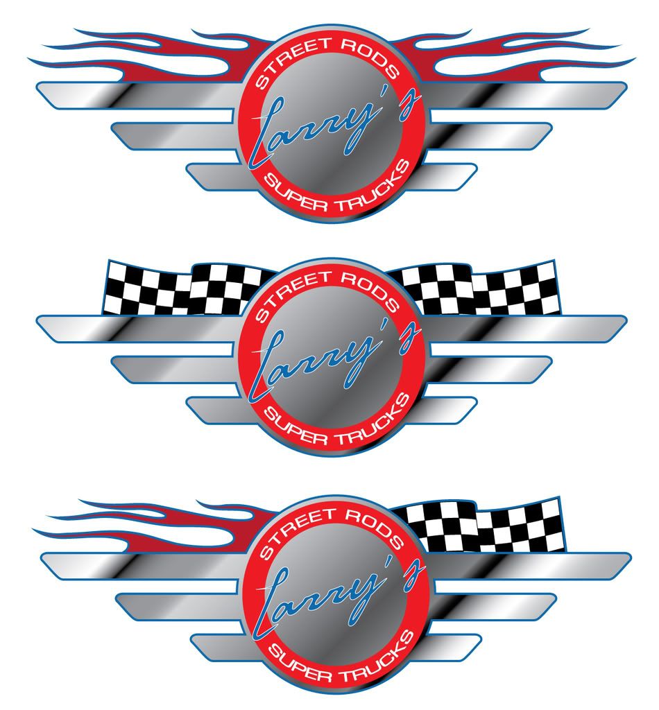
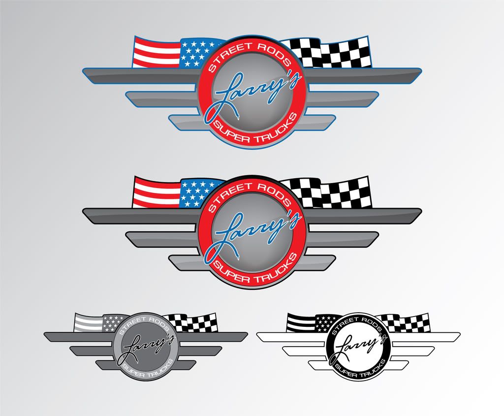
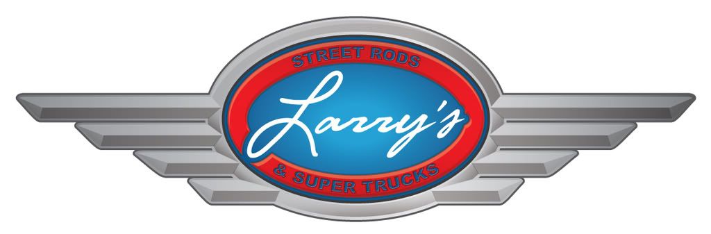
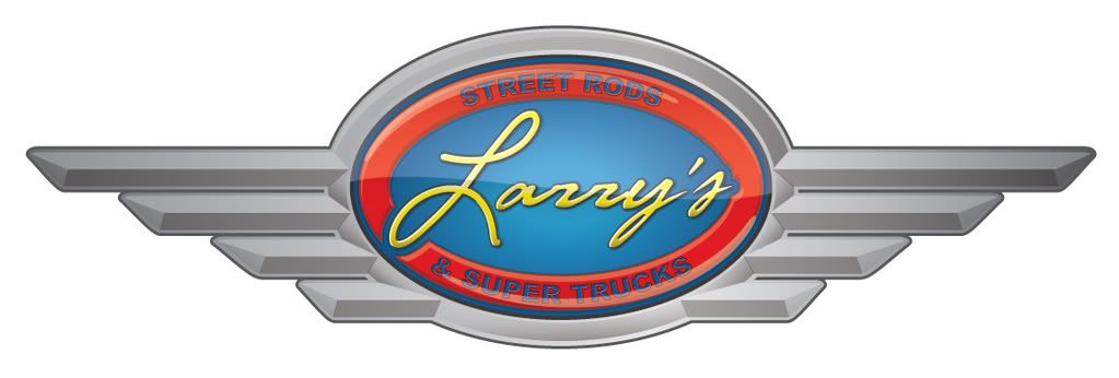
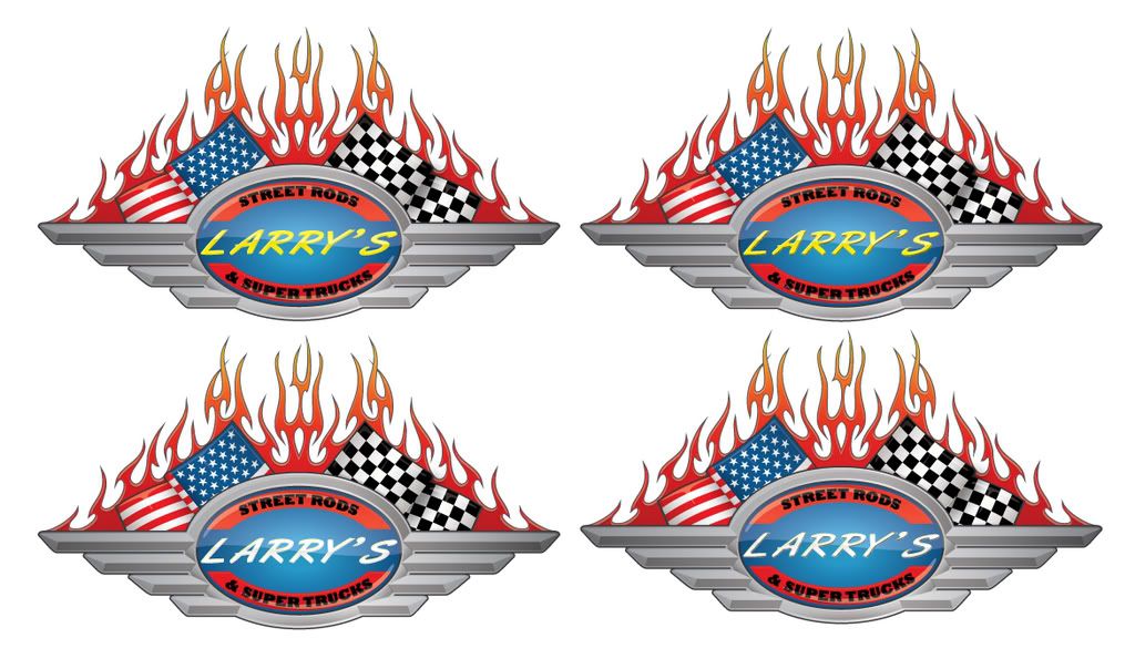
will post the pics in a sec of other revisions..
Edited by Coy, 27 February 2009 - 07:05 PM.
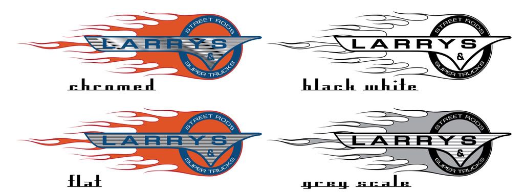
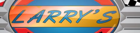
#11
Posted 27 February 2009 - 07:03 PM
He said he wanted the bars seperate, flames and a flag.
And then wanted to see it with an American Flag.
I was messing around with an idea and tossed this out there.
Then he wanted the bars to look like they were coming to a point kinda.
did this and showed what it looked like with yellow lettering, cause it just pops more then the colors he wants.
Now he wantes the bars to be just touching each other and wasn't sure if he wanted them "feathered" at the ends or "straight".. So I sent him this.
and asked him to choose wich one to go forward with.
#12
Posted 27 February 2009 - 07:06 PM
well added to it. Possibly finished.. so what'da ya think?
I still need to do one in a more blocked letter font.
Edited by Coy, 27 February 2009 - 09:50 PM.
#13
Posted 03 March 2009 - 10:19 PM
He likes it but now wants to try some other fonts out and a couple other ideas.
He keeps looking through car/truck magazines and wants to try this and that.
Anyway. let me know what you think of this with the flags and fire added.
What would you change or take away?
This is the one with the script type lettering.
and this is trying a different font and a small change he wanted to see what it looked like.
#15
Posted 04 March 2009 - 01:20 AM
#16
Posted 04 March 2009 - 01:29 AM
He's now wanting to capture the look of what automotive painters call "quick stroke" lettering (instead of the script). which is similar to the font on the second one.
I however am not liking the bar but he wants me to play with it.. any suggestions? color, different placement etc.?
He's also liking the block letters in black. which on the next version I'll do in the blue color. and a version with the font w/ out the bar.
for print/shirts/hats, I'll loos all the glossy look and gradiants. But this is first going to be used on his upcoming website.
I'll probably have another update tomorrow. LOL
#18
Posted 05 March 2009 - 06:44 PM
So here are some variations
All togeather.
Just the different bar looks.
and without the bars. I set up the lettering two different way with slight variations. I personally like the top left one w/out the bar.
#19
Posted 05 March 2009 - 06:50 PM
I'm kinda wanting to make a background that looks kinda like and old school paint job.
1st thoughts were white with light grey(silver) racing type strips down the middle, then I was thinking silver with light blue "goast flames" that matched the newer tribal type flames he likes. maybe some sort of old school pin striping look.
I know I want to keept he back ground fairly light colored and not real busy as I think the darker color will kinda swallow up the photo's and logo. plus text on a light background is easier to read then a dark..
wow look at me ramble on. sorry. stopping now.
#20
Posted 06 March 2009 - 07:18 PM
1 user(s) are reading this topic
0 members, 1 guests, 0 anonymous users