Jump to content

  • Free consultations and support
  • Live chatClick Here for Live Chat
  • Call ico 1888-906-1888
    Phone support: Open

    Ready for your call :)

    Our business hours:

    Mon — Fri, 2am — 8pm (EST)

    US & EU support teams

    Phone support: Closed

    We are back in: 1h 20m

    Our business hours:

    Mon — Fri, 2am — 8pm (EST)

    US & EU support teams


Autobody shop


  • Please log in to reply
&nsbp;

#21 Coy

Coy

    Elite Designer

  • Designer
  • 2534 posts

Posted 09 March 2009 - 11:50 PM

Thank you for the complements.
He thinks these are it. Just wanted me to add est. 1977 and show him a black "larry's" version. which is done.

Now I'm on to designing some of the website elements.

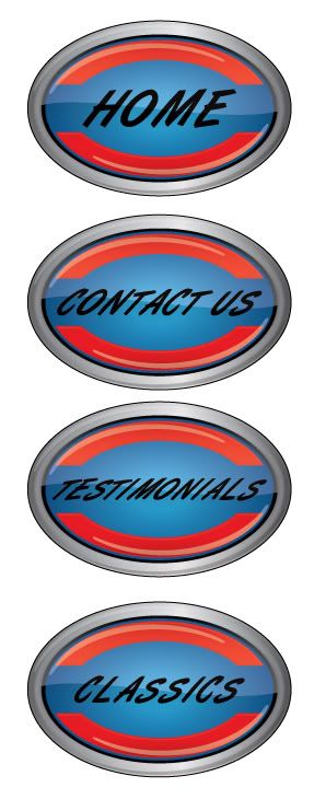
I just finished making some buttons. Basically used the same exact set up, I was going to use some flames but liked the center of the logo so just went that route.

Let me know what you think.. I kinda like them yellow but went w/ black for now. as he still hasn't made his mind up about which color exactly to use with the logo, and wanted them to match.
Posted Image

#22 mashke

mashke

    Junior Member

  • Designer
  • 13 posts

Posted 17 March 2009 - 08:44 AM

Wow, the one with the orange and yellow blend are absolutely stunning. Good job imo.

#23 Gx3 Grafix

Gx3 Grafix

    Apprentice Designer

  • Designer
  • 84 posts

Posted 17 March 2009 - 11:40 AM

I like the concept of keeping them looking like the logo to create consistancy but I wonder about the size, will you be bringing that down? It is also my opinion that the font in the logo should be unique to the website. I find it often where the same font is used throughout the site and it kind of takes away from the logo. Are you going to do hover over images? That would be cool to change that inner gradient color to another color from the logo on rolloever. I can't wait to see what this thing looks like all put together, I know a lot goes into making a website. You're doing a great job so far, keep us posted!
  • Coy likes this

#24 Coy

Coy

    Elite Designer

  • Designer
  • 2534 posts

Posted 17 March 2009 - 05:43 PM

mashke - Thanks, he likes that one the best also. but I think he's going with that and the yellow one. For now he wanted me to use the gradiant yellow/orange.

I like the concept of keeping them looking like the logo to create consistancy but I wonder about the size, will you be bringing that down? It is also my opinion that the font in the logo should be unique to the website. I find it often where the same font is used throughout the site and it kind of takes away from the logo. Are you going to do hover over images? That would be cool to change that inner gradient color to another color from the logo on rolloever. I can't wait to see what this thing looks like all put together, I know a lot goes into making a website. You're doing a great job so far, keep us posted!


Thanks
Never thought about the same font taking away from the logo. I did want to use a more modern type of font, may try it to see how he likes it.
I was going to do a hover over just wasn't sure what yet. I was thinking of when you hover over it would look like the name i.e."home" looked sprayed on since he's a body man. but your idea sounds simpler. :)

Right now I'm making a million "doodles" of possible images to use as backgrounds, borders ect. I'm just not sure how I want to put it all togeather, just yet. And he still has to get me some of the thousands and thousands of pics he has of cars he's done, I've also asked him for anything he's done that's been put in the magazines.

So for now I'm just thinking/figuring out how to make it look - oldschool with a modern feel at the same time being different and standing out that what's currently out there. So I'm up for any IDEAS or SUGGESTIONS:D


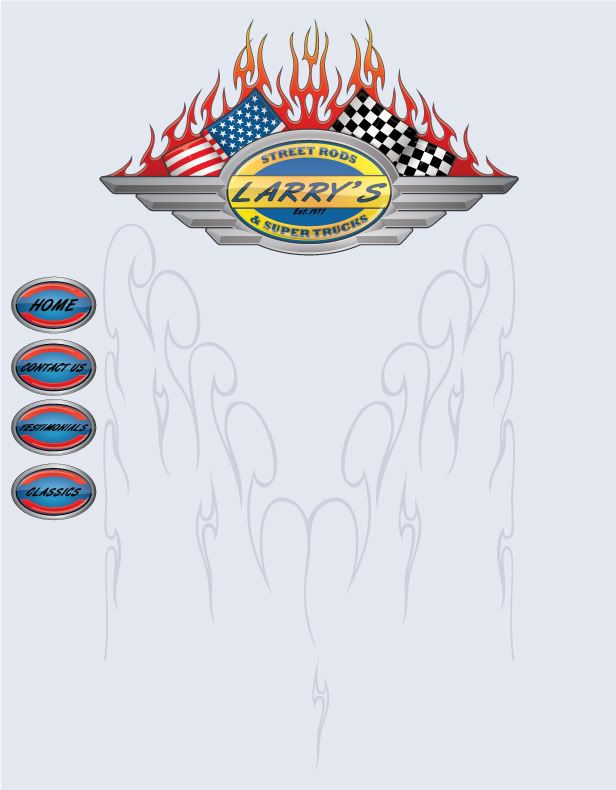
This is the first one I've kinda put togeather to see how the page might look, this is just an "outline" sorta. I still have many Ideas to put down and see what I like/dislike.
For not not really "feeling it" with this one.
Posted Image


Couple things I might use

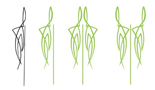
I was thinking this for a border between the buttons and the text/pic area.
Posted Image

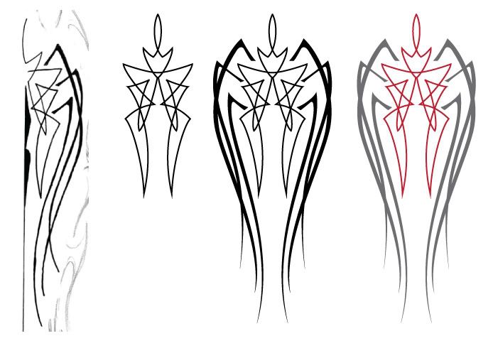
I was thinking this for a background image but make it look like it's pushing up, like an embossed look.
Posted Image

#25 Coy

Coy

    Elite Designer

  • Designer
  • 2534 posts

Posted 17 March 2009 - 05:49 PM

One other thing.

This has been a HUGE help. letting me bounce everything off ya-all.

I really appreciate it.


0 user(s) are reading this topic

0 members, 0 guests, 0 anonymous users