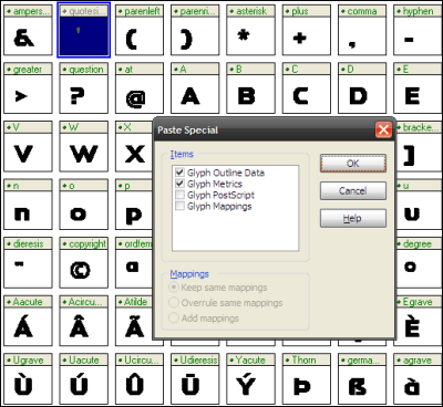
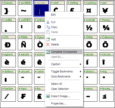
Just repeat what we've done in section 1 to do autocomplete for the rest of the sections.
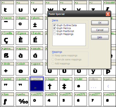
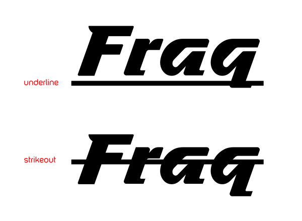
When do the autocomplete for C cedilla or c cedilla....

Edited by morabira, 02 September 2012 - 02:03 AM.

Ready for your call :)
Mon — Fri, 2am — 8pm (EST)
US & EU support teams
We are back in: 1h 20m
Mon — Fri, 2am — 8pm (EST)
US & EU support teams

Posted 05 September 2012 - 06:19 PM


Edited by morabira, 07 September 2012 - 07:29 PM.
Posted 05 September 2012 - 06:23 PM

Edited by morabira, 05 September 2012 - 08:46 PM.
Posted 05 September 2012 - 08:45 PM

Edited by morabira, 06 September 2012 - 02:39 AM.
Posted 06 September 2012 - 02:38 AM

Edited by morabira, 07 September 2012 - 07:43 PM.
Posted 07 September 2012 - 07:42 PM

Posted 07 September 2012 - 07:44 PM

Edited by morabira, 12 September 2012 - 01:35 AM.
Posted 14 September 2012 - 04:38 AM

Edited by morabira, 14 September 2012 - 08:20 AM.
Posted 14 September 2012 - 06:13 AM

Edited by morabira, 22 September 2012 - 10:59 AM.
Posted 20 September 2012 - 02:36 PM

Edited by morabira, 21 September 2012 - 03:02 AM.
Posted 21 September 2012 - 02:58 AM

Posted 21 September 2012 - 03:13 AM

Edited by morabira, 21 September 2012 - 10:17 AM.
Posted 21 September 2012 - 03:20 AM


Edited by morabira, 21 September 2012 - 05:38 AM.
Posted 21 September 2012 - 05:14 AM


Edited by morabira, 21 September 2012 - 09:44 AM.
Posted 21 September 2012 - 10:00 AM

Edited by morabira, 21 September 2012 - 10:03 AM.
Posted 21 September 2012 - 10:05 AM
ADDITIONAL IMPORTANT INFO:
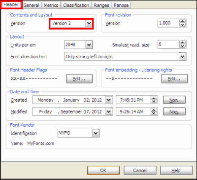
1) For other weight (bold, medium, black etc), use same value when importing EPS into High Logic (when resizing and positioning our imported eps). Each weight need to use their own i-based guideline for eps exporting purpose.
2) As an extra step, if we want to convert our font to other format (OTF etc), we can use program like "TransType Pro" by Fontlab. We can rent their online service to use the converter for one day for USD9.00++ to convert all of our font. It just took less than 5 minutes to convert a single font.
3) If we want to sell our font, just go to any font marketplace like www.myfonts.com, www.fonts.com and many more...contact their email. Normally they'll email us "Contract Agreement" to be filled and email back to them together with our fonts files.
4) If you give up designing your own font, just save some money and purchase our foundry fonts here 
https://www.myfonts....bahtera-foundry

THE END
Edited by morabira , 09 February 2024 - 12:08 AM.
Guru

Posted 21 September 2012 - 12:54 PM
ADDITIONAL IMPORTANT INFO:
1) For other weight (bold, medium, black etc), use same value when importing EPS into High Logic (when resizing and positioning our imported eps). Each weight need to use their own i-based guideline for eps exporting purpose.
2) As an extra step, if we want to convert our font to other format (OTF etc), we can use program like "TransType Pro" by Fontlab. We can rent their online service to use the converter for one day for USD9.00++ to convert all of our font. It just took less than 5 minutes to convert a single font.
3) If we want to sell our font, just go to any font marketplace like MyFonts: Webfonts & Desktop Fonts, Fonts.com and many more...contact their email. Normally they'll email us "Contract Agreement" to be filled and email back to them together with our fonts files.
THE END


Designer's Resources →
Photography →
waterfallsStarted by SmartWeb, 11 Jul 2013 |
|
|
0 members, 0 guests, 0 anonymous users