Jump to content

  • Free consultations and support
  • Live chatClick Here for Live Chat
  • Call ico 1888-906-1888
    Phone support: Open

    Ready for your call :)

    Our business hours:

    Mon — Fri, 2am — 8pm (EST)

    US & EU support teams

    Phone support: Closed

    We are back in: 1h 20m

    Our business hours:

    Mon — Fri, 2am — 8pm (EST)

    US & EU support teams


Wacom Logo RE-redesign. Deadline January 1, 2008


  • This topic is locked This topic is locked
&nsbp;

#121

  • Guests

Posted 28 December 2007 - 10:00 PM

Thanks for the opportunity to enter. Great contest and several awesome ideas!


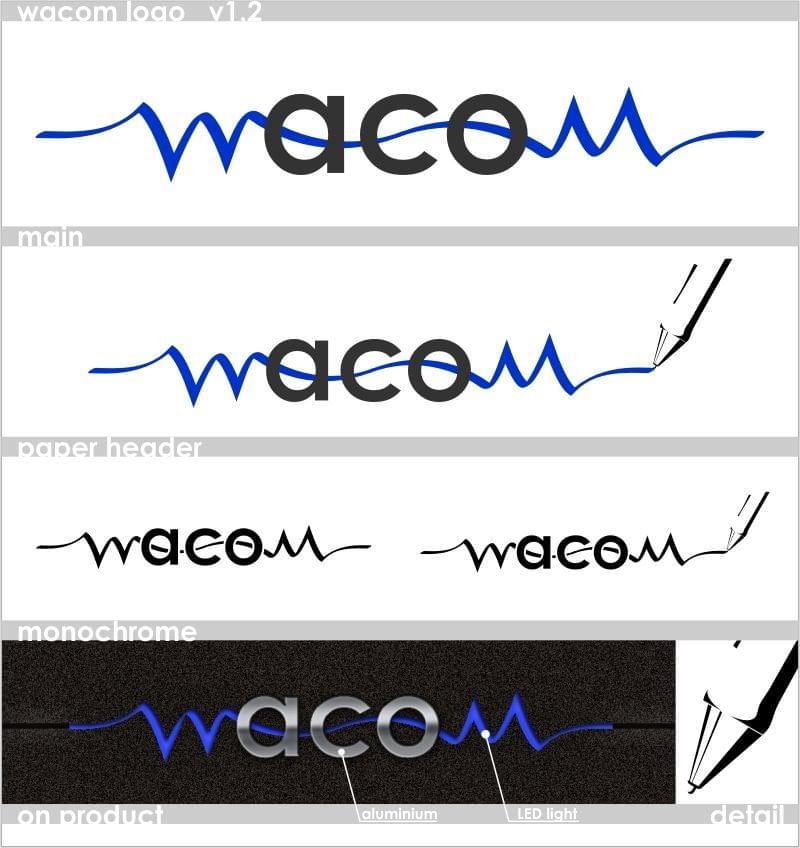
Thanks for entering! While I kind of see what you wanted to do I still have to point out that the perspective has gone out of control. Even if you wanted to use inverted perspective, you should stick to it to the end and use the same perspective for all the forms in the designs unless there is a reason for not doing so.

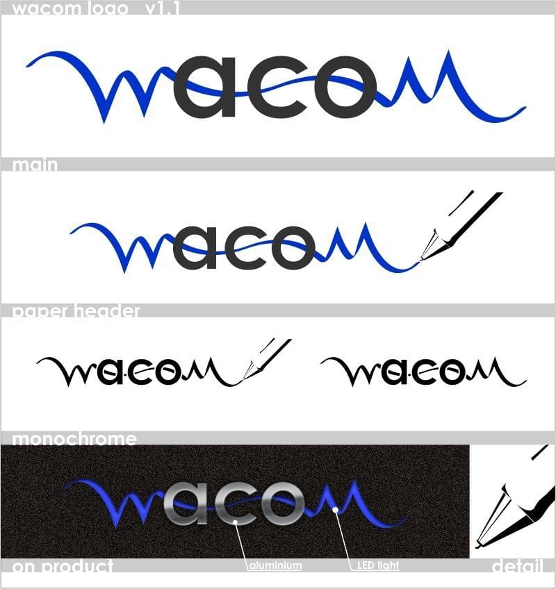
Well anyway, I should be honest, I don't think Wacom would use a logo that was made in an hour.

#122 Chung Dha

Chung Dha

    Guru

  • Designer
  • 1439 posts

Posted 28 December 2007 - 10:49 PM

The Idea of a big W is very clear like resurepus said the perspective is all out of order. Also the overal shape is not the same width on each block. The pen is clearly a tablet pen but when you cut it , it should not be straight more in half circle shape. I would advice you so use a grid so it easier to keep the correct widt and angles and perspective. And the pen width is to thin compared to the other shapes to complete the shape of the W.

To be honest even mine logo was done in 1 hour hehe.

#123 mroedel82

mroedel82

    Apprentice Designer

  • Designer
  • 7 posts

Posted 29 December 2007 - 02:47 AM

Thanks for the great suggestions and advice. I tried to follow it as closely as possible

#124 Chung Dha

Chung Dha

    Guru

  • Designer
  • 1439 posts

Posted 29 December 2007 - 11:08 AM

It is not really working actually placing text on logo illustration. And its odd to have a abstract figure and a non abstract figure. I think it would been better if you placed the name wacom outside the figure like normal logo's does.

Here is a catchy phrase from Paul Rand that should help.

Don't try to be original, try to be good.

#125 mroedel82

mroedel82

    Apprentice Designer

  • Designer
  • 7 posts

Posted 29 December 2007 - 05:51 PM

Thanks for the great suggestions. I might play with the "W" a little more and look into losing the pen out of the design. I kind of see what you're saying.

#126 piast

piast

    Apprentice Designer

  • Designer
  • 2 posts

Posted 29 December 2007 - 10:56 PM

Hello All,
I'm newbie in "DesignContest", and this is my first try in this forum.
"W", and "M" letters are identical, but rotated 180 deg. They are "hand-written" to emphasize type of work with Wacom products.
"ACO", are geometrical, and simple to say: "this is perfect technology, but simple in use".
Thanks for all comments.
Posted Image
and second version:
Posted Image

#127 Chung Dha

Chung Dha

    Guru

  • Designer
  • 1439 posts

Posted 29 December 2007 - 11:03 PM

You need to find a solution to make Aco blend with the W and the M, because the W and M look more like extra decoration like a life line or a horizon with mountains and that the company is called Aco instead of Wacom.

The idea is good but need a better way to work it out. So that people would read Wacom and not only Aco.

#128 hackdesign

hackdesign

    Apprentice Designer

  • Designer
  • 95 posts

Posted 29 December 2007 - 11:12 PM

i have the same opinion
lose the pen
make it work better together
making w and m same color
makes the aco stand out too much
try all the same color
but still make them connect
maybe where they overlap, use a different shade

You need to find a solution to make Aco blend with the W and the M, because the W and M look more like extra decoration like a life line or a horizon with mountains and that the company is called Aco instead of Wacom.

The idea is good but need a better way to work it out. So that people would read Wacom and not only Aco.


#129 zooley

zooley

    Senior Member

  • Designer
  • 117 posts

Posted 30 December 2007 - 03:32 PM

Here is another idea.
Oh, and a Happy New Year for all of you... :)

#130 mroedel82

mroedel82

    Apprentice Designer

  • Designer
  • 7 posts

Posted 30 December 2007 - 05:18 PM

Hi Everyone. Here's another take on the "W" idea. All suggestions welcome. Happy New Year!

#131 Chung Dha

Chung Dha

    Guru

  • Designer
  • 1439 posts

Posted 30 December 2007 - 07:50 PM

You should try a totally different design because staying with the same one for a long time won't help improve.

#132 _Redrum

_Redrum

    Retired Admin

  • Designer
  • 1957 posts

Posted 30 December 2007 - 11:45 PM

mroedel82, you need to try another concept. This one is going in the wrong direction. Straight geometric shapes and lines are far too rigid for Wacom. Your logo doesn't communicate their brand, which (in my best estimate) encompasses words like "sleek, sexy, stylish, smooth, and simple".

Another helpful logo tip: Don't use thin black outlines. They're for drawing, not for logos.

#133 punkerella

punkerella

    Apprentice Designer

  • Designer
  • 43 posts

Posted 31 December 2007 - 05:31 AM

mroedel82, you need to try another concept. This one is going in the wrong direction. Straight geometric shapes and lines are far too rigid for Wacom. Your logo doesn't communicate their brand, which (in my best estimate) encompasses words like "sleek, sexy, stylish, smooth, and simple".

Another helpful logo tip: Don't use thin black outlines. They're for drawing, not for logos.


Yeah, I agree with _Redrum. Think smoother. Stretch your mind. It'll come.

#134 mroedel82

mroedel82

    Apprentice Designer

  • Designer
  • 7 posts

Posted 31 December 2007 - 06:09 AM

Thanks Redrum and punkerella - I really appreciate the tips and direction. Not sure if I'll have time tomorrow to come up with something before end of contest, but I'm definitely going to try.

#135 ADD

ADD

    Apprentice Designer

  • Designer
  • 29 posts

Posted 31 December 2007 - 06:52 AM

Hi all,.....here is my design for wacom.

creation+dream+designer+passion+enjoyment
designer font+graphical+colours+mobility+spaces

.............

#136 samisad0rk

samisad0rk

    Apprentice Designer

  • Designer
  • 64 posts

Posted 31 December 2007 - 07:02 AM

Here is my last minute try :) Comments and criticism welcome.

Posted Image

#137 donskut

donskut

    Apprentice Designer

  • Designer
  • 7 posts

Posted 31 December 2007 - 08:20 AM

v2

#138 donskut

donskut

    Apprentice Designer

  • Designer
  • 7 posts

Posted 31 December 2007 - 08:22 AM

v1

hi guys, this is my first contribution to this forum

hope you like it

c&c are welcome :)

#139 ADD

ADD

    Apprentice Designer

  • Designer
  • 29 posts

Posted 31 December 2007 - 09:44 AM

another variation

#140 ADD

ADD

    Apprentice Designer

  • Designer
  • 29 posts

Posted 31 December 2007 - 11:39 AM

Variant


0 user(s) are reading this topic

0 members, 0 guests, 0 anonymous users