
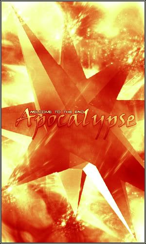
Apocalypse (Poster Style Image)
I made this for a little "battle" on some graphics forums, may I please receive some rates.
&nsbp;
#5
: post #5")
ic3d
-

- Designer
- 60 posts
Apprentice Designer
Posted 05 August 2004 - 10:41 PM
Looks pretty nice, but what's bothering me on the picture is that (whine mode) iam questioning what that big star has to do with an apocalypse?
Furthermore i think some other colors or variants would break the pic up a little bit, it's too duotone if you know what i mean
Goodluck with your battle.
Furthermore i think some other colors or variants would break the pic up a little bit, it's too duotone if you know what i mean
Goodluck with your battle.
#6
AceD
-
- Designer
- 31 posts
Apprentice Designer
Posted 05 August 2004 - 11:48 PM
It doesn't really have anything to do with an apocalypse it was just a render I decided to use, I only titled it apocalypse because of the explosion effect I made with the brushes, and I won the battle like 6 votes to none.
#7
ic3d
-
- Designer
- 60 posts
Apprentice Designer
Posted 05 August 2004 - 11:54 PM
Ah okay then i misunderstood, i thought you were in an 'apocalypse' competition.
I do still stick with the color thing though, that's just my humble opinion.
Congratulations with your win
I do still stick with the color thing though, that's just my humble opinion.
Congratulations with your win
#9
Conner
-

- Designer
- 2 posts
Apprentice Designer
Posted 07 August 2004 - 01:12 AM
I like how it looks like the star is skidding along something metal. It kind of looks like sparks are flying off the ends of the tips. Anyways, if you were going for an explosion effect, you certainly nailed it. Good job on your win, and nice design.
nodesinglimits :: link
------------------------------
NLD is currently under construction but will be fully functional soon.
------------------------------
NLD is currently under construction but will be fully functional soon.


0 user(s) are reading this topic
0 members, 0 guests, 0 anonymous users
