Jump to content

  • Free consultations and support
  • Live chatClick Here for Live Chat
  • Call ico 1888-906-1888
    Phone support: Open

    Ready for your call :)

    Our business hours:

    Mon — Fri, 2am — 8pm (EST)

    US & EU support teams

    Phone support: Closed

    We are back in: 1h 20m

    Our business hours:

    Mon — Fri, 2am — 8pm (EST)

    US & EU support teams


Producing font using CorelDraw and High Logic Font Creator

waterfalls

  • Please log in to reply
&nsbp;

#41 morabira

morabira

  • Designer
  • 1008 posts

Posted 14 August 2012 - 02:42 PM

So, before we start do the kerning setting, all characters should have been transferred to High Logic. We should have something like this now..How many symbol/characters have we transferred? 165 ...
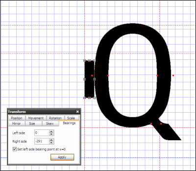
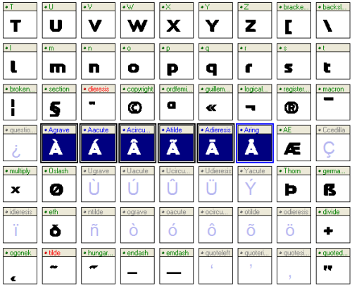
Sure, there are still some empty glyphs. Just leave them as they are.
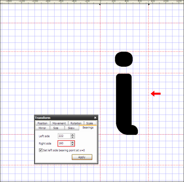
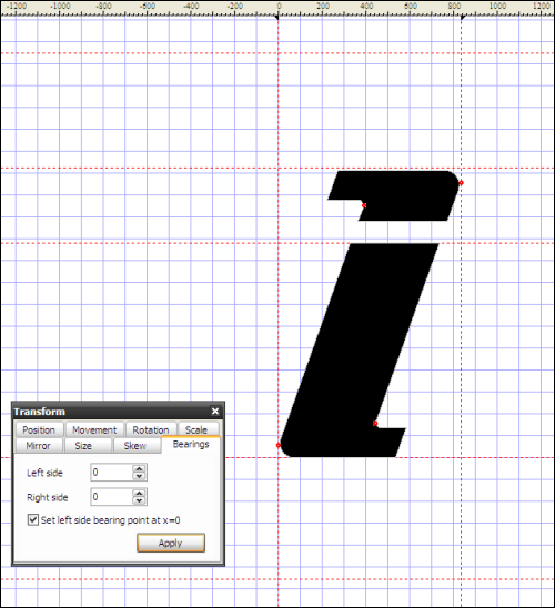
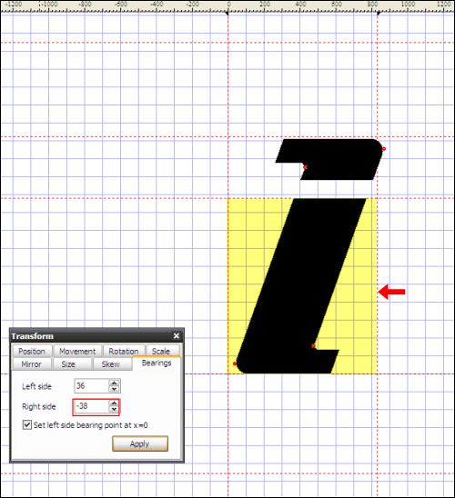
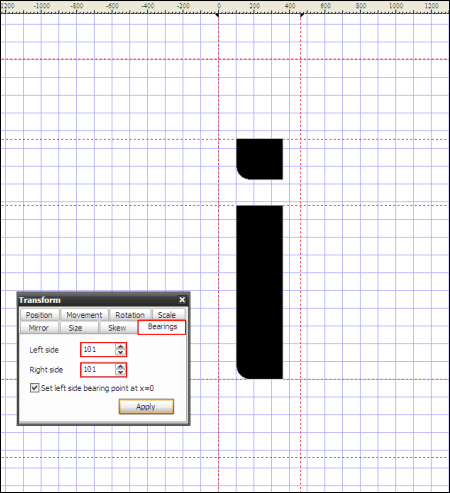
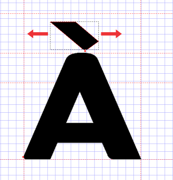
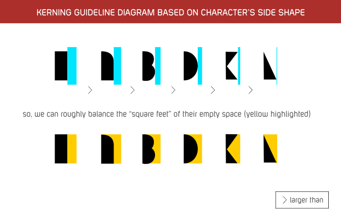
We need to do the kerning first, before we complete them.
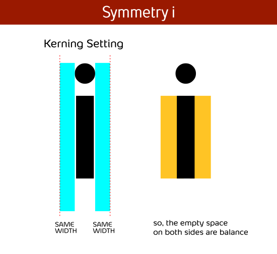

Posted Image

Large version here


To be continued.....

#42 Creativita

Creativita

    Member

  • Designer
  • 38 posts

Posted 14 August 2012 - 05:10 PM

Very helpful. Thanks for the effort :)

#43 morabira

morabira

  • Designer
  • 1008 posts

Posted 14 August 2012 - 05:44 PM

No problem Creativita...
Actually, this second part (working in High Logic), you all can read later...It is quite technical...
Just to show the process step by step by NKOTB.
Kind of boring hehehehe

Edited by morabira, 29 August 2012 - 10:16 PM.


#44 morabira

morabira

  • Designer
  • 1008 posts

Posted 16 August 2012 - 12:36 PM

First letter that we need to kern is an "i".
Different i shape need different style of kerning. Always remember...our target is to balance the "square feet" of empty space on both sides of our i.
Basically, we follow this style when kern the i....


Posted Image


Posted Image


Posted Image


to be continued...

Edited by morabira, 16 August 2012 - 12:40 PM.


#45 mohit

mohit

    Banned

  • Banned
  • 65 posts

Posted 21 August 2012 - 10:13 AM

just wow.......... hats off to you Mr. morabira just amazing things, this is why I am here.......... its lovely to get tips for you guys here hope to learn a lot from DC and its talented artists..... thanks for such a good tutorial.... keep them coming :)
Thanks & Regards
Mohit

#46 morabira

morabira

  • Designer
  • 1008 posts

Posted 22 August 2012 - 04:48 PM

Thanks Mohit...& you're welcome....You remind me of my favorite actor, Ajay Devgan...:)

Ok, continue...

Posted Image


Before we start the i kerning, set back our working place zoom factor to 25.00...Go to "Tools>Options>Glyph...(refer previous screenshot)


to be continued....

Edited by morabira, 23 August 2012 - 11:44 AM.


#47 morabira

morabira

  • Designer
  • 1008 posts

Posted 23 August 2012 - 05:54 PM

i kerning: style 1

Now, we're ready to kern our i.
Let say we decided to use 100% of i width for our i empty space.
In the case where our i is symmetry and the i dot is not wider than the i stem, we can simply select our i stem and check its width in the "transform box" (look in the size width section)...we can see it shows 266 in this sample (means, our i stem width is 266)

Posted Image


So, we set the kerning of our i by adjusting the "bearings" section of the transform box as shown below.
(Set both left side and right side bearing values to 266...make sure the small checkbox is ticked...apply/enter)


Posted Image


Go to "Font>Test" (or hit F5) to open the font test window...type ii there...We can see that the i is already kerned.


Posted Image


Close the "font test" and i windows as we are ready to kern our next character , the "o".

Edited by morabira, 26 August 2012 - 08:27 PM.


#48 morabira

morabira

  • Designer
  • 1008 posts

Posted 25 August 2012 - 03:43 AM

i kerning: style 2

Let say we decided to use 100% of i width for our i empty space...
For a case where our i is not symmetry and the i dot is wider than the i vertical stem, firstly, copy paste the i stem. (select it, ctrl-c, ctrl-v)


Posted Image


Then, draw a rectangle across the i stem by using the red highlighted tool (as shown below).


Posted Image


Select both i stem and the new rectangle. (use shift key)


Posted Image


Click the intersect tool (red highlighted). Now we can see the width of our i vertical stem in the transform box. Remember it.


Posted Image


Delete the small intersect rectangle.
Now, select our i dot to get its width. (red highlighted)


Posted Image


For sure we can calculate our left side bearing now...

Left Side Bearing = (i vertical stem width)-[((i dot width)-(i vertical stem width))/2]

For this sample:

Left Side Bearing = 240-[(275-240)/2] = 222.5 = 222 (just ignore the decimal value)

Put this value for our left side bearing, make sure the small checkbox is ticked...Enter(apply)


Posted Image


Drag the Right side bearing guideline (shown by arrow)...Remember, our target is to balance the i empty space. So, focus on the empty space.
The right side bearing value is adjusted automatically when we drag its guideline.


Posted Image


Go to "Font>Test" (or hit F5) to open the font test window...type ii there...We can see that our i is already kerned.


Posted Image


Close the "font test" and i windows as we are ready to kern our next character , the "o".


to be continued....

Edited by morabira, 26 August 2012 - 08:28 PM.


#49 morabira

morabira

  • Designer
  • 1008 posts

Posted 26 August 2012 - 09:02 PM

i kerning: style 3

Let say we decided to use about 100% of i width for our i empty space (between two i)...
In this case, our i is italic. We can see that initial bearing value for both left and right are 0 (as we set it earlier during the eps transfer).


Posted Image


We need to set the left bearing first. Select our i (including the dot), drag them while holding "shift" button (to maintain horizontal level).
Focus our eyes on the width of the left empty space (blue highlighted)...make it about same width of our i stem width. Just use our eyes, should be ok. We can see that the left side bearing value is automatically changed and set in the transform box.


Posted Image


Now we need to set the right side bearing.
Drag the Right side bearing guideline (shown by arrow)...Remember, our target is to balance the i empty space. So, focus on the empty space (yellow highlighted).
The right side bearing value is adjusted automatically when we drag its guideline.


Posted Image


Go to "Font>Test" (or hit F5) to open the font test window...type ii there...We can see that our i is already kerned.


Posted Image


Close the "font test" and i windows as we are ready to kern our next character , the "o".


to be continued....

Edited by morabira, 27 August 2012 - 02:44 PM.


#50 morabira

morabira

  • Designer
  • 1008 posts

Posted 27 August 2012 - 10:56 PM

Remember this diagram?
We should have known how to use it(refer previous explanation)...


Posted Image


to be continued....

Edited by morabira, 27 August 2012 - 11:08 PM.


#51 jjyepez

jjyepez

    Guru

  • Designer
  • 955 posts

Posted 27 August 2012 - 11:11 PM

Wow Mohd!
Huge work!
We all who follow this thread appreciate the effort!

Thanks!
Keep it up!
--
jjy

#52 morabira

morabira

  • Designer
  • 1008 posts

Posted 28 August 2012 - 10:00 AM

You're welcome Julio and all...


o kerning


Let say we use 101 value for our i left and right bearing:


Posted Image


Open the o window..Look at the kerning diagram, guess an appropriate value for our o bearings. (it seems about 40% of our i bearing).
So put that value for our o left and right side bearing (of course same value for both if our o is symmetry)...In this example, we put 39.


Posted Image


Go to "Font>Test" (or hit F5) to open the font test window...type oii there...type also oo...We can see that our o is already kerned. If we're not satisfied, go back to o windows, adjust the bearings value (add if we want the o empty space wider... reduce if we want the o kerning tighter...)...Then, check the font test again...


Posted Image


Close the "font test" and o window, done with the "o".
Continue completing the kerning for the rest small letters, capital letters, and other symbols.
When kerning the capital letter, begin with the letter "I" and then "O" (normally use a bit larger value than the small letters)...
but how much larger/wider the capital letter "I" kerning than small letter "i" ?...
Arial uses 137.2% wider...
Calibri uses 112.3% wider...
Futura uses 105.3% wider...
So, use our own eyes and discretion...Try it in font test preview, type it side by side with small letter/letters...

Edited by morabira, 28 August 2012 - 12:59 PM.


#53 morabira

morabira

  • Designer
  • 1008 posts

Posted 28 August 2012 - 10:52 AM

Some notes when do kerning...


1) When kern the "a" (after kerning the i and o), delete the double "o"(oo) in the font test preview...type in aii..and aa. Repeat this when kern the next character (means after kern the "a", remove the "aa" from font test preview).
So, we have sequence like this....
Why? We need to avoid the double letters from distracting our focus...


Posted Image


2) To insert symbols that are not available on keyboard into font test preview, use the previous attached document file (copy the symbol and paste it into font test preview)


3) Similar side shape means similar kerning value (bearing width).

It means, if the "d" have similar left side shape to the "o", its left side bearing value must be similar to the left side bearing value of the "o".

It also means, for "d" and "b" (if their shape are identical, just a flipped version of each other), they must have same bearing values but opposite in their values (b left bearing=d right bearing...vice versa).

etc....


4) If our Q tail is wider than the rounded part, we can do something like this to set its bearing/kerning:

Edited by morabira, 31 August 2012 - 12:33 AM.


#54 morabira

morabira

  • Designer
  • 1008 posts

Posted 29 August 2012 - 09:27 PM

Set the left bearing first, normally just use our "O" left kerning value. Apply/enter


Posted Image


Draw a rectangle so its width is from left side bearing guideline to edge of the Q left side rounded edge.
Zoom in if necessary.


Posted Image


Bring the rectangle to the Q right side rounded edge. Drag the right bearing guideline (shown by arrow).


Posted Image


Delete the rectangle. Done. We got almost identical left and right side empty space.
For sure, it is not exactly accurate as we just depend on our eyes. But it is ok.


Posted Image


If we want more accurate value...we can do this step in Coreldraw or AI by resizing the height of the whole design to a value that we use when importing our eps (use pixel or point as our workspace units in CorelDraw or AI). Then do some aligning, intesecting, trimming here and there to the "Q", to get the exact accurate value.

This situation can also occurred to letter "y" etc (depend on design)...

Edited by morabira, 30 August 2012 - 05:38 AM.


#55 Squewheet

Squewheet

    Junior Guru

  • Designer
  • 328 posts

Posted 29 August 2012 - 10:46 PM

For that program for producing the ai file into a font. Is it avaliabe on Mac's or is it just a windows only program.

#56 morabira

morabira

  • Designer
  • 1008 posts

Posted 29 August 2012 - 10:56 PM

High Logic program can be installed on Windows/pc only. For Mac user, you need to use other alternative program such as FontLab etc...

Edited by morabira, 29 August 2012 - 11:16 PM.


#57 morabira

morabira

  • Designer
  • 1008 posts

Posted 31 August 2012 - 05:13 PM

COMPLETING THE EMPTY GLYPHS....


1) Completing "Dotless i" glyph


Select "i" glyph. Go to "Edit>Copy" (or hit "ctrl C")


Posted Image


Select "Dotless i" glyph. Go to "Edit>Paste Special" (or hit "ctrl E"). On its popup box, tick the "glyph outline data" and "glyph metrics" checkbox (which means we're pasting the character including its kerning setting). Hit "OK". Our "i" will be pasted in the "Dotless i" glyph.


Posted Image


Double click the "Dotless i" glyph to open its window. Delete the dot. Done. No need to set the kerning because it is already kerned.
Type it also in font test preview to avoid mistake (just type it in between 2 "i"s, should be ok... no need to type the double letters after this for this glyph completing process).


Posted Image

Edited by morabira, 01 September 2012 - 02:51 AM.


#58 morabira

morabira

  • Designer
  • 1008 posts

Posted 01 September 2012 - 03:00 AM

2) Completing "Grave accent" glyph


Select "Acute accent" glyph. Go to "Edit>Copy" (or hit "ctrl C")


Posted Image


Select "Acute accent" glyph. Go to "Edit>Paste Special" (or hit "ctrl E"). On its popup box, tick the "glyph outline data" and "glyph metrics" checkbox. Hit "OK". Our "Acute accent" will be pasted in the "Grave accent" glyph.


Posted Image


Double click the "Grave accent" glyph to open its window. Select the shape. Click mirror tool (red highlighted) to mirror it horizontally. In the transform box, change the bearing order (left bearing becomes right bearing....vice versa)...by reinsert the values. If their value are same, ignore this step.
Type it also in font test preview to avoid mistake.


Posted Image

Edited by morabira, 01 September 2012 - 03:18 AM.


#59 morabira

morabira

  • Designer
  • 1008 posts

Posted 01 September 2012 - 03:21 AM

3) Completing all "letters with accent and cedilla" glyphs by using autocomplete.

For this glyphs completing , we will approach it section by section as shown below. Each continuous highlight represents one section. Mean, we have 10 sections.


Posted Image

Edited by morabira, 01 September 2012 - 08:35 PM.


#60 morabira

morabira

  • Designer
  • 1008 posts

Posted 01 September 2012 - 08:33 PM

section 1:

Select all them ('A grave' up to 'A ring'...use 'shift' key). Right click our mouse, select "complete composite".


Posted Image


All of that glyphs will be inserted/completed. We can see glyphs which are used in the autocomplete become red (their name)...it means they're linked to the autocomplete glyphs.


Posted Image


Open the completed glyphs windows one after another...to check for the accent location. If we're not satisfied, just move the accent manually (drag it while holding shift key...or we can use left or right arrow on keyboard). We can see they're already kerned...so no need for kerning setting.


Posted Image


After complete the checking, select them again. Hit "Make simple" tool. By doing this, we break their link (they become individual glyph...not linked to their accent component glyph, dierisis...grave etc). After we hit the "make simple" tool, we will see that the red tag for the dieresis etc be back to normal (green color)...
*note: in this sample below, it is still red as I haven't click the "make simple" tool yet.


Posted Image

Lastly, open the font test preview, type them in between the II like before to avoid any mistake.

Edited by morabira, 01 September 2012 - 09:41 PM.


Also tagged with one or more of these keywords: waterfalls

1 user(s) are reading this topic

0 members, 1 guests, 0 anonymous users