Jump to content

  • Free consultations and support
  • Live chatClick Here for Live Chat
  • Call ico 1888-906-1888
    Phone support: Open

    Ready for your call :)

    Our business hours:

    Mon — Fri, 2am — 8pm (EST)

    US & EU support teams

    Phone support: Closed

    We are back in: 1h 20m

    Our business hours:

    Mon — Fri, 2am — 8pm (EST)

    US & EU support teams


Cartoonish Font


  • Please log in to reply
&nsbp;

#1

  • Guests

Posted 29 December 2008 - 12:56 PM

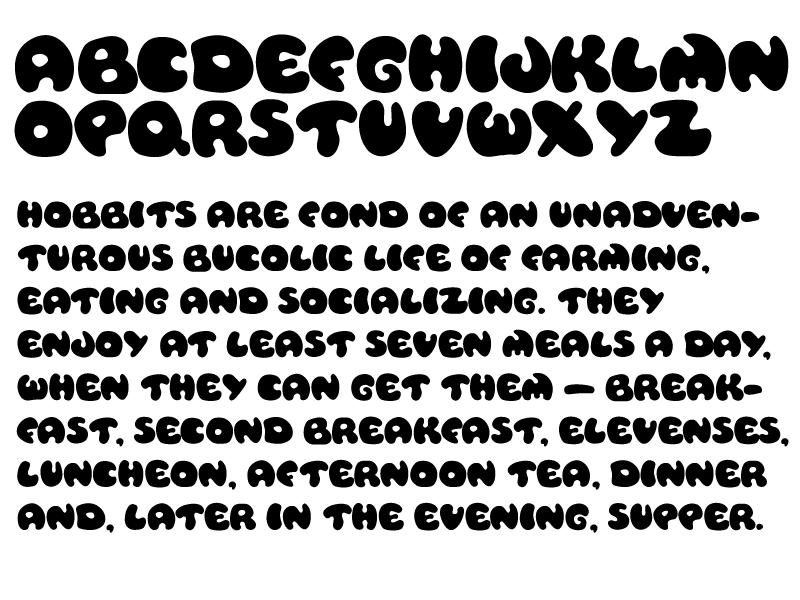
it's my first experience in font design. I would love to hear comments and constructive criticism from fellow designers.
As you can imagine this font can be used in titles and logos that need to have a "cartoonish look".
Posted Image

#2 KHDZN

KHDZN

    Junior Guru

  • Designer
  • 395 posts

Posted 29 December 2008 - 02:13 PM

The M & W are the only two letters that I am really struggling with. I don't care for their shapes in comparison to the other letters.

I also don't like the extreme thick and thin in the Y—it works in the X but the Y looks unbalanced. The X & Y are the only two letters with straight lines in them. Did you try adding a curvy line to one of the strokes in each of the letters like the rest?

Just my thoughts—I haven't worked on type design in years; hope my suggestions are helpful. Good job!

#3

  • Guests

Posted 29 December 2008 - 05:08 PM

KHDZN, yes, your comments are very helpful, thanks a lot! I've kind of had the same thoughts, especially about X and Y, but it's good to have them confirmed. I will try to collect some more feedback, have a short break from the font and after that I will rework some letters.

#4 Zpsy

Zpsy

    Apprentice Designer

  • Designer
  • 110 posts

Posted 29 December 2008 - 05:49 PM

From my point of view i think the letter F its to much rotated. its hard to recognize from distance. its looks more like C. First time i read the word FAST as CAST also F looks to close to A . try to make second line in F a bet longer like in E.
another letter is I i think its too thick it sould be like L and U .
Also i agree with KHDZN about X & Y.

I do like the other letters good work !
But i would like to see them more smaller.

#5

  • Guests

Posted 29 December 2008 - 06:32 PM

Zpsy, thanks for your feedback! I will post a sample with smaller letters later tonight.

#6 a9609067

a9609067

    Apprentice Designer

  • Designer
  • 17 posts

Posted 06 January 2009 - 05:08 AM

agree with the Y comments, but i think X is fine.
or perhaps just because there's no application of X as part of a word in the passage, i can't visualize whether or not it works out fine.
i love the Y alone, but he can't stand with other letters.

i think the W is good, but the relatively sharpe angle on the top right corner of M does not look cohesive with the overall style - the smooth, lovely bubble feeling.

For letter Z, i also expect to see its application. Right now, I can see the base is very heavy, not sure if it would look too heavy in a word. (Try it in different placement like zebra, zoo, emphasize, analysize, sizzle etc.)

Warm reminder: the limitation
Personally, I believe that this kind of cartoonish typeface doesn't work well when they look small as it will be hard to read. Well, still recognizable but it slows down the speed of reading. Good for title, but stay away from long sentences/paragraphs.

One reason I guess is because people are familiar with the default/traditional balancing of each letter (i.e. Times New Roman, Arial), so when you move the visual weight, we cant read it fast.

Edited by a9609067, 06 January 2009 - 05:17 AM.


#7

  • Guests

Posted 06 January 2009 - 07:11 PM

a9609067, Thanks a lot for your comment!
Now I think I am getting to the point when I feel I need to go back working on the font.

I talked to my graphic design professor at school and she thinks that lowar case characters won't hurt. So there is so much more work to do...

Thanks for the riminder, but I realize that and I mean this font for headlines and/or decoration. I wouldn't torture people by making them read whole texts typed in this font.

Thanks again for your helpful comment. I will offer you a license for the font when it is finished :)

#8 awhipl

awhipl

    Member

  • Designer
  • 62 posts

Posted 07 January 2009 - 10:05 PM

Hey resurepus,

I certainly think having lowercase options would help. The font is very big, big and fun, which I like but at the same time a solid row of big/fun letters can be overwhelming. I think lowercase will help the eye move more easily over words and sentences.

I also agree with KHDZN in reference to the 'M.' I think the shape of the top, right section should be made a bit smaller. The horn works with the N, but almost breaks the flow of the M because the viewer follows that horn instead of finishing down the last leg of the M.

Overall I really like the font. I always like fonts that have character and feel to them, this one certainly does. Let me know if anything I said was confusing, I tend to have a weird way of looking at fonts. :p

-Adam

#9

  • Guests

Posted 22 January 2009 - 08:52 PM

Hi, guys! Thanks for all of your comments! Finally I have added the lower case, so please, comment on it too. I have changed some of the letters in upper case too, but I am sure there are more things to be done about this font. So, please, critique!
Posted Image

#10 awhipl

awhipl

    Member

  • Designer
  • 62 posts

Posted 22 January 2009 - 09:57 PM

I definitely like the changes. The only things that look a little weird to me are the lowercase a, u and v.

a- i feel like a slight curve to the tail would help its shape.
u- i think the bottom indentation could be moved to the right a bit to help its shape.
v- i think the right tip should be less curved?

I'm not sure if these would actually improve the characters, but that's just my initial impression. I really like the font and especially like the speech you chose to display it :p
#11

  • Guests

Posted 23 January 2009 - 09:18 PM

I definitely like the changes. The only things that look a little weird to me are the lowercase a, u and v.

a- i feel like a slight curve to the tail would help its shape.
u- i think the bottom indentation could be moved to the right a bit to help its shape.
v- i think the right tip should be less curved?

I'm not sure if these would actually improve the characters, but that's just my initial impression. I really like the font and especially like the speech you chose to display it :p

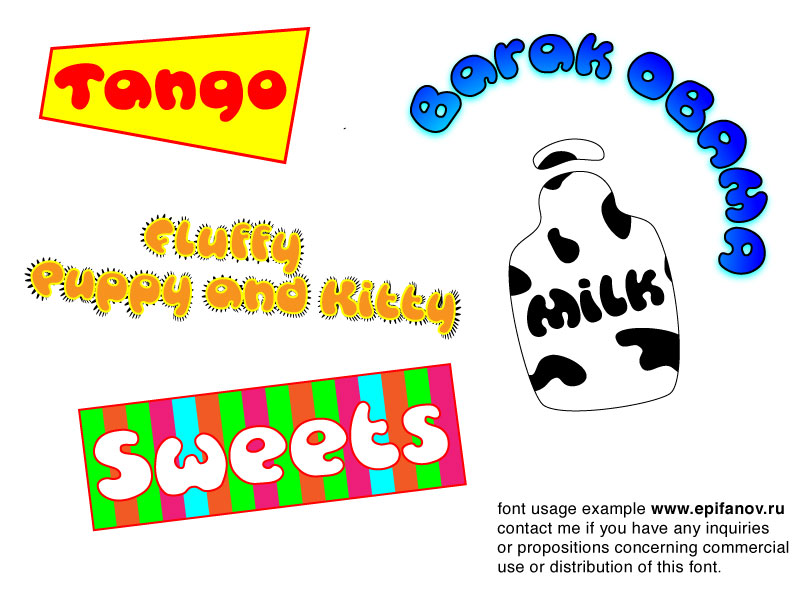
Thanks for your comment! I will defintely play with the letters more. Meanwhile here's an example of possible font usage. You do understand that it's a kind of joke about Obama, right :)

Posted Image

#12 awhipl

awhipl

    Member

  • Designer
  • 62 posts

Posted 23 January 2009 - 11:47 PM

Thanks for your comment! I will defintely play with the letters more. Meanwhile here's an example of possible font usage. You do understand that it's a kind of joke about Obama, right :)


yes :p

hence the ":P"

#13 DreamSky

DreamSky

    Senior Member

  • Designer
  • 132 posts

Posted 27 January 2009 - 12:23 PM

Overall I really like it.

Still, I think that currently the lower case "v" looks too much like an "u". May be sharpening just a little bit its bottom (like on the upper case V) would help.

Good start!

#14 Louise

Louise

    Apprentice Designer

  • Designer
  • 3 posts

Posted 27 January 2009 - 01:59 PM

Hi there

overall i think your typeface is really rather legible for a comic style! well done. i like the addition of the lowercase, but am unsure about the v. it could do with being slightly wider perhaps with a pointier bottom!

i can definitely see usage in it. are you planning to sell or is it just a project?

#15

  • Guests

Posted 28 January 2009 - 09:50 PM

Thanks, guys! yes, I will work more on the "v".


0 user(s) are reading this topic

0 members, 0 guests, 0 anonymous users