
Dang, I'm stumped...
The client doesn't like any of my other ideas (see link). She insists on using a stone (a whetstone, to be specific) in the logo. She wanted to use a photo but I told her that was no good, so she wants me to make a graphic stone but they always come out looking stupid and cheesy. I played with some stone-like ideas but haven't found anything that works.
Whetstone Logo Concept Proofs
Ideas? suggestions?
Maybe I should stick to photography.
Blah.
(thanks!)
Whetstone Instructional Support Logo
Dang, I'm stumped... The client doesn't like any of my other ideas (see link). She insists on...
&nsbp;
#2

Deathdart
-

- Designer
- 140 posts
Senior Member
Posted 04 June 2009 - 04:32 AM
Try explaining to your clients that a logo need not represent the name of the company graphically, but what they stand for. Use examples such as Google (googol), Orange, Saffron, etc. Maybe then you'll get some creative freedom?
#3
.:FMD
-

- Designer
- 188 posts
Senior Member
Posted 04 June 2009 - 05:08 AM
Dang, I'm stumped...
The client doesn't like any of my other ideas (see link). She insists on using a stone (a whetstone, to be specific) in the logo. She wanted to use a photo but I told her that was no good, so she wants me to make a graphic stone but they always come out looking stupid and cheesy. I played with some stone-like ideas but haven't found anything that works.
Whetstone Logo Concept Proofs
Ideas? suggestions?
Maybe I should stick to photography.
Blah.
(thanks!)
What exactly is the company? Whetstone (pronounced wheat or wet) Instructional support? What do they do? Cant really help you if we dont know what the company is about.
And Deathdart as for your comment about what the logo not need to represent the name, that is not entirely true. There are companies out there that thier logo represents both thier name and what they do. You said google...well when you look at the google logo what do you think it represents? I see a logo with a fun name and very colorful to represent this product that can be fun as well as business with the serif type face. I bet they used the different colors to maybe show the variety of what google brings?
#4
jtwant
-

- Designer
- 50 posts
Apprentice Designer
Posted 04 June 2009 - 06:43 PM
The company (Whetstone pronounced "wet-stone") provides services for homeschooling families and small private schools who lack resources. They provide "instructional support" which means they will independently teach courses specific to the needs of their clients - typically their courses deal with classical literature, writing, logic, etc...
I hope that's clear. They're going for the classical/refined look...
Thanks!
-josh
P.S.
Deathdart:
Though it's true to say that the logo needn't necessarily graphically represent the NAME of the business but it should give some feel for what the business is all about. Making that connection is an important part of branding. Don't you think? Still, you're right - that doesn't mean we need to put a stone in the logo. That's just bad art.... right?
#6
jtwant
-
- Designer
- 50 posts
Apprentice Designer
Posted 04 June 2009 - 08:10 PM
Here's a quote from an email correspondance from my client...
I've gotten very little feedback. I'll need to spend more time sketching this up on paper, I think....
For a look, I'd say something classy, whatever that means. =) My business is classical education. So I want something simple, elegant, understated. Old is good.
My website has stock photos but it could give you an idea of what I chose there (not the colors particularly, but the photos and the style). An international look is good, especially something from Greece, Rome, or England, or maybe Byzantine?
I don't know about other logos I like...
I've gotten very little feedback. I'll need to spend more time sketching this up on paper, I think....
#7
.:FMD
-
- Designer
- 188 posts
Senior Member
Posted 04 June 2009 - 08:46 PM
Here's a quote from an email correspondance from my client...
I've gotten very little feedback. I'll need to spend more time sketching this up on paper, I think....
You should be looking at classical greek or roman architecture and trying to come up with something along those lines. That is what the client wants and you should give what the client wants especially if you want more business from them.
#8
jtwant
-
- Designer
- 50 posts
Apprentice Designer
Posted 04 June 2009 - 09:29 PM
You should be looking at classical greek or roman architecture and trying to come up with something along those lines. That is what the client wants and you should give what the client wants especially if you want more business from them.
Abrupt but poigniant.
Thanks!

#10
Coy
-

- Designer
- 2534 posts
Elite Designer
Posted 04 June 2009 - 11:50 PM
this is what I think of when someone says 'wet stone'
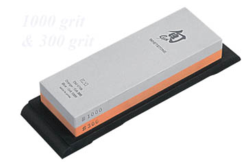
but google gives other pictures like a stone that is wet.
maybe web 2.0 a greek type colom? lol
I also google whetstone and the first image is a worn or weathered stone. http://images.google...etstone&spell=1
So maybe an elegant weathered look of some sort.. This is a tuff one and really hasn't given you much direction it sounds like.
OK one more edit LOL: just read their tag line "as iron sharpens iron" googled it but not much help there. But made me think of making something stone w/iron around or a part of it.?
Edited by Coy, 04 June 2009 - 11:56 PM.
#12
Deathdart
-
- Designer
- 140 posts
Senior Member
Posted 06 June 2009 - 04:44 AM
@jtwant and FMD:
That's exactly what I said rephrased in your own words.... :| You don't need to represent the NAME of the company, but rather what they STAND FOR; their principles etc.
I know there are companies that successfully use the graphic form of their name in the logo (Apple for example), but that's not necessary to make a good logo. Nike, possibly the most successful logo of all time, does not have a Greek goddess for their symbol as in their name...
So what I suggest is trying not to limit yourself to using a STONE for the logo, try an abstract representation of what the company does, what their values are, in a way that it doesn't follow any current trends that will die out in a few years to give longevity to the logo. Also keep in mind the target audience and the competition that this logo will face, you need to stand out and be memorable.
#13
smack
-

- Designer
- 99 posts
Senior Member
Posted 11 June 2009 - 06:33 AM
You mentioned they wanted classic styling and an actual image of a whetstone. Image searches for whetstone produce basically rectangular blocks (not very interesting). I did an image search for "ancient whetstone" and found this image. Could be worth exploring and it's visually more interesting than a rectangle.


0 user(s) are reading this topic
0 members, 0 guests, 0 anonymous users
