BUt ive kinda hit a wall with the direction i want to take and stuff..
So im looking for some suggestions and ideas of any sort!
http://i298.photobuc...9/Kusa_Logo.jpg


Ready for your call :)
Mon — Fri, 2am — 8pm (EST)
US & EU support teams
We are back in: 1h 20m
Mon — Fri, 2am — 8pm (EST)
US & EU support teams
Junior Member

Posted 06 October 2009 - 09:03 PM
Elite Designer
Posted 06 October 2009 - 10:48 PM
Apprentice Designer

Posted 07 October 2009 - 05:19 PM
Junior Member
Posted 08 October 2009 - 08:04 AM

Member

Posted 08 October 2009 - 09:48 PM
Elite Designer
Posted 15 October 2009 - 04:10 PM
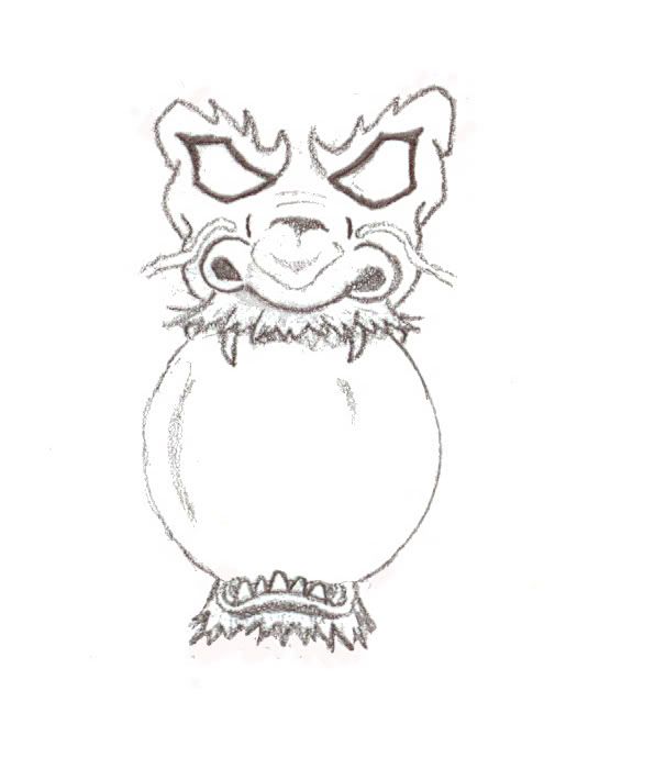
i guess that should be a kind of a sport logo, right?
is that's the case, i would rather put the ball in dragon's claws.
this way, head looks a bit strange a not effective as it could be.
Elite Designer
Posted 15 October 2009 - 10:53 PM
I think it looks weerd
Junior Member
Posted 16 October 2009 - 10:26 AM
 lol
lolSenior Member

Posted 16 October 2009 - 01:43 PM


Junior Member
Posted 28 October 2009 - 09:48 PM
Apprentice Designer
Posted 31 October 2009 - 07:22 AM
So I have sketched up this logo.. i dont know what im gonna use it for yet.. lol
BUt ive kinda hit a wall with the direction i want to take and stuff..
So im looking for some suggestions and ideas of any sort!
http://i298.photobuc...9/Kusa_Logo.jpg
Junior Member

Posted 02 December 2009 - 05:17 AM


0 members, 0 guests, 0 anonymous users


