Jump to content

  • Free consultations and support
  • Live chatClick Here for Live Chat
  • Call ico 1888-906-1888
    Phone support: Open

    Ready for your call :)

    Our business hours:

    Mon — Fri, 2am — 8pm (EST)

    US & EU support teams

    Phone support: Closed

    We are back in: 1h 20m

    Our business hours:

    Mon — Fri, 2am — 8pm (EST)

    US & EU support teams


Still tweaking Logo


  • Please log in to reply
&nsbp;

#1 Ghastly

Ghastly

    Member

  • Designer
  • 30 posts

Posted 06 May 2007 - 03:50 AM

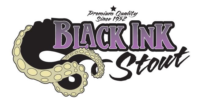
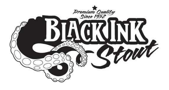
This is a work in progress...please any feedback is appreciated
Posted Image
-
Posted Image

#2 Ghastly

Ghastly

    Member

  • Designer
  • 30 posts

Posted 06 May 2007 - 06:10 AM

Posted Image

#3 LionGraphics

LionGraphics

    Junior Member

  • Designer
  • 22 posts

Posted 23 May 2007 - 05:38 AM

Oooh, what a fun logo! Did you try making the words "Black Ink" a little larger compared to the tentacles (and more to the left; like more nestled into the tentacles); maybe starting the "S" as a connected piece of that last swirl of the tentacle.

Looks good, though -- I'd drink it! :)

#4 Beaude

Beaude

    Apprentice Designer

  • Designer
  • 32 posts

Posted 25 May 2007 - 01:07 PM

thats great! Love the combination of purple and black. Where do you use the logo for?

#5 2ndFloorDesign

2ndFloorDesign

    Junior Member

  • Designer
  • 28 posts

Posted 20 October 2008 - 03:56 AM

Nice start. I'd consider dropping the stout font, and using the same "black ink" font all around. Also, the premium quality info on the top is real small, can you make it larger, possiblly all on one line?
It's a fun start though, I like the tenticle, and it flows real nice in to the black ink words.:)

#6 Chung Dha

Chung Dha

    Guru

  • Designer
  • 1439 posts

Posted 21 October 2008 - 11:34 AM

The white outline around black in will disappear when it is resized small. I don't know how big his logo would be used because when is will be resized smaller allot of details and things will disappear because they are very thin or small. You need to ask the costumer what the normal sizes are that they will be using and do a few print out and check if everything is still there in your design and if everything is readable. On a screen is often easy to resize see the logo in big and small but the best is see how it works when it is printed on a piece of paper.

#7 blakeissuarez

blakeissuarez

    Apprentice Designer

  • Designer
  • 26 posts

Posted 29 October 2008 - 12:06 AM

maybe try adding some sort of inky texture to the tentacles. The stroke is too solid and clean.

#8 EdwardRuvalcaba

EdwardRuvalcaba

    Apprentice Designer

  • Designer
  • 13 posts

Posted 15 January 2009 - 08:24 PM

i like it try putting the whole octupus in or ink splatter

#9 jecrt

jecrt

    Junior Guru

  • Designer
  • 432 posts

Posted 15 January 2009 - 09:42 PM

I like this a lot! I think some of the suggestions would make it even better. I like the secondary font for stout - but what if you move Stout in tighter to the left? Also - what about making the "suckers" on the tentacle (is that even what they're called?? I don't know) black and the tentacle part a lighter shade of the purple you used in the type? I think that would tie the two together better. It looks great, though!

ooh - I like the black ink splatter idea, too! You could put that behind the tentacle on the left side to beef up that thin line...just a thought.

Edited by jecrt, 15 January 2009 - 09:44 PM.


#10 Ghastly

Ghastly

    Member

  • Designer
  • 30 posts

Posted 16 January 2009 - 02:25 AM

Those are good ideas ! I mentioned up above in another post Im in Portfolio class this semester and Im re-visiting some projects. This is one of them so thanks for the feedback Ill post some updates soon.

#11 AuDesign

AuDesign

    Apprentice Designer

  • Designer
  • 10 posts

Posted 20 January 2009 - 12:08 AM

Wow! This is a very cool logo. Great job!

#12 DanielDesign

DanielDesign

    Apprentice Designer

  • Designer
  • 34 posts

Posted 20 January 2009 - 12:36 AM

Nice! what if you made the stout an Ink Splattered font? Oh wow this is kind of an old project. Oh well I already typed it and my delete button is too far for my finger to reach.

#13 bgaff

bgaff

    Apprentice Designer

  • Designer
  • 10 posts

Posted 20 January 2009 - 01:52 AM

I really like this, but I wonder about the stout font as well....It's the only thing I can see throwing everything off..


0 user(s) are reading this topic

0 members, 0 guests, 0 anonymous users