Jump to content

  • Free consultations and support
  • Live chatClick Here for Live Chat
  • Call ico 1888-906-1888
    Phone support: Open

    Ready for your call :)

    Our business hours:

    Mon — Fri, 2am — 8pm (EST)

    US & EU support teams

    Phone support: Closed

    We are back in: 1h 20m

    Our business hours:

    Mon — Fri, 2am — 8pm (EST)

    US & EU support teams


work from sketch


  • Please log in to reply
&nsbp;

#1 anjelik

anjelik

    Apprentice Designer

  • Designer
  • 44 posts

Posted 24 April 2008 - 06:54 AM

i was drawing with my son,then some idea come to me,i just continue drawing,here is outcome,try to do something more from it,its just work for myself,it can be like a card for Mothers day,or so..
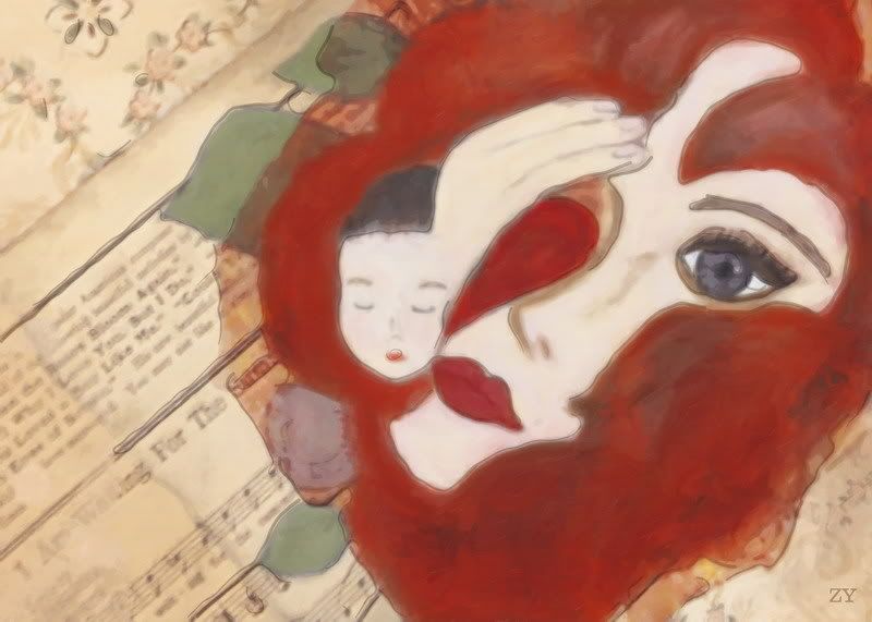
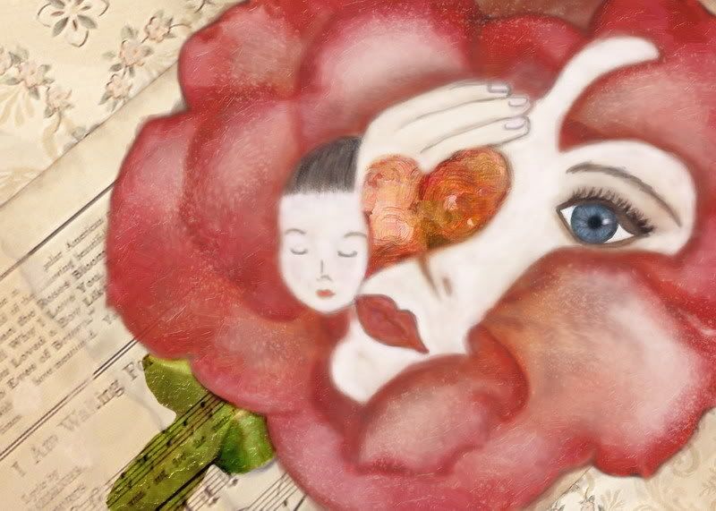
not completely finished yet,

any comments are welcome:
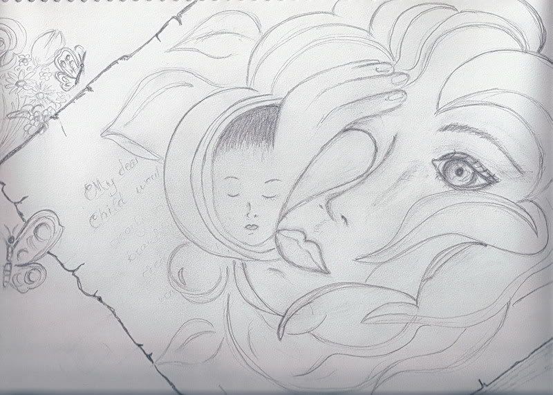
Posted Image

original sketch:
Posted Image

#2 DreamSky

DreamSky

    Senior Member

  • Designer
  • 132 posts

Posted 24 April 2008 - 07:35 AM

I love the original sketch! It is really nice and could become a card for the Mothers day indeed. Very gentle and very appealing.

About the next two - they are nice but I guess they are just not my style... The red reminds me of blood too much and casts a gloom on me (but that may be just my mixed-up mind :o )

#3 anjelik

anjelik

    Apprentice Designer

  • Designer
  • 44 posts

Posted 24 April 2008 - 07:50 AM

I love the original sketch! It is really nice and could become a card for the Mothers day indeed. Very gentle and very appealing.

About the next two - they are nice but I guess they are just not my style... The red reminds me of blood too much and casts a gloom on me (but that may be just my mixed-up mind :o )


you are right red is too much,i wanted to be like a flower her hair,red rose,but the colour is too deep,i was thinking just to make hair,or,maybe i will change the colour to pink,still thinking how to finish it

here some retouch and adjusting colours,but still working on it:
Posted Image

#4 ambitiongirl

ambitiongirl

    Apprentice Designer

  • Designer
  • 10 posts

Posted 16 June 2008 - 10:09 PM

i think it's fantastic. it most certainly looks like a red flower now. my only observation is that the left side of the boy's face doesn't have enough delineation—it's a little blurred into the flower.

#5 Winter artwork

Winter artwork

    Senior Member

  • Designer
  • 105 posts

Posted 17 June 2008 - 03:13 PM

I like the first colored version better but I can see how it can be view as a little morbid

#6 vdubdesign

vdubdesign

    Apprentice Designer

  • Designer
  • 11 posts

Posted 18 June 2008 - 03:28 AM

I think you have made some great progress. I use to hate it when my art professor told me to push it a little bit more (this after 20 some odd hours of what felt like hard labor).

... but that is exactly what I think you need to do here. I think some subtle textures incorporated in the flower petals would bring more depth to your image.

I think the music sheet in the back is a cool idea.

#7 Chung Dha

Chung Dha

    Guru

  • Designer
  • 1439 posts

Posted 20 June 2008 - 11:32 PM

Nice work looks very good.


0 user(s) are reading this topic

0 members, 0 guests, 0 anonymous users