Jump to content

  • Free consultations and support
  • Live chatClick Here for Live Chat
  • Call ico 1888-906-1888
    Phone support: Open

    Ready for your call :)

    Our business hours:

    Mon — Fri, 2am — 8pm (EST)

    US & EU support teams

    Phone support: Closed

    We are back in: 1h 20m

    Our business hours:

    Mon — Fri, 2am — 8pm (EST)

    US & EU support teams


Walmart logo


  • This topic is locked This topic is locked
&nsbp;

#1 NancyCarter

NancyCarter

    Elite Designer

  • Designer
  • 827 posts

Posted 02 July 2008 - 02:45 PM

http://www.undercons...rst_for_wal.php

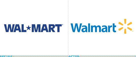
Posted Image

"How can something be so bland and so nauseating at the same time?" (quoted from reader of BrandNew)
Blessings,
Nancy

www.NancyCarterDesign.com

#2 JNT86

JNT86

    Apprentice Designer

  • Designer
  • 32 posts

Posted 02 July 2008 - 06:58 PM

well i say that grocery store logos should be bland, especially wal mart. it's all things to all people so the logo needs to be as neutral as possible. its got the very trendy 2.0 look tho. i think it will be changed again within 7-8 years as it will become dated very soon. i like the way they imply a star with an apostrophy.

#3 Winter artwork

Winter artwork

    Senior Member

  • Designer
  • 105 posts

Posted 03 July 2008 - 09:08 PM

lol @ the rendering...is that a super market or an out house?


it's clean, bland and oh so "corporate" VERY Wal*Mart...oops...I meant Walmart :D

#4 atondex

atondex

    Senior Member

  • Designer
  • 247 posts

Posted 07 July 2008 - 10:39 AM

It sems like web 2.0 style has made the jump from...well...web, to... reality ?

Looks like a social networking site logo, LOL.

#5 cthistle

cthistle

    Apprentice Designer

  • Designer
  • 16 posts

Posted 07 July 2008 - 12:36 PM

it looks a lot better than their lonestar logo.... little to texasesque for me. They new one seems more.. friendly, if you will

#6 KHDZN

KHDZN

    Junior Guru

  • Designer
  • 395 posts

Posted 08 July 2008 - 10:10 PM

The colors are better this time around. The original logo looked very generic; the new colors give the logo a little personality -- for Walmart at least. :D

#7 Pilar_Robledo

Pilar_Robledo

    Apprentice Designer

  • Designer
  • 12 posts

Posted 08 July 2008 - 10:29 PM

Hi! I like de colours used on the new logo. Also it looks more friendly when i see it a I want to go to Walmart! jeje

#8 bschall23

bschall23

    Apprentice Designer

  • Designer
  • 29 posts

Posted 09 July 2008 - 01:37 PM

Atleast Target's logo makes sense. What's this supposed to be, a light burst or something?

#9 Winter artwork

Winter artwork

    Senior Member

  • Designer
  • 105 posts

Posted 09 July 2008 - 01:49 PM

^^I think it's another version of the star from their previous logo

#10 Tuoni

Tuoni

    Apprentice Designer

  • Designer
  • 5 posts

Posted 12 July 2008 - 11:55 PM

Modernizing an old logo that is so well known as wall marts is allways going to be a shock to a lot of people because they are so used to the old one.

But I think they made the right decision in changing it early in stead of waiting untill even more people are even more used to it, and waiting for it to be totally out dated.

This shows they are folowing up things quickly, updating and modernizing where they can.

#11 JNT86

JNT86

    Apprentice Designer

  • Designer
  • 32 posts

Posted 25 July 2008 - 11:01 PM

they are trying to re-vamp their image to be more socially concious and/or green. not that they actually are, its all just bs like when they sold the "made in usa" stuff that was made in china. no logo is an island.

#12 ghbarratt

ghbarratt

    Apprentice Designer

  • Designer
  • 8 posts

Posted 29 July 2008 - 05:17 AM

Well I agree that de-star-hyphenating their logotype was a wise move.

It's like the word email. I am sure some people would still argue that it is "e-mail" and not "email." I would argue that "e-mail" made sense when traditional "mail" was more commonly used than "e-mail" but now that email is so normal for people, it makes sense that it no longer be an abbreviation of "electronic mail." It makes sense that email (has) evolve(d) to become something a little more independent "email" of its relative, the traditional post mail.

I see "Wal-Mart" or "Wal*Mart" putting a lot of emphasis on Sam Walton (or his family) as was obviously first intended. But since the company has grown, and Sam has been gone for almost 2 decades, the time has come to make the next evolution of the logotype. An evolution similar to "email" which makes it just a tad more individual. It's not really Mr. Walton's mart. I am not sure if it is even a true "mart" ... but I do know what a Walmart is. It is something that we all know due to the fact that we are all consumers.

As for the burst or star or whatever, well I guess it is as good as anything they could have used. An icon is really useful at times, (as I am sure all you designers know,) so what icon could Walmart use? I mean they sell everything so it is hard show a product-oriented logo. They wanted it to be simple and recognizable I am sure, but not associable to anything or anyone else. The smiley face was good for price cards and name tags, but probably not as great for a logo icon and it is something that Walmart can could never claim as their own.

Anyways thats my two bits.

#13 magneto-ms

magneto-ms

    Elite Designer

  • Designer
  • 31 posts

Posted 11 August 2008 - 06:24 AM

Yes I understand the reason for the change, but still feel the new logo isn't powerful enough.

#14 Waqqas

Waqqas

    Apprentice Designer

  • Designer
  • 14 posts

Posted 17 November 2009 - 03:34 AM

[ghbarratt] What you've said is right.
But I have a feeling that the asterisk is disproportionately large as compared the logo overall. They could have used a normal-size asterisk. Or better yet, one/three small stars at the end of Walmart. Three --> to imply growth since the last logo was designed.
:)

#15 sharie

sharie

    Admin

  • Administrators
  • 21753 posts

Posted 17 November 2009 - 07:49 AM

I always wondered why they never used the smilely ball, they use it all the time for roll backs and such, just seems the smilely ball would be fitting for wal mart logo

Like us on facebook


#16 Coy

Coy

    Elite Designer

  • Designer
  • 2534 posts

Posted 17 November 2009 - 06:32 PM

I always wondered why they never used the smilely ball, they use it all the time for roll backs and such, just seems the smilely ball would be fitting for wal mart logo


I think it's cause the smiley ball is really kinda Generic if you will. I mean it's been on just about everything so it really couldn't be copywrited or trademarked.

#17 Geko

Geko

    Member

  • Designer
  • 77 posts

Posted 18 November 2009 - 12:13 AM

I liked this one, I does look too web2.0 but i t works at the store advertising. I feel it more friendly

#18 chrisharis

chrisharis

    Apprentice Designer

  • Designer
  • 7 posts

Posted 20 November 2009 - 11:04 AM

Looks clean and neat IMO

#19 Concussion

Concussion

    Apprentice Designer

  • Designer
  • 14 posts

Posted 22 November 2009 - 02:56 AM

I don't think the old logo was very good from a design standpoint, but some brands are so familiar that a change doesnt make sense unless done carefully. In this case, the clunky Texas star seemed to fit Walmart, and the new logo/identity is just generic. Not that the old wordmark was so iconic that the board would never approve a redesign (think Ford or GE or IBM), but it was immediately familiar to nearly everyone in the US. Also, the asterisk/sunburst is not something that could stand on its own and immediately bring to mind "Walmart". That is like claiming a question mark or tilde as your logo and expecting people to differentiate your brand. Although, Barry Bonds may have been able to pull of the asterisk as a personal logo...

#20 brandyarnold

brandyarnold

    Guru

  • Designer
  • 792 posts

Posted 04 December 2009 - 10:34 PM

there's an idea for a new community contest... redesign the Walmart (Wal-Mart, Wal*Mart?) logo!


0 user(s) are reading this topic

0 members, 0 guests, 0 anonymous users