Jump to content

  • Free consultations and support
  • Live chatClick Here for Live Chat
  • Call ico 1888-906-1888
    Phone support: Open

    Ready for your call :)

    Our business hours:

    Mon — Fri, 2am — 8pm (EST)

    US & EU support teams

    Phone support: Closed

    We are back in: 1h 20m

    Our business hours:

    Mon — Fri, 2am — 8pm (EST)

    US & EU support teams


Logo Design


  • Please log in to reply
&nsbp;

#1 GRAF1CS

GRAF1CS

    Apprentice Designer

  • Designer
  • 26 posts

Posted 06 December 2008 - 10:39 PM

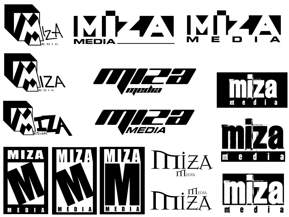
Something Im working on at the moment, if you could reply on what you think works the best or what doesn't that would be heplfull.

Thanks.....cnc appreciated!
Posted Image

#2 Chung Dha

Chung Dha

    Guru

  • Designer
  • 1439 posts

Posted 07 December 2008 - 12:34 AM

At the moment it is very typographic don't they want a more illustrative logo. Or is this really what they want?

#3 GRAF1CS

GRAF1CS

    Apprentice Designer

  • Designer
  • 26 posts

Posted 07 December 2008 - 01:09 AM

They are particularly looking for a typographic logo, they do not wish for there to be any kind of icon or pic in the logo, only type based.

Guess it would have helped to tell you that.

#4 NancyCarter

NancyCarter

    Elite Designer

  • Designer
  • 827 posts

Posted 08 December 2008 - 09:45 PM

I like your work here -- I like that you are working in black and white. I think that it's often a typographical solution is a good idea when the company name is not a common word. Keeps the focus on the name.

I did immediately think of this logo when I saw your similar designs:

Posted Image

They are particularly looking for a typographic logo, they do not wish for there to be any kind of icon or pic in the logo, only type based.

Guess it would have helped to tell you that.


Blessings,
Nancy

www.NancyCarterDesign.com

#5 Chung Dha

Chung Dha

    Guru

  • Designer
  • 1439 posts

Posted 08 December 2008 - 10:50 PM

actually all looks like existing logo's. Just don't want to search them all together. Tip for you don't use any fonts if you need to make an typographic logo. Write and design the font yourself. At the moment you get inspired too much by existing logo's.

#6 GRAF1CS

GRAF1CS

    Apprentice Designer

  • Designer
  • 26 posts

Posted 09 December 2008 - 12:16 AM

Thanks for the replys, and yes i was inspired by the mature content logo for that one style logo, as far as most the others they were just playin with fonts and typography, which is what they are looking for. I'm troubled with this though not have much inspiration I guess. Waiting to hear back from them on what they are interested in or for more ideas to follow through on.

#7 EdwardRuvalcaba

EdwardRuvalcaba

    Apprentice Designer

  • Designer
  • 13 posts

Posted 15 January 2009 - 08:11 PM

try working with the 2 m's

#8 AuDesign

AuDesign

    Apprentice Designer

  • Designer
  • 10 posts

Posted 19 January 2009 - 11:16 PM

I agree with NancyCarter... Avoid "borrowing" from popular icons (like the esrb rating). This company specializes in an anime... Research their market and you will find your inspiration. Maybe incorporate "robotech" mechanical styling into the font. Good luck!


0 user(s) are reading this topic

0 members, 0 guests, 0 anonymous users