Jump to content

  • Free consultations and support
  • Live chatClick Here for Live Chat
  • Call ico 1888-906-1888
    Phone support: Open

    Ready for your call :)

    Our business hours:

    Mon — Fri, 2am — 8pm (EST)

    US & EU support teams

    Phone support: Closed

    We are back in: 1h 20m

    Our business hours:

    Mon — Fri, 2am — 8pm (EST)

    US & EU support teams


Sports Team logo..


  • Please log in to reply
&nsbp;

#1 Winter artwork

Winter artwork

    Senior Member

  • Designer
  • 105 posts

Posted 23 April 2009 - 12:34 AM

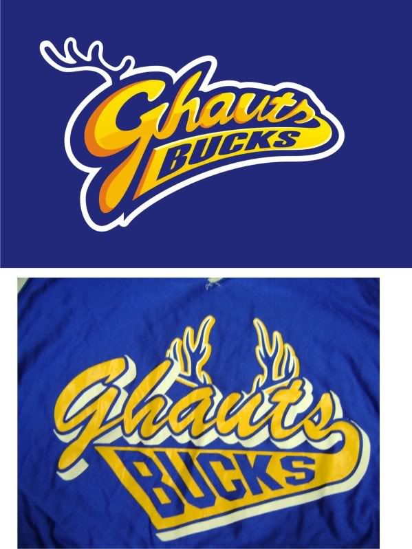
opinions needed :)

it's a reworking of the original (bottom)
Posted Image

#2 eienblue25

eienblue25

    Apprentice Designer

  • Designer
  • 28 posts

Posted 24 April 2009 - 01:32 PM

I love it.. it's awesome

#3 xValentynex

xValentynex

    Member

  • Designer
  • 47 posts

Posted 24 April 2009 - 02:21 PM

I like it a lot

Edited by xValentynex, 24 April 2009 - 02:23 PM.


#4 baiskee

baiskee

    Elite Designer

  • Designer
  • 915 posts

Posted 24 April 2009 - 04:21 PM

Better than the old one I must say.

Nice work. ;)
LOGOWORX

“Do not spoil what you have by desiring what you don't have; rather remember that what you have now was once among the things you only hoped for.”

#5 KHDZN

KHDZN

    Junior Guru

  • Designer
  • 395 posts

Posted 24 April 2009 - 07:50 PM

Nice!

#6 Guest_Gerhard Schlee_*

Guest_Gerhard Schlee_*
  • Guests

Posted 25 April 2009 - 01:47 PM

You can really call it an evolution! It is better than the old one in every single aspect! You could also try to shape the upper part of the "G" like a deer head, so it could interact better with the horns. It would probably make it too detailed and lose definition in small sizes, but you could give it a try... Not that the actual version is not appropriated, much on the contrary!

#7 andy kurovets

andy kurovets

    Apprentice Designer

  • Designer
  • 12 posts

Posted 16 December 2009 - 08:11 AM

Looks great!

#8 brandyarnold

brandyarnold

    Guru

  • Designer
  • 792 posts

Posted 24 December 2009 - 01:08 AM

Hi Winter, your new version of the logo is better than the old by leaps and bounds, it's updated, current, attractive... better in every way. And yet, still recognizable as the same team. Awesome job!
:) Brandy

#9 glyphica

glyphica

    Member

  • Designer
  • 64 posts

Posted 24 December 2009 - 09:23 AM

I agree, it's much more modern, but still maintains the recognition as an evolution of the previous logo. Just a couple suggestions... I would have is to have the outer white outline be all the same line weight and either have curves or points. Also, with the white outline, the part right above the curve of the "h" looks a little off. Other than that looks awesome, great job! :)

Stephanie

#10 RoT

RoT

    Member

  • Designer
  • 70 posts

Posted 04 January 2010 - 12:56 PM

Hi Winter,

I agree with the previous posts that the version that you provided is definitely an evolution comparing it to the old. But still, at the moment the horns need a little more work. At the moment they kinda mix the whole composition of the logo with the placement and the size. I have similar to Gerhard's suggestion, implementing/connecting the horns with the G. That way they will follow the style that you have created for the logotype.

Valentin
The best design decisions are simple, because they don't contain elements that are not necessary... and contain the necessary elements in a way that looks logical...

#11 Brewman2010

Brewman2010

    Junior Member

  • Designer
  • 20 posts

Posted 04 January 2010 - 05:44 PM

Gerhard and I are thinking along the same wavelength. I think the deer head would be a great idea to try. Otherwise, the antlers seem to be 'lonely'. Great jog, though. I think its a great update!


0 user(s) are reading this topic

0 members, 0 guests, 0 anonymous users