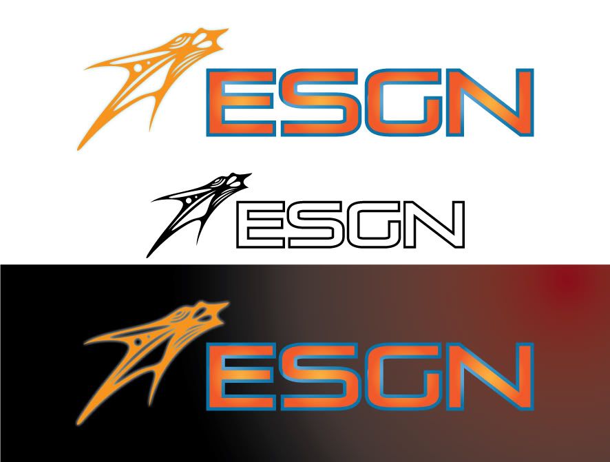
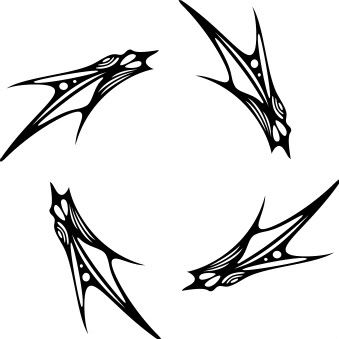
what does it convey to you?
I really want to use it for something, but I'm just not sure where to target it?
any and all help is appreciated.. even if you hate it. let me know.


Ready for your call :)
Mon — Fri, 2am — 8pm (EST)
US & EU support teams
We are back in: 1h 20m
Mon — Fri, 2am — 8pm (EST)
US & EU support teams
Elite Designer
Posted 13 June 2009 - 12:00 AM
Junior Member

Posted 13 June 2009 - 03:24 AM
Apprentice Designer
Posted 13 June 2009 - 05:37 AM

Member

Posted 13 June 2009 - 07:26 AM
Elite Designer
Posted 15 June 2009 - 05:53 PM
Junior Guru
Posted 23 June 2009 - 01:05 PM
Elite Designer
Posted 23 June 2009 - 04:32 PM
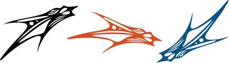
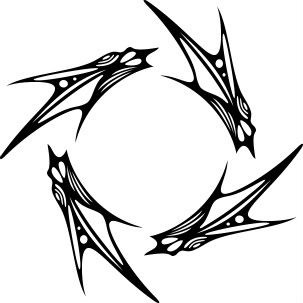
I don't know - it reminds me of something kinda sci-fi related - or maybe 8bit video game cover-ish...especially when you put them in the that repeating circle (not a bad thing at all)
I don't know if it works with that font, though. I think something MUCH more organic feeling would work.


0 members, 0 guests, 0 anonymous users


