Jump to content

  • Free consultations and support
  • Live chatClick Here for Live Chat
  • Call ico 1888-906-1888
    Phone support: Open

    Ready for your call :)

    Our business hours:

    Mon — Fri, 2am — 8pm (EST)

    US & EU support teams

    Phone support: Closed

    We are back in: 1h 20m

    Our business hours:

    Mon — Fri, 2am — 8pm (EST)

    US & EU support teams


B/W Logo Design


  • This topic is locked This topic is locked
&nsbp;

#1 TheDeagler

TheDeagler

    Junior Member

  • Designer
  • 7 posts

Posted 05 February 2010 - 04:26 AM

Hey guys, this is the 2nd design I've made, and was hoping for some criticism.

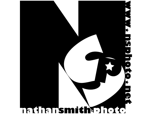
I was originally making this for the NSPhoto contest, but seeing as I'm not an elite design member, I decided to post it here for your guys' opinions.

My main concern is the stars on the logo - its kinda cheesy in my opinion. However, if you follow that contest, he really wants to show the pride, and quality of work - and I figured stars would be a subtle addition in that direction.

Let me know what you think! Since I'm just getting into design, any and all opinions, ranging from the absolute, most simple comments, to advanced tips and tricks.

Thanks guys!

Posted Image

#2 TheDreamer_EJoy

TheDreamer_EJoy

    Apprentice Designer

  • Designer
  • 208 posts

Posted 05 February 2010 - 03:18 PM

I like it a lot (im an amateur here i think...and got a lot of training to do yet myself but i personally dont like the website on the side there... Maybe if it was in a different position Or something.... ? See what others say though!

#3 Coy

Coy

    Elite Designer

  • Designer
  • 2534 posts

Posted 05 February 2010 - 05:43 PM

to me it feels unbalanced. The letters don't appear to work well togeather and the stars really don't say "pride" at all it makes it feel like it's directed towards kids in a way.

I also don't see a reason for the p..

If you wanted to use the elements you have I'd say leave the p and starts out. bring the S upright and have it bleed a little out of the N. If you wanted to keep the nathan Smith reversed out of the N then just use Nathan Smith and under the N type photography and span it to each edge of the N.

Hope that helps.

#4 Gwinchester

Gwinchester

    Junior Member

  • Designer
  • 11 posts

Posted 06 February 2010 - 07:39 AM

nice work!
But,you should take the p out,and i think the star from the low part of the logo looks kinda confusing!
Also you could move the s to the right and make it bigger,so it looks like it fades away with te backgroud.
hope it helps you .Bye

#5 TheDeagler

TheDeagler

    Junior Member

  • Designer
  • 7 posts

Posted 06 February 2010 - 01:59 PM

Thanks for the tips! I applied most of the ideas, but I could not seem to get the "Nathan Scott Photography" in right. When I tried to put "Nathan Scott" on the legs of the N, they were just too far away, and the addition of "Photography" just made it even more awkward. This is what I ended up doing.

Posted Image

I also tried just removing the website on the right, and I actually liked that one better. Let me know what you guys think!

Thanks!

#6 sevehn

sevehn

    Senior Member

  • Designer
  • 192 posts

Posted 06 February 2010 - 03:15 PM

your revised logo is much much more cleaner! -- the first one, (from my point of view) seemed a little too busy ... there was no focus on the "brand" of the photographer himself ... -- now your revised logo, seemingly gives a direct statement of "Nathan Smith" and his photography, and is less busier ... though -- i think -- you can add something that makes it stand out? ...... :)

hey The Deagler! hope you dont mind, but, im joining you on your thread and posting my "testing" design for NSP as well =D

what you guys think tooooo?

(ooops, here is my try-out) =D watcha think too guys?


Posted Image

Edited by sevehn, 06 February 2010 - 03:42 PM.

:D
--
the best is yet to come ~

#7 TheDeagler

TheDeagler

    Junior Member

  • Designer
  • 7 posts

Posted 07 February 2010 - 06:37 AM

Thanks for the input!

I like your design. I just think the crayon-y look speaks more for painting than photography. I prefer the first set out of the two because the N is more reasonably sized, and the word "photography" is in a more logical location.

#8 sevehn

sevehn

    Senior Member

  • Designer
  • 192 posts

Posted 07 February 2010 - 04:06 PM

Thanks too! -- hmm ... yah ... the fonts seem too "softy" kinda sorta .... here is a revision ... :rolleyes:

i kinda made this logo with my artboard in sepia color ... LOL! looks different with a white backGround! =D watcha guys think now? =D


Posted Image

Edited by sevehn, 07 February 2010 - 04:08 PM.

:D
--
the best is yet to come ~

#9 sevehn

sevehn

    Senior Member

  • Designer
  • 192 posts

Posted 07 February 2010 - 04:41 PM

okay -- hehehe ... i am so hyper! --- here is another revision! =D

also, am gonna takeOff my old images soon ... hehehe coz, was just trying out stuff! :p


Posted Image
:D
--
the best is yet to come ~

#10

  • Guests

Posted 07 February 2010 - 04:41 PM

you are not an Elite designer and you cannot post designs for an Elite contest while it is still open. If this happens again I will have to suspend your account.


0 user(s) are reading this topic

0 members, 0 guests, 0 anonymous users