Jump to content

  • Free consultations and support
  • Live chatClick Here for Live Chat
  • Call ico 1888-906-1888
    Phone support: Open

    Ready for your call :)

    Our business hours:

    Mon — Fri, 2am — 8pm (EST)

    US & EU support teams

    Phone support: Closed

    We are back in: 1h 20m

    Our business hours:

    Mon — Fri, 2am — 8pm (EST)

    US & EU support teams


Self Identity As Well


  • Please log in to reply
&nsbp;

#1 halpinc

halpinc

    Apprentice Designer

  • Designer
  • 12 posts

Posted 16 February 2010 - 06:31 AM

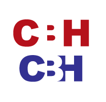
What do you think about my logo type?
My initials are cbh

Posted Image

#2 Coy

Coy

    Elite Designer

  • Designer
  • 2534 posts

Posted 16 February 2010 - 08:20 PM

it feels tooo blocky and stretched out.
I'd play with different ways to creat a CBH, I can think of one that would be kinda neet..

use a squared C as you have there, then on the b loose the left bar just leaving it looking kinda like a 3, then on the h loose the left bar thing again.. bring them really close togeather. it's worth a try? and leaves a little mystery to it for some others to figure out what it says.?

#3 glyphica

glyphica

    Member

  • Designer
  • 64 posts

Posted 16 February 2010 - 09:59 PM

I agree with Coy. I would try to combine the letters in a clever way. When I do type treatments, I usually mess around and try something out, then make a copy, try something else, then make another copy. Basically, I keep a copy of everything I do in that one document and then I have them all there to look at and compare and see what I like best. :)

#4 xpressions

xpressions

    Member

  • Designer
  • 95 posts

Posted 19 February 2010 - 02:45 AM

You can also look at negative space as well ex:
Posted Image

and try different fonts or create the letters out of simple shapes, :)

#5 halpinc

halpinc

    Apprentice Designer

  • Designer
  • 12 posts

Posted 19 February 2010 - 03:08 AM

hey I just wanted to say thanks to everybody for the good ideas, have yet to be able to work on it yet tho super busy!

#6 jjyepez

jjyepez

    Guru

  • Designer
  • 955 posts

Posted 19 February 2010 - 03:08 AM

Hi!
Try different fonts, overlapping letters, try some transparencies, some 3d :-) there are many things you can do to design a kool logo-type ;-) the one you have there is a little bit simple I think ...
Cheers!
--
jjyepez

Edited by jjyepez, 19 February 2010 - 09:30 PM.


#7 colekins

colekins

    Member

  • Designer
  • 34 posts

Posted 19 February 2010 - 03:43 PM

when working with letters in a logo, i feel like choosing the right font, color, and use of negative space, etc can give you a great looking, professional, logo. fool around with different combinations and see what looks best. break up the letters and rearrange them in different ways. experiment!

#8 ArtFX

ArtFX

    Junior Member

  • Designer
  • 17 posts

Posted 24 February 2010 - 03:02 PM

I do agree with most of the comments, however, a logo becomes what you make it. It doesn't matter if it is catchy, colorful or not. Look at many of the logos out there. Many are not very good, yet the company is successful. Another key is consistency, a logo ideally should stand the test of time, but again that is not always the case. Some companies show a change in identity to show growth. Bottom line...it is your logo, you are the customer...are you happy with it?


0 user(s) are reading this topic

0 members, 0 guests, 0 anonymous users