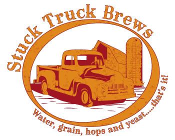
Beer logo that will be used as part of the label also.
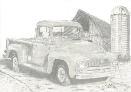
took a pic I drew a while back like 2004?
I did move the barn over a little to the left while in illustrator to kinda tighten it up some

Ready for your call :)
Mon — Fri, 2am — 8pm (EST)
US & EU support teams
We are back in: 1h 20m
Mon — Fri, 2am — 8pm (EST)
US & EU support teams
Elite Designer
Posted 24 February 2010 - 11:12 PM
Guru
Posted 24 February 2010 - 11:21 PM
 I love it. Especially the pencil sketch. It makes me feel all warm and fuzzy! Your shading and detail work on the barn is phenomenal. Just gorgeous. Makes me want to pick up a pencil and sketch pad again!
 Brandy
Elite Designer
Posted 24 February 2010 - 11:37 PM
Junior Member

Posted 25 February 2010 - 01:09 AM

Junior Member

Posted 25 February 2010 - 01:56 AM
Member

Posted 25 February 2010 - 06:55 PM
Edited by websmythe, 25 February 2010 - 07:00 PM.
Apprentice Designer
Posted 25 February 2010 - 08:58 PM
Elite Designer
Posted 25 February 2010 - 09:08 PM
Like the design. The illustration is rad. The major structure is there, just seems to need some finishing. Hope ya don't mind, I played with it a bit to test out my thoughts.
Maybe just changing to caps would help the font issue. Personally, I find that it's a font style that doesn't lend itself well to mixed case. The letter/word spacing does seem a bit sparse.
The oval is drawing attention away from the other elements in the design. The thick and thin isn't re-enforcing shape of the font or other elements. When I changed it to a single (horizontal) oval (...boring... I know) everything jumped into place and the visual focus shifted to the truck, complimenting it's shape.
When I did a horizontal flip on the truck it seemed to make more sense cause the angle of the truck and the offset lettering became complimentary.
You might wanna think about how the label will be die-cut. What that might add or take away from the design.
Anyways, don't stop. Will be nice to see the final version.
Illustration is very tight, type unfortunately isn't. I would really like to see the typography polished out, there are some kerning issues in the word "yeast" and I wouldn't recommend using more than 3 periods. I hope these comments help. Best Wishes.
Elite Designer

Posted 26 February 2010 - 05:49 PM
Elite Designer
Posted 26 February 2010 - 06:19 PM
Hmm.. dont have time for a complete summary most people hit on things i would say. Check your kerning when you have time. Maybe a different font in whole... not sure though.
Maybe a darker brown for the type?
Would like to see it with a regular circle instead of an ellipse frame.
Overall not bad.. came out pretty good i must say. keep with it man.
Btw i got a chilli company im doing a logo for.. i might post that on here we'll see.
Senior Member

Posted 26 February 2010 - 07:19 PM
Elite Designer
Posted 26 February 2010 - 08:39 PM
Good job! The pencil drawing is very impressive! I like the first logo better, but I agree that the font looks a little "off" on the top line.
Of course, in order to properly critique the final product, we should probably all get a free sample of the beer...


Senior Member
Posted 27 February 2010 - 05:41 PM
Elite Designer
Posted 01 March 2010 - 06:16 PM
@Coy: Me too! I attended a homebrewing class a while ago for free, offered by a local homebrewer's club. You may want to check and see if they offer anything like that in your community.
Apprentice Designer
Posted 05 April 2010 - 01:44 PM


0 members, 1 guests, 0 anonymous users

