STuck Truck your thoughts
I was going to say something about the truck not being stuck ... but I see you've changed it since...
&nsbp;
#21

Posted 21 April 2010 - 03:43 AM
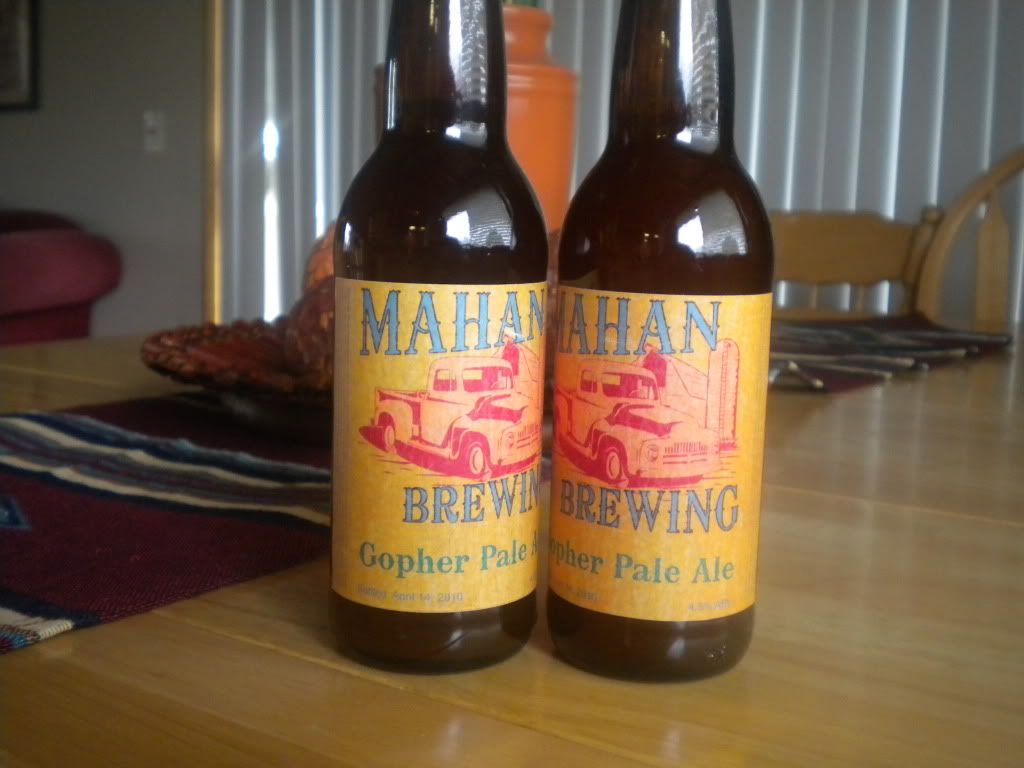
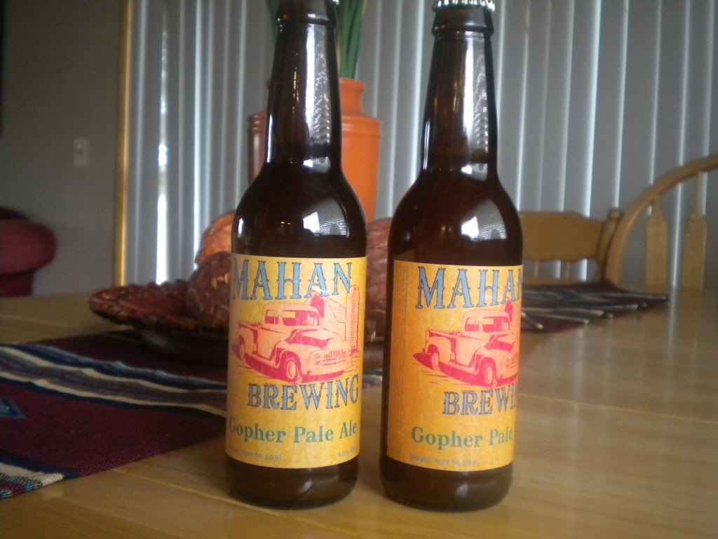
I was going to say something about the truck not being stuck  ... but I see you've changed it since that was posted. I like the new one, The angles of the fonts keep your eyes in the center... and since the truck is not dark but a 'close' color to the label, along with the detail of the truck and vibrating colors (red-blue), it makes you see the truck with out it competing with the font and font color as your eyes bounce around the image... hope that made sense lol... nice use of analogous (red,yellow,orange) for the back ground and split complementary colors (red, blue, teal) for the fore-ground gives a good balance... basically... good color choices... and I guess it was a good idea that you didn't change the picture to display a stuck truck
#22

Posted 21 April 2010 - 09:13 AM
Was that the final design of the label?
That is a real nice sketch of the truck.
I definitely like the Typography of your last design better than the first concept.
Just one thing I would change was the amount of colours used. Maybe drop the Green and leave it as Blue and Red. As your going for an old style label, the extra colour looks out of place to me. Wouldn't have been many printers in that era using a lot of colours. If you get what I mean.
#23

Posted 21 April 2010 - 05:58 PM
Thanks Kihndesigns and aset.
yes it is the final label. as for the teal (green) font I wanted the name of the beer to be a different color then the rest of the text. simply cause it's going to be changing froma pale ale to a stout to an IPA to a weizen and so on. The colors will also change somewhat but the reason was that it would differentiate the beer name from the overall beer label.
yes it is the final label. as for the teal (green) font I wanted the name of the beer to be a different color then the rest of the text. simply cause it's going to be changing froma pale ale to a stout to an IPA to a weizen and so on. The colors will also change somewhat but the reason was that it would differentiate the beer name from the overall beer label.
1 user(s) are reading this topic
0 members, 1 guests, 0 anonymous users


