Jump to content

  • Free consultations and support
  • Live chatClick Here for Live Chat
  • Call ico 1888-906-1888
    Phone support: Open

    Ready for your call :)

    Our business hours:

    Mon — Fri, 2am — 8pm (EST)

    US & EU support teams

    Phone support: Closed

    We are back in: 1h 20m

    Our business hours:

    Mon — Fri, 2am — 8pm (EST)

    US & EU support teams


NYCow Logo


  • Please log in to reply
&nsbp;

#41 Coy

Coy

    Elite Designer

  • Designer
  • 2534 posts

Posted 15 March 2010 - 08:38 PM

I'm thinking photoshoped.. LOL

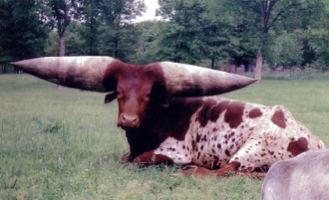
the cow wouldn't be able to hold it's head up.
Posted Image

#42 brandyarnold

brandyarnold

    Guru

  • Designer
  • 792 posts

Posted 15 March 2010 - 08:41 PM

I think you'd have a hard time getting your teeth up around his ear, too.
:) Brandy

#43 sinjix_media

sinjix_media

    Apprentice Designer

  • Designer
  • 51 posts

Posted 15 March 2010 - 08:56 PM

how's this 'coy'?
Posted Image

#44 Coy

Coy

    Elite Designer

  • Designer
  • 2534 posts

Posted 15 March 2010 - 09:06 PM

dude I'm liking that one the most so far..

for brandy.. sorry I keep taking this a bit off topic.

Here is a pic of a tipical branding. But where the three kids are sitting on the calf there was one holding it's head.
Basically a guy on horse would go through the heard of 300+ looking for slick calves (no brand) rope it and bring it to us, while others on horses would keep the cows at bay.
There were 3 of us (I was 17 and 160lbs). 1. would grab the head and release the rope 2 would grab the flank and flip it on it's side the 3rd would stretch it's legs. they would casturate at the same time they were branding. but when you get a bigger calf say 600lbs it's more difficult to hold. but the number 1 guy was the most important cause if their head is still their body was still and the leg guy would keep it from kicking. Then we'd rotate the flanker would get the next one's head.
Posted Image

#45 sinjix_media

sinjix_media

    Apprentice Designer

  • Designer
  • 51 posts

Posted 15 March 2010 - 09:18 PM

wow, we do have a lot of cows in new york, but they're upstates, so i haven't ever seen one. this is a totally foreign culture for me. i couldnt imagine something like that. i'm not against it or anything. just a bit weird imo.

i guess this is what i was thinking with the 'devilish' horns

Posted Image

#46 Coy

Coy

    Elite Designer

  • Designer
  • 2534 posts

Posted 15 March 2010 - 09:24 PM

I gotcha.. maybe round off the horns at the top. with a little curve to them

#47 sinjix_media

sinjix_media

    Apprentice Designer

  • Designer
  • 51 posts

Posted 15 March 2010 - 09:32 PM

I gotcha.. maybe round off the horns at the top. with a little curve to them

on the devilish one?
i think we have a final product with this one here.
i shortened the 'Y' a bit.
Posted Image

[edit] im a pest.
i think i like the original up there that 'coy' liked.
not sure about the 'shortened' 'Y'

Edited by sinjix_media, 15 March 2010 - 10:40 PM.


#48 Coy

Coy

    Elite Designer

  • Designer
  • 2534 posts

Posted 15 March 2010 - 10:42 PM

nicely done revision.

#49 sinjix_media

sinjix_media

    Apprentice Designer

  • Designer
  • 51 posts

Posted 15 March 2010 - 10:50 PM

great! haha, i dunno why i'm like this. i NEED confirmation from others before i can like something. so you like the shorter vertically 'Y'?
all i need is a sign-off from brandy for it, and i'm good!

#50 Coy

Coy

    Elite Designer

  • Designer
  • 2534 posts

Posted 15 March 2010 - 10:51 PM

yep it just seams to flow more nicely with the y shortened up a bit.

#51 sinjix_media

sinjix_media

    Apprentice Designer

  • Designer
  • 51 posts

Posted 15 March 2010 - 10:53 PM

yes! i have a logo!

#52 brandyarnold

brandyarnold

    Guru

  • Designer
  • 792 posts

Posted 15 March 2010 - 11:00 PM

all i need is a sign-off from brandy for it, and i'm good!


HAHA! It looks great! congrats on your new logo!
:) Brandy

#53 sinjix_media

sinjix_media

    Apprentice Designer

  • Designer
  • 51 posts

Posted 15 March 2010 - 11:18 PM

HAHA! It looks great! congrats on your new logo!

thanks for all the help!

#54 ralphzoontjens

ralphzoontjens

    Junior Member

  • Designer
  • 14 posts

Posted 10 August 2010 - 01:58 PM

That's a nice and funny logo there.

Well I'm from Holland, the land of cows, so I've seen at least 84 million of them in my life. To me, the Friesian Holstein is the cow, but I'm not sure about the NY area. I thought they had them over there as well. They have the horns curved inwards as you can see:

http://www.corbisima...42-15274292.jpg

As for the logo, I wasn't sure if you were going for either making a logo that has an entire cow in there, or just adding some 'cowy' elements to the font. I was trying to see a cow, but with its tail underneath its chin that was a little hard. I was imagining a cow head illustrated on top of the left stem of the 'n', the tail where it is now, and some indication of an udder on the belly of the 'y'. But I like it!


0 user(s) are reading this topic

0 members, 0 guests, 0 anonymous users