Jump to content

  • Free consultations and support
  • Live chatClick Here for Live Chat
  • Call ico 1888-906-1888
    Phone support: Open

    Ready for your call :)

    Our business hours:

    Mon — Fri, 2am — 8pm (EST)

    US & EU support teams

    Phone support: Closed

    We are back in: 1h 20m

    Our business hours:

    Mon — Fri, 2am — 8pm (EST)

    US & EU support teams


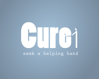
I need critique on this logo design


  • Please log in to reply
&nsbp;

#1 Bernadette

Bernadette

    Member

  • Designer
  • 87 posts

Posted 15 March 2010 - 10:57 PM

Posted Image

Cure is a drug rehabilitation center
tell me what do you think honestly

thanks

#2 like an angel

like an angel

    Moderator

  • Designer
  • 1422 posts

Posted 15 March 2010 - 11:54 PM

hey..may be i'm not sooo pro in this but i'll tell u my first reaction to it :)
i think the colors are right for this cause :)..but i don't figure what's the shape after the word (cure) ..is it no.1 or !!!

hope i could help more..good luck with it ;)

Edited by like an angel, 15 March 2010 - 11:56 PM.


#3 DixielandDesign

DixielandDesign

    Senior Member

  • Designer
  • 296 posts

Posted 16 March 2010 - 12:29 AM

In an article from Health .com called boost your mood with color it says, "Most of us choose blue as our favorite color, and it’s really no wonder. Blue is a very soothing hue—it’s the color of the sky and the sea—and we can all use soothing touches of it in our hectic lives. In one study, it wase found that people who were faced with difficult tasks felt less anxious after they saw something blue. Because the color is relaxing, you can feel free to use it more liberally than happy or energizing colors—it will work well in any room where you long to feel less stressed. So As Just Like an Angel said the color is perfect for the cause. In my opinion the main font may be a bit thick and this overpowers the Figure of the person or Number 1 that follows, My first impression was it was a figure holding out an open hand. This figure I think needs a bit more weight. I think I like the tagline in the font you used. Simple text with a simple but impactful message. Bernadette, as always just my opinion, I hope it helps you with your decisions.

Vince

Designers are meant to be loved, not to be understood. — Fabien Barral

#4 KittySaurus

KittySaurus

    Junior Member

  • Designer
  • 3 posts

Posted 16 March 2010 - 12:50 AM

I agree with the color. I think it's great, and you probably want something more soothing then agitating like a bright red. I also agree with like an angle, I'm not sure what that graphic is after the word. OH...I see it now..I was going to comment on changing the -e, but now i see it's a reflection and "people reaching for each other" Great concept, but I would push it further. It's too abstract and your point does not come fast enough to the reader. Over all great idea!

#5 brandyarnold

brandyarnold

    Guru

  • Designer
  • 792 posts

Posted 16 March 2010 - 12:59 AM

like the other responses, I really like the soothing blue color, very soft, nice.

I didn't see the person and the reflection in the E until KittySaurus pointed that out - and wow, it's really cool... but I think it needs to be more obvious, not blatant, but I'm not sure I ever would have noticed it, I just thought your stick figure looked a little off... work on that element of the logo and I think you've got yourself something really cool, the concept is definitely there!

Can't wait to see more!
:) Brandy

#6 DixielandDesign

DixielandDesign

    Senior Member

  • Designer
  • 296 posts

Posted 16 March 2010 - 01:32 AM

Wow, do like the E, now that it was pointed out. Great concept but agree with kitty I would work that aspect since I completely missed it. But who am I I missed the arrow in FedEx also :)

Vince

Designers are meant to be loved, not to be understood. — Fabien Barral

#7 Bernadette

Bernadette

    Member

  • Designer
  • 87 posts

Posted 16 March 2010 - 12:27 PM

wow! thanks everyone, I will be working on it and show you what I come to

#8 Jukes

Jukes

    Junior Member

  • Designer
  • 2 posts

Posted 17 March 2010 - 10:03 PM

My first response evaporated, but I'll try this again. :(

This is a wonderful concept. Great use of negative space.

I have a few suggestions to get the idea to shine through a little better. The first is to chose a more subdued "neutral" font. The font that you chose has a little too much character in its marshmallowy forms, and ends up competing with the figures. This makes the first glances pretty confusing, is it "Cure 1"? Is the "e" a little monster that's about to eat the guy's hand? Secondly, in order to really emphasize the concept it will work out best to have the figures match in widths, especially the heads.

All in all, it's a great idea, which is always the hardest part of the process.

#9 xpressions

xpressions

    Member

  • Designer
  • 95 posts

Posted 17 March 2010 - 10:28 PM

Got it as soon as I saw it....I love the concept. Agree in most part with what has already been offered by other designers above. Play around with other typefaces and the size of the little guys. Very good job. :)

#10 like an angel

like an angel

    Moderator

  • Designer
  • 1422 posts

Posted 18 March 2010 - 12:04 AM

ohhh..now i can see it too :)..and i love how u use the E..((brilliant))..but i'm with KittySaurus u should try push it further .
good luck

♥ Selma ♥
DesignContest on Facebook


#11 aset

aset

    Elite Designer

  • Designer
  • 113 posts

Posted 20 March 2010 - 07:07 AM

I love the way with your e you have used the image of people helping each other. To me it looks like the figure on the outside of the e is pulling the figure on the inside, out of the abyss which is drug addiction. I don't know if you meant to do that, but thought it represented it perfectly. Just a little work on the typography and you will have yourself a very good logo.

Edited by aset, 21 March 2010 - 11:48 AM.


#12 shefshef019

shefshef019

    Senior Member

  • Designer
  • 131 posts

Posted 23 March 2010 - 12:20 AM

I like the concept of the one figure helping the other escape, so you should definitely keep that. That being said, I think the figures are too small in relation to the text. Try playing around with some other fonts that aren't as thick - there might be a more fluid font that offers a better option. Great start! :)
Designs by Jenna Sheffler: Professional portfolio
Design Intervention: Freelance graphic and web design
Technicolor Carnival: One-of-a-kind handmade jewelry and gifts

#13 Llamalord

Llamalord

    Junior Member

  • Designer
  • 11 posts

Posted 23 March 2010 - 08:11 PM

The figures on the right are a great use of the natural letter shapes, the colors are smooth and soft... This may be rather finicky, but the only thing I would change would be the gap between the sides of the C. Shrinking it to closer match that of the e would look better to me.

#14 jecrt

jecrt

    Junior Guru

  • Designer
  • 432 posts

Posted 23 March 2010 - 09:39 PM

the concept is good, but the execution needs a little help. I really didn't see the person in the E until it was pointed out. I wasn't even sure that the person was a person. Is there different iconography that you could use that would evoke the same idea? You basically want to simmer an idea down to the bare minimum. Could you use outstretched hands in place of the people - they'd be larger and perhaps buy you more visual recognition? The font used on the tagline kinda looks like default courier...like when a font doesn't load or something? Maybe go with a light weight sane serif??

Also - your logo is white. Unless your logo will ONLY live on a single color, it's best to design on white. Several people have commented on the blue color, but aren't you only using that for presentation? When you're in concepting mode (especially when working with negative space) it's usually a good idea to work in black on white. That way, you get the full impact that your logo has - you can always go back and add gloss effect, gradients, etc.!

hope that wasn't "too" honest...we're all trying to get better, right? :)

#15 mgray

mgray

    Junior Member

  • Designer
  • 19 posts

Posted 26 March 2010 - 09:57 PM

I like what you are doing here. One suggestion is to take the word and just skew it slightly to allow the figure at the end to show more. Just a quick thought. The color is great.

#16 lilpolcat1

lilpolcat1

    Junior Member

  • Designer
  • 19 posts

Posted 27 March 2010 - 08:23 PM

The color is perfect. The stick like figure offering a helping hand is a good idea, but
not easily recognized.
Maybe one could take the letter R and manipulate it so it gives the impression of
protection.


0 user(s) are reading this topic

0 members, 0 guests, 0 anonymous users