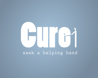
I need critique on this logo design
#2
Posted 15 March 2010 - 11:54 PM
i think the colors are right for this cause ..but i don't figure what's the shape after the word (cure) ..is it no.1 or !!!
hope i could help more..good luck with it
Edited by like an angel, 15 March 2010 - 11:56 PM.
#3
Posted 16 March 2010 - 12:29 AM
Designers are meant to be loved, not to be understood. — Fabien Barral
#4
Posted 16 March 2010 - 12:50 AM
#5
Posted 16 March 2010 - 12:59 AM
I didn't see the person and the reflection in the E until KittySaurus pointed that out - and wow, it's really cool... but I think it needs to be more obvious, not blatant, but I'm not sure I ever would have noticed it, I just thought your stick figure looked a little off... work on that element of the logo and I think you've got yourself something really cool, the concept is definitely there!
Can't wait to see more!
#6
Posted 16 March 2010 - 01:32 AM
Designers are meant to be loved, not to be understood. — Fabien Barral
#8
Posted 17 March 2010 - 10:03 PM
This is a wonderful concept. Great use of negative space.
I have a few suggestions to get the idea to shine through a little better. The first is to chose a more subdued "neutral" font. The font that you chose has a little too much character in its marshmallowy forms, and ends up competing with the figures. This makes the first glances pretty confusing, is it "Cure 1"? Is the "e" a little monster that's about to eat the guy's hand? Secondly, in order to really emphasize the concept it will work out best to have the figures match in widths, especially the heads.
All in all, it's a great idea, which is always the hardest part of the process.
#9
Posted 17 March 2010 - 10:28 PM
#10
Posted 18 March 2010 - 12:04 AM
good luck
♥ Selma ♥
DesignContest on Facebook
#11
Posted 20 March 2010 - 07:07 AM
Edited by aset, 21 March 2010 - 11:48 AM.
#12
Posted 23 March 2010 - 12:20 AM
Design Intervention: Freelance graphic and web design
Technicolor Carnival: One-of-a-kind handmade jewelry and gifts
#13
Posted 23 March 2010 - 08:11 PM
#14
Posted 23 March 2010 - 09:39 PM
Also - your logo is white. Unless your logo will ONLY live on a single color, it's best to design on white. Several people have commented on the blue color, but aren't you only using that for presentation? When you're in concepting mode (especially when working with negative space) it's usually a good idea to work in black on white. That way, you get the full impact that your logo has - you can always go back and add gloss effect, gradients, etc.!
hope that wasn't "too" honest...we're all trying to get better, right?
0 user(s) are reading this topic
0 members, 0 guests, 0 anonymous users