Jump to content

  • Free consultations and support
  • Live chatClick Here for Live Chat
  • Call ico 1888-906-1888
    Phone support: Open

    Ready for your call :)

    Our business hours:

    Mon — Fri, 2am — 8pm (EST)

    US & EU support teams

    Phone support: Closed

    We are back in: 1h 20m

    Our business hours:

    Mon — Fri, 2am — 8pm (EST)

    US & EU support teams


Kid Cudi Design


  • Please log in to reply
&nsbp;

#1 N.T.Designs

N.T.Designs

    Junior Member

  • Designer
  • 24 posts

Posted 07 July 2010 - 03:29 PM

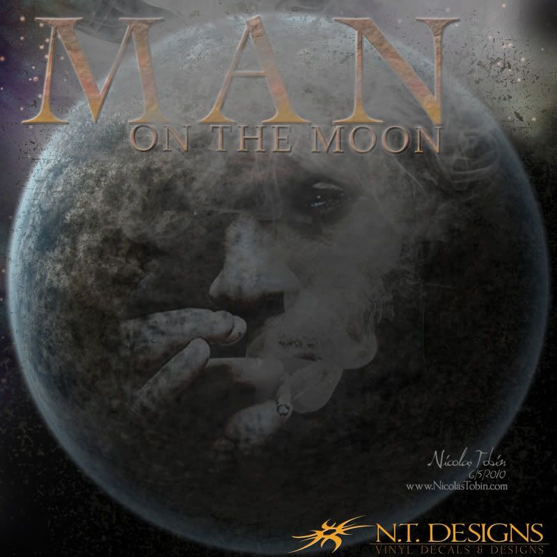
Hello, I recently came across an awesome Photoshop tutorial on how to create a realistic planet using nothing but filters. While reading the tutorial, I came up with an idea to create a design using Kid Cudi. The design was for my own personal use, and created out of bordem. Please share your opinions, advice, and comments. Thanks. Please visit my portfolio as well.
N.T. Designs
Nicolas Tobin | Online Portfolio
Posted Image

#2 rinaldidesigns

rinaldidesigns

    Elite Designer

  • Designer
  • 2258 posts

Posted 07 July 2010 - 03:45 PM

that is really cool.....I love the textures:)

#3 swoop

swoop

    Apprentice Designer

  • Designer
  • 39 posts

Posted 08 July 2010 - 07:21 PM

great work,love the hand with the sigaret in it

#4 N.T.Designs

N.T.Designs

    Junior Member

  • Designer
  • 24 posts

Posted 08 July 2010 - 10:43 PM

thank you for the positive comments, I really appreciate it. I'm still learning design so any advice is greatly appreciated.

#5 N.T.Designs

N.T.Designs

    Junior Member

  • Designer
  • 24 posts

Posted 09 July 2010 - 03:42 AM

Thank you again. Those of you who are interested in the tutorial, I found the site I used. It was alot of fun to make, I tweaked mine alot to go along with my design. Here is the link.. Planet Tutorial by `dinyctis on deviantART

#6 marcovich

marcovich

    Member

  • Designer
  • 41 posts

Posted 11 July 2010 - 06:13 AM

Nice outcome, pretty realistic.

#7 andiwibowo_4108

andiwibowo_4108

    Junior Member

  • Designer
  • 11 posts

Posted 11 July 2010 - 06:17 AM

nice one, realy good idea there u got

#8 sandras

sandras

    Apprentice Designer

  • Designer
  • 12 posts

Posted 12 July 2010 - 09:34 AM

it has a special 'jules verne feeling'. did you see the movie 'man on the moon?' the headline typography could be more expressive.

#9 N.T.Designs

N.T.Designs

    Junior Member

  • Designer
  • 24 posts

Posted 12 July 2010 - 10:58 AM

I just looked up Jules Verne. Very interesting stuff. And yes, I did see the movie Man on the moon with Jim Carey. As far as the type, I didn't want to take too much attention from the design, because the design was not about the type. But what exactly could I have done differently to it?


1 user(s) are reading this topic

0 members, 1 guests, 0 anonymous users