N.T. Designs
Nicolas Tobin | Online Portfolio

Ready for your call :)
Mon — Fri, 2am — 8pm (EST)
US & EU support teams
We are back in: 1h 20m
Mon — Fri, 2am — 8pm (EST)
US & EU support teams
 This topic is locked
Junior Member

Posted 21 July 2010 - 03:32 PM
Apprentice Designer
Posted 06 August 2010 - 12:08 AM
Member

Posted 06 August 2010 - 06:04 AM
Junior Member
Posted 06 August 2010 - 02:16 PM
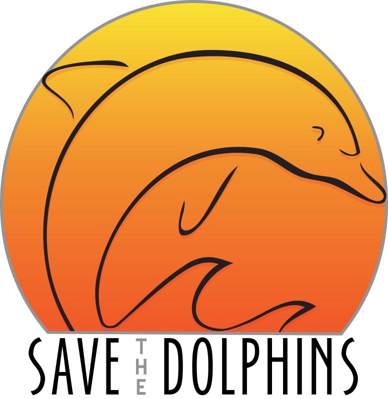
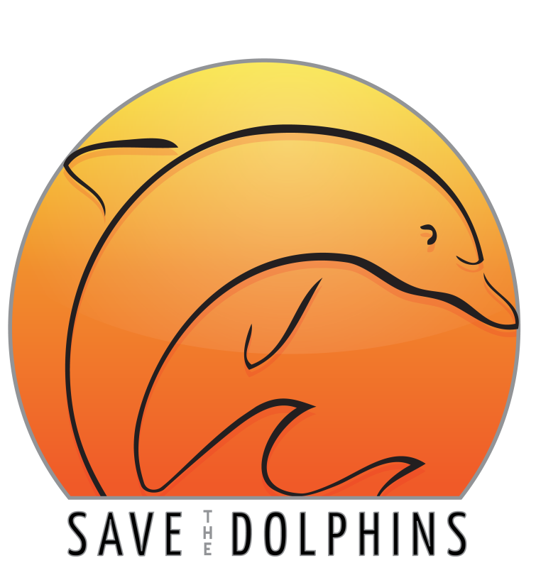
to me, the logo looks really good. Although the phrase "Save the Dolphins" is a bit tilted to the right?
Not sure if it's intended or not, but i would make it a bit more balance. Again, it's just me =), everything else looks nice though
Junior Member
Posted 06 August 2010 - 02:21 PM
I like a lot the concept, with the sun at the sunset/sunrise and the dolphin jumping from the water. The logo it's very expresive but some harmony is missing. some working on the shape of the dolphin, and some working on the text is needed
Junior Member

Posted 08 August 2010 - 03:00 PM
Junior Member
Posted 02 September 2010 - 04:33 PM
Elite Designer

Posted 02 September 2010 - 04:56 PM

Junior Member
Posted 03 September 2010 - 06:04 AM
I like the logo but that's because I'm a fan of the Miami Dolphins football team and this logo uses similar colors to their logo and the dolphin is facing the same direction as the team logo.
When I see something like this with a dolphin in it, I always think of the Miami Dolphins first. I can't help it, I got football on my brain!

Admin

Posted 03 September 2010 - 06:28 AM
Like us on facebook
Junior Member
Posted 03 September 2010 - 01:34 PM
Design 1 I think is the best. This is a much better design then the very first you one you posted. The text placed with the dolphins was too distracting and really took away from this nice design. This new version has a better balance and the design isn't competing with the text (font)
i wonder what a little space would look like between the dolphin and the circle trim. Being close to the edge kinda gives a feeling of crowded..maybe just my eye.
Any way this is way better
Edited by N.T.Designs, 03 September 2010 - 07:37 PM.
Apprentice Designer
Posted 07 September 2010 - 11:58 AM


0 members, 1 guests, 0 anonymous users