Jump to content

  • Free consultations and support
  • Live chatClick Here for Live Chat
  • Call ico 1888-906-1888
    Phone support: Open

    Ready for your call :)

    Our business hours:

    Mon — Fri, 2am — 8pm (EST)

    US & EU support teams

    Phone support: Closed

    We are back in: 1h 20m

    Our business hours:

    Mon — Fri, 2am — 8pm (EST)

    US & EU support teams


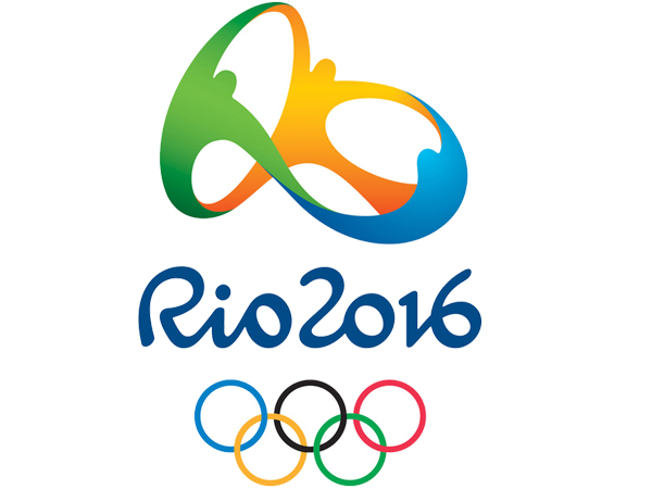
Rio 2016 Olympics logo


  • Please log in to reply
&nsbp;

#1 jjyepez

jjyepez

    Guru

  • Designer
  • 955 posts

Posted 13 July 2012 - 10:43 AM

Posted Image

Absolutely lovely, playful, colourful, energic! Brazilian!

“Organisers said the logo was designed based on four pillars: contagious energy, harmonious diversity, exuberant nature and Olympic spirit.”


source
video updated
http://vimeo.com/18331485

What do you think?

Edited by jjyepez, 11 August 2012 - 11:39 AM.

  • likes this

#2

  • Guests

Posted 13 July 2012 - 11:41 AM

I like it a lot, especially the typography. Very Brazilian feel overall! Thanks for sharing!

#3 jjyepez

jjyepez

    Guru

  • Designer
  • 955 posts

Posted 13 July 2012 - 11:51 AM

Absolutely,
Typography is almost dacing samba (not over-acted though :) )! waving!

btw: I know you are creator and fan of typographies, "banzai moloko", hu?
Cheers!

#4 hang

hang

    Member

  • Designer
  • 42 posts

Posted 13 July 2012 - 05:38 PM

I alos love this logo not only typo but alos symbol.
The symbol is similar to 1 picture of Picasco.
:D

#5 karma

karma

    Junior Member

  • Designer
  • 4 posts

Posted 13 July 2012 - 06:15 PM

The design is very beautiful and simple, however i would include some more elements from brazilian culture like samba or capoeira :)

#6 Javed

Javed

    Banned

  • Banned
  • 49 posts

Posted 14 July 2012 - 11:13 AM

just wow........ very good theme and nicely executed logo.... thanks for sharing

#7 rezahs

rezahs

    Junior Member

  • Designer
  • 1 posts

Posted 14 July 2012 - 12:32 PM

nice.. :)

#8 jjyepez

jjyepez

    Guru

  • Designer
  • 955 posts

Posted 14 July 2012 - 08:24 PM

I alos love this logo not only typo but alos symbol.
The symbol is similar to 1 picture of Picasco.
:D


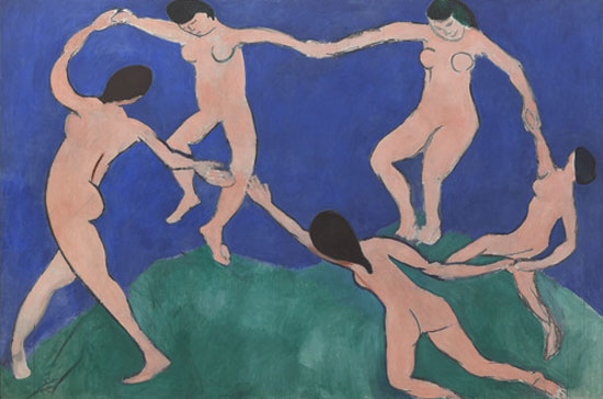
Some claim that this is based on a painting by Henri Matisse titled "The Dance"
Posted Image

Some others claim tha this is a copy from other previous ideas. So. There is some polemic atmosphere surronding this design.
source

Nevertheless, I love it :-)

#9 NakamuraToki

NakamuraToki

    Junior Member

  • Designer
  • 14 posts

Posted 15 July 2012 - 01:51 AM

^^ beautiful!

It goes with the theme that the World Cup in 2014 is also in Brazil :D

the logo also looks as a flying butterfly

#10 hongxia

hongxia

    Member

  • Designer
  • 51 posts

Posted 16 July 2012 - 02:46 AM

Nice Design ;)

#11 Donyfajar

Donyfajar

    Junior Member

  • Designer
  • 17 posts

Posted 16 July 2012 - 05:56 AM

very dynamic, some how can feel the capoeiran dance or something

#12 VhienceFX

VhienceFX

    Senior Member

  • Designer
  • 123 posts

Posted 18 July 2012 - 06:41 AM

Impressive logo!

#13 maovfe

maovfe

    Junior Member

  • Designer
  • 25 posts

Posted 02 August 2012 - 01:39 PM

Nice Logo very attractive, all the Olympics Logo are always has its strong intense layout of design, impressive!

#14 Lau

Lau

    Member

  • Designer
  • 31 posts

Posted 05 August 2012 - 06:20 PM

Really like the logo, it represents their "out-af-the-box" culture.

#15 jhunce

jhunce

    Junior Member

  • Designer
  • 5 posts

Posted 06 August 2012 - 01:11 AM

Wow,,,

#16 WebStar

WebStar

    Member

  • Designer
  • 113 posts

Posted 06 August 2012 - 03:32 AM

The Rio 2016 logo is very nice & colorful.

Loved the logo.:cool:

#17 rezaflush

rezaflush

    Junior Member

  • Designer
  • 9 posts

Posted 09 August 2012 - 03:46 AM

Is the logo make some words? or only people dancing?

#18 simrks

simrks

    Junior Member

  • Designer
  • 11 posts

Posted 11 August 2012 - 06:06 AM

Very nice logo, an perfect logo for an perfect event.

#19 jjyepez

jjyepez

    Guru

  • Designer
  • 955 posts

Posted 11 August 2012 - 11:35 AM

Is the logo make some words? or only people dancing?


Some say that shapes spell Rio .... hard to see though.

I have updated the video at the top post. Enjoy it .. very interesting!
I recommend it a lot!
It depicts the process of creating such an amazing piece.

Rgrds,
--
jjy

Edited by jjyepez, 11 August 2012 - 11:58 AM.


#20 WJK

WJK

    Junior Member

  • Designer
  • 6 posts

Posted 11 August 2012 - 02:24 PM

Reminiscent of 2010. London's logo will still look good in two year's time and be remembered for ever as an unusually good Olympic logo.

That just falls in with the others: a symbol representing unity, over the city name in a brushstroke typeface. Done.

It's dull, and no more like Rio than I am.


0 user(s) are reading this topic

0 members, 0 guests, 0 anonymous users