
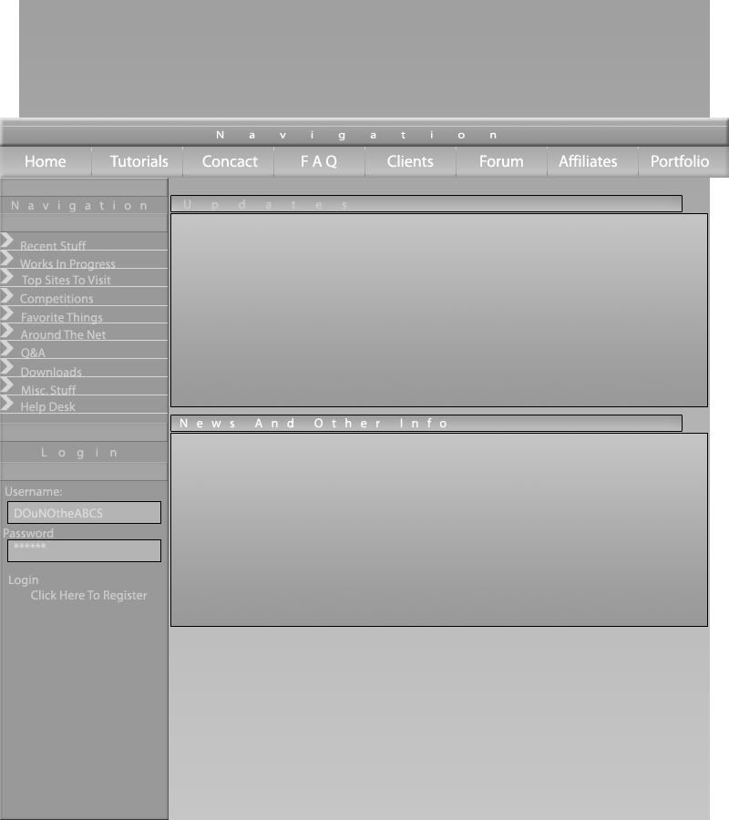
http://i83.photobuck...theABCS/wip.jpg
c&c plz
Random W.I.P template
http://i83.photobuck...theABCS/wip.jpgc&c plz
&nsbp;
#2

nevadabadgirl
-

- Designer
- 4217 posts
Guru
Posted 30 June 2006 - 05:47 AM
I really like the navbar on that one.
Nice work!
Nice work!
You MUST be an Elite Designer to enter the contests. Please go to www.designcontest.net and follow the link that says "Love to Design" to get more information and the requirements for joining. There are NO EXCEPTIONS.
#4
Uniment1
-

- Designer
- 381 posts
Apprentice Designer
Posted 30 June 2006 - 09:49 PM
not bad .... I would add some color.... maybe make your Title text a color(something very bright!). I would also cut the nav bar off so it is at the same edge as the content boxes.
Does'nt look bad overall though!
Nice
Does'nt look bad overall though!
Nice
www.uniment1.com :: Design Services
#5
StudioMeridian
-

- Designer
- 15 posts
Junior Member
Posted 11 July 2006 - 03:47 PM
I agree with the color comment. The buttons are very hard to read when grayed out. Also, if we're going for the clean, high-tech look...try to use all caps when tracking out copy, like you've done with "Navigation", "Login", "Updates", etc.... Upper-lower case copy tracked out tends to lose the effect.


1 user(s) are reading this topic
0 members, 1 guests, 0 anonymous users
