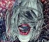
here again with another logo entry
please provide some feedback and help me learn
Thanks in advance

 upload3-01.png 14.53KB
28 downloads
upload3-01.png 14.53KB
28 downloads

Ready for your call :)
Mon — Fri, 2am — 8pm (EST)
US & EU support teams
We are back in: 1h 20m
Mon — Fri, 2am — 8pm (EST)
US & EU support teams
Member

Posted 12 May 2014 - 05:29 PM
upload3-01.png 14.53KB
28 downloads
Moderator

Posted 12 May 2014 - 07:30 PM


Junior Member
Posted 28 July 2017 - 09:02 AM
I really like the concept. But, in my opinion you need to work on your letters 'd' and 'o' in order to get symmetrical and compact headphones look.
Also, maybe to rotate them (use the vanishing point) to get them good perspective. I like your color scheme!


Showoff / Critique →
Finished Work Showcase →
Looking for FeedbackStarted by MitchellHepburn, 20 Jul 2014 |
|
|
||
Showoff / Critique →
Finished Work Showcase →
Is it good enough..?Started by prabhuganga, 01 Mar 2014 |
|
|
||
Showoff / Critique →
Finished Work Showcase →
Poll
Critiques needed please..!Started by prabhuganga, 23 Feb 2014 |
|

|
||
General Information →
Feature Requests →
A subtle way to get Contest Holders to give feedbackStarted by PASTEXPIRYcom, 27 Dec 2013 |
|

|
||
General Information →
Feature Requests →
A unique feedback ideaStarted by PASTEXPIRYcom, 17 Dec 2013 |
|

|
0 members, 1 guests, 0 anonymous users