Jump to content

  • Free consultations and support
  • Live chatClick Here for Live Chat
  • Call ico 1888-906-1888
    Phone support: Open

    Ready for your call :)

    Our business hours:

    Mon — Fri, 2am — 8pm (EST)

    US & EU support teams

    Phone support: Closed

    We are back in: 1h 20m

    Our business hours:

    Mon — Fri, 2am — 8pm (EST)

    US & EU support teams


Animals & what not


  • Please log in to reply
&nsbp;

#1 jecrt

jecrt

    Junior Guru

  • Designer
  • 432 posts

Posted 13 January 2009 - 05:23 AM

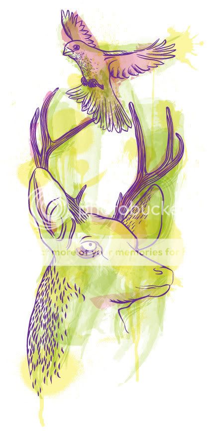
Hi - I'm working on this illustration for a possible tshirt design. I feel like it needs another element of some sort. Thoughts? It also might need some more linework for the fur...I was trying to keep it relatively simple, but then I filled the antlers.

Anyway - any comments/suggestions? Thanks!
Posted Image

Edited by jecrt, 13 January 2009 - 05:40 AM.
new link


#2 awhipl

awhipl

    Member

  • Designer
  • 62 posts

Posted 13 January 2009 - 07:57 AM

I'm not sure what could be done outside of the animals. I feel like swirls or extensive line work would make it too similar to mainstream fashion designs and I like the simplicity.

One thing you might think about is the deer's eye. I think adding another circle or a bit more detail might liven it up and give it more character. At the moment the deer almost seems dead in the eye to me.

Wonderful piece, I've always liked blues and greens and bluegreens :p

#3 georgian

georgian

    Junior Member

  • Designer
  • 13 posts

Posted 13 January 2009 - 02:10 PM

you may thing of making that fur...and maybe make it disappeare in the white bg...just maybe.

and you may wanna put some more color around the right horn, so that it doesn't "touches" the bg...visually that is quite annoying

nice work - i like it!!! hope i don't seem to b ann..... :)

#4 Chung Dha

Chung Dha

    Guru

  • Designer
  • 1439 posts

Posted 13 January 2009 - 02:41 PM

The reindeer look more like a goat

#5 jecrt

jecrt

    Junior Guru

  • Designer
  • 432 posts

Posted 13 January 2009 - 03:49 PM

thanks!
good call on the right horn touching. As for the eyes being a little dull, that's okay...I was intending for it to feel a little "off". I also like the faint fur.

chung dha - it's a little stylized, but is there anything that really sticks out as being "goatish"? The nose maybe?

#6 eyenod

eyenod

    Junior Member

  • Designer
  • 10 posts

Posted 13 January 2009 - 05:21 PM

It reminds me of my print class at school. We were doing etchings on metal plates and then you burn the plates on nitric acid. The effect is sort of similar like etched or intaglio

#7 julhenke

julhenke

    Apprentice Designer

  • Designer
  • 20 posts

Posted 13 January 2009 - 05:33 PM

It is the nose that is making look like goat/alpaca.I think is short for a reindeer.

#8 jecrt

jecrt

    Junior Guru

  • Designer
  • 432 posts

Posted 13 January 2009 - 05:34 PM

I used to love etching - it's too involved for me to do now. I just stick to woodcuts & screen prints now.

#9 brian_lsf

brian_lsf

    Member

  • Designer
  • 51 posts

Posted 13 January 2009 - 07:10 PM

I'm not sure about the colour.. although it would really depend on the colour of the shirt you're printing on

The bird's wings seem too small or its tails looks too big and the deer does look like some kind of goat..

I just checked your portfolio and really like your works =)
I'm eager to see how this one turns out when it's done..

Edited by brian_lsf, 13 January 2009 - 07:17 PM.


#10 jecrt

jecrt

    Junior Guru

  • Designer
  • 432 posts

Posted 13 January 2009 - 11:06 PM

update: I reworked the nose area and added some more linework/texture. I also redid the background (in case you didn't notice - haha) I felt like it needed to be more organic. I also think the lighter line was kinda making a lot of things look...um, weird? Kinda like when you look at a negative...things just don't seem right. Better or worse?
Posted Image

Edited by jecrt, 13 January 2009 - 11:06 PM.
I'm a moron with linkzzz


#11 Chung Dha

Chung Dha

    Guru

  • Designer
  • 1439 posts

Posted 14 January 2009 - 04:42 AM

The update nose is much better now look more like a reindeer. Only thing the version the lines under the eye of the reindeer make it looks tired. Actually might be better to make the iris of the eye dark, instead of the tiny pupil.

#12 georgian

georgian

    Junior Member

  • Designer
  • 13 posts

Posted 14 January 2009 - 09:03 AM

on a black t shirt, the bg that you made - white, and the outlines - black. at least that's what i would like, couse that pastel thing that you made, doesn't work for me (no offense, is just a personal opinion)

#13 georgian

georgian

    Junior Member

  • Designer
  • 13 posts

Posted 14 January 2009 - 09:04 AM

something out of this discussion (sorry for that) : do you know why my avatar doesn't appear?

#14 jecrt

jecrt

    Junior Guru

  • Designer
  • 432 posts

Posted 14 January 2009 - 02:13 PM

chung dha - awesome! As for the tired-looking lines, they are intentional. I'm going for tired/vacant expression.

georgian - I was actually thinking silver (light gray) for the shirt. I'm trying to keep things light/colorful to balance the expression of the animals.

as for your avatar - is your avatar a light gray box? If so - it's working PERFECTLY! haha


1 user(s) are reading this topic

0 members, 1 guests, 0 anonymous users