

Every day we use the services of various companies and brands that everywhere are trying to surround us with their advertising and emblems. Many corporations in their logos use hidden meanings and symbols for various purposes. And we will tell you about ten such logos. But first, let’s look at how to create a logo.
1. Come up with an idea.
2. Match the colors and style of the logo.
3. Implement the idea or find someone who will do it.
4. Look at the user’s reaction to the logo.
5. If necessary, redesign.
6. Do not be afraid to experiment!
So, what are the logos of popular companies that keep secrets?
1. Tour de France
For those who do not know, Tour de France is the annual biggest cycling race in Europe. Even if you have not heard about these competitions, you can easily guess what’s what, just by looking at the logo.
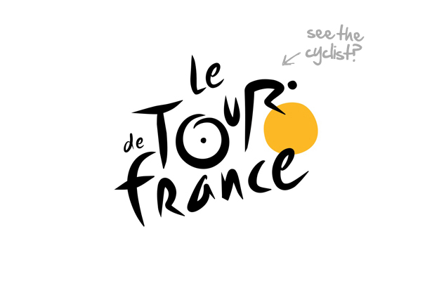
You see? From the first view, you can see a person riding a bicycle. The letter “O” and a yellow circle, similar to the sun – it’s the wheels on the seat. Well, the letter “P” is none other than a bicyclist.
2. Baskin Robbins
Among readers of this article, there are many fans of ice cream, and therefore fans of Baskin Robbins, that is one of the main brands for the production of these sweets. But did you notice anything unusual in the brand logo? Take a closer look!
![]()
Yes, the capital letters of the company at the same time show the number 31. It shows how many types of ice cream can be purchased at any ice-cream shop. But time passed and Baskin Robbins, of course, had to diversify the range. Now there are much more tastes, but the well-known brand logo has remained.
3. VAIO
It is a brand of personal computers and laptops, which until 2014 belonged to Sony. Since 2008, the abbreviation of the company name is treated as Video Audio Integrated Operation, but this is not the only hidden meaning in the logo. Let’s divide the logo in half!
![]()
The first two letters look like a wave, then the letters “I” and “O” are read as 1 and 0.
4. Coca-Cola
One of the most famous brands in the world is Coca-Cola. But the logo of this company is not as simple as it looks.
![]()
Look at the space between the letters “O” and “L”. Which state flag do you see? That’s right, Denmark! There is no exact information about it, some people say that the flag turned out by chance, others that it decided to disguise it in the logo because Denmark is one of the happiest countries in the world. In any case, the company realizes that it is possible to see the flag in the logo because during the campaign in Denmark Coca-Cola used it at full speed.
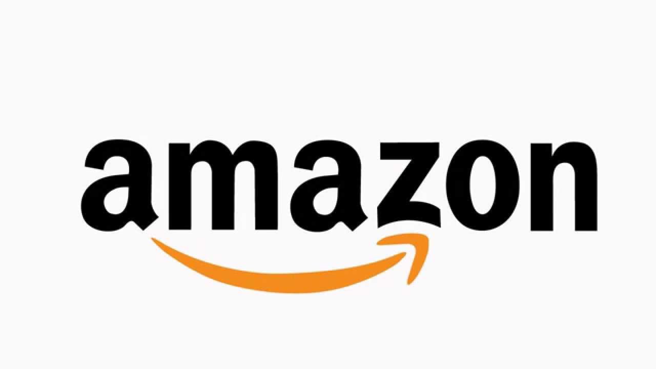
5. Amazon
Many people bought something on Internet services like Amazon if not, they have accurately heard about it. The logo doesn’t mean something super secret, but still, something can be explained. An orange arrow from below as much as possible tries to remind a smile. Designers wanted users to remain contented on a subconscious level. This arrow does not just begin with the letter “A” and ends with “Z” that’s because these letters are the first and last of the English alphabet. Thus, the company has shown that in their assortment you can find absolutely everything.
6. Toblerone
On the shelves of many shops, you can find not the cheapest one, but very delicious chocolate Toblerone. The company was officially established in 1909 in the Swiss capital – Bern. The Toblerone logo also carries something hidden, despite the fact that there is only a mountain in Switzerland that is characteristic of this country.

If you look closely at the rock, you can see the silhouette of a bear standing on its hind legs. All because Bern is called a city of bears and the chocolate company decided not to bypass this fact by side.
7. FedEx
With the development of various online stores, logistics companies have developed and one of the largest billion-dollar brand – Federal Express, which is commonly referred to as FedEx. Look at the company logo!
![]()
Everything is extremely simple, but if you look closely, you can see that the empty space between the letters “E” and “X” forms an arrow. According to the designer of the logo words, this arrow should cause people to associate with the fast delivery speed at a subconscious level.
8. Pepsi
For several decades, the Pepsi logo looked like a ball, painted exclusively in the colors of the American flag. Relatively recently the logo was slightly corrected and, as the designers reported, now it is associated with the theory of relativity, feng shui, the magnetic field of the earth and much more than that. But that’s not all!

Try to bring the bank Pepsi to the mirror and read the name of the brand, it turns out “is dead”. Whether it is an accident or not, we can only guess.
9. LG
Until now, a very successful brand in the field of electrical engineering is the South Korean company LG. We have seen this logo so many times that we have not noticed any subtleties of the sign, but they are.
![]()
The company tried to transform the face of the smiling person. Thus, the company builds friendly relations with everyone. See how easily the brand emblem turns into a face that is often compared to the legendary hero Pacman, and the truth is, there is a similarity.
10. McDonald’s
In the field of fast food, no company can compete with McDonald’s. Who knows, maybe it’s thanks to its logo.
The first thing we see is logo of the brand is just the first letter of the title of golden color and with a special font. Not really! According to Freud’s psychology, this sign causes people to associate with a lactating female breast and an unconscious attraction. Be careful, because, in addition to the smell, you can get caught in the logo, even if it is just a letter.
11. Kolner Zoo
Everyone, who has even once watched tv shows about animals, knows the logo of Kolner Zoo. That’s not only because this logo is one of the most recognizable, it also has a secret.

Looking at it for the first time you will not see anything special, but after the second view tell us, please, what animals do you see on it?
12. Formula 1
How many times have you seen the logo of Formula 1? Even if you’re a woman, you must see that. Anything special?

That’s not just letter ‘F’ and number ‘1’, between these two symbols we can see white number, that proves that this racing is the best and the most famous one.
And what other logos with hidden meaning do you know and what have we missed? Leave your version in the comments and we will definitely include it in the next top!


