

Do you remember the poll DesignContest has posted on Facebook recently? It was called It’s in the water, baby! and we’re finally ready to share its results with you! Our Facebook community of more than 400 000 followers has chosen the design by LotusBlue to be a winning one. So, we decided to ask this extremely talented designer (whose name, by the way, is Maria Biru) on her work, relationships with clients etc. and it turned out she could give lots of useful tips to our designers, as well as to our clients. Thus, enjoy her answers!
Maria, among other designs in the poll yours was considered to be the best out of the best. What do you think is so special about this logo design? Why does it appeal to people so much?
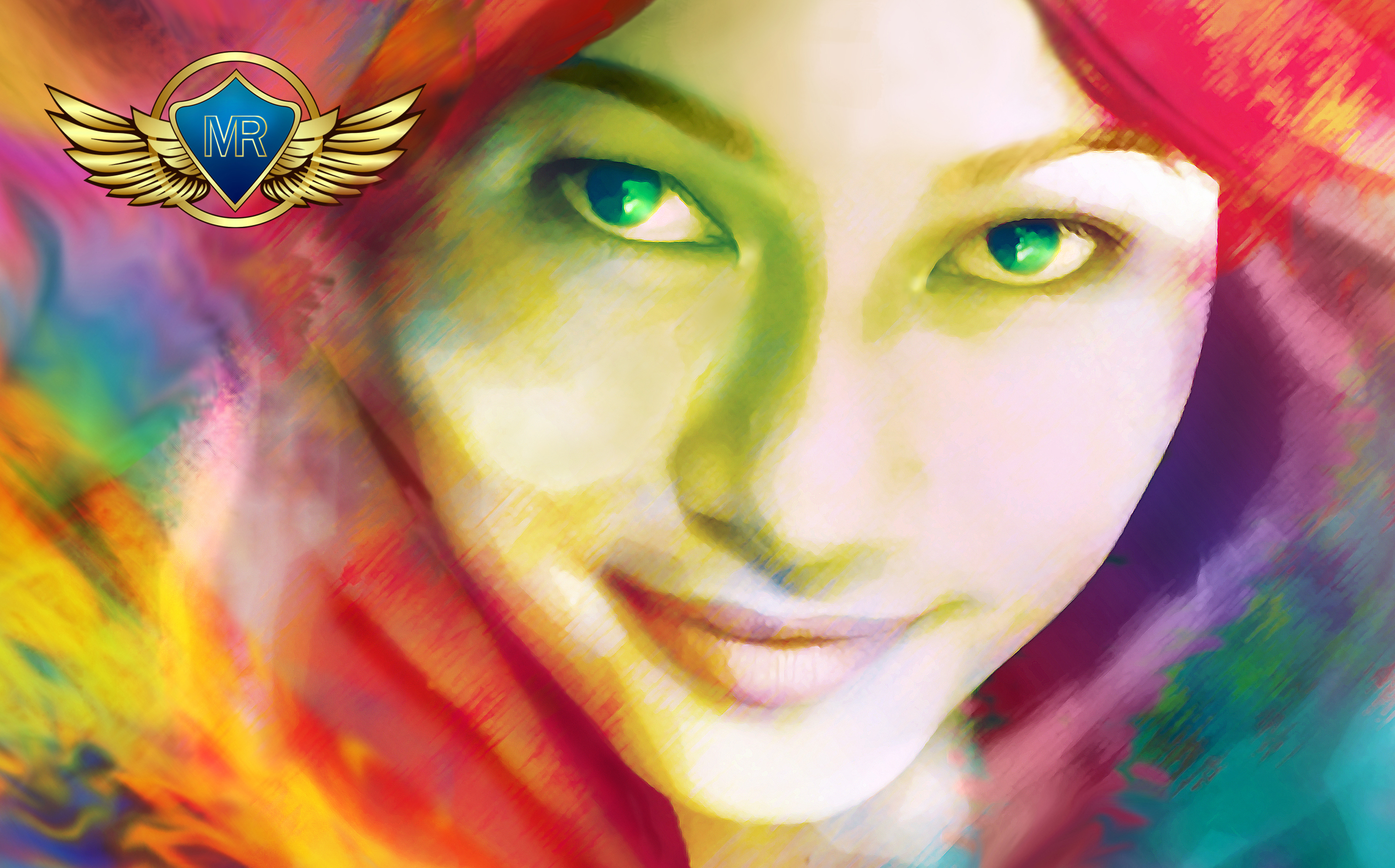
From my point of view, I think this logo has a deeper meaning than just a visualization of a name/theme. The sense of that deeper meaning which is strong yet also invisible makes this logo special. This logo is a presentation of a paradox.
Actually, I am not sure what makes this logo appeal to other people so much, as I can only know from my own perspective.
I guess because the logo contains unique shapes with bright color combinations which will be hardly found on other designs.
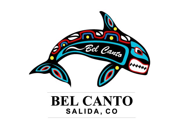
Your logo for that contest was described as “a mysterious one that warns people against all the dangers the underwater world is hiding. Beware, for the brilliance of this logo will mop you up!â€. Do you agree with this description? How would you describe this logo?
I like the description made for this logo. And I do think it fits the logo perfectly as an introduction for other viewers, I agree with this description.
As this logo’s designer, I see this logo based on the ideas and reasons why I made it that way. I made this logo as an expression of courage and boldness of the logo owner/user that exude the ability to move without doubts.
Presented by a sea beast/monster fish which expresses strength, Â courage, boldness, and invincibility in exploring the unpredictable sea world, the bright colors are used to distinguish this positive monster fish from “an evil creature”.
According to your profile on DesignContest, you are keen on logo designs. Do you have any logo designed by you that you’re especially proud of?
By the way Miss, I rarely (almost never) use the word “proud” to express or describe the feeling I feel when what I did or do make a significant mark. So I will use the word “like so much” instead.
On designcontest.com, I like so much the logo that I made for a fashion store ( if I’m not mistaking 😀 ) titled “Blue Gypsy Rebellion” because it has many little details and that was the first time I was using Adobe Illustrator successfully to directly draw a female figure. It took me 2 days to complete the first version.
Prior to that one, I always used Photoshop for painting or drawing 3D human figures.
What are the key principles of designing a successful logo, in your opinion?
In my opinion, the key principles to design a successful logo are:
– The willingness to see from 3 different perspectives (the client, the designer, and the general receiver/audience).
– The courage to explore out of the comfort zone of our mind.
– Executions of ideas which include the process of combining visualization of meaning, the expression of purpose and the usage of the right techniques.
What are the most common mistakes in a logo design? How one can avoid them?
From my point of view, the most common mistake in a logo design is lacking one of three points in executing ideas as mentioned on the last point above (visualization of meaning, expression of purpose and using the right techniques)
I think one can avoid this mistake by: Â
– Continually practicing or in other words; learning by doing.
– Regularly activating our thirst for knowledge in graphic design area so we will be keen on reading graphic design journal and literature that help us to renew our knowledge and understanding.
What should designers do in order to persuade clients to choose their design as a winning one?
I am not quite sure about this one, as on designcontest.com I only communicate with clients after getting their feedbacks.
But as a suggestion, I think the designer can start first by explaining the thinking, the meaning, and purpose behind his/her designs.
Do you have any preferences as for logo trends while designing a logo?
No, I do not unless it is required by the clients.
Have you ever experienced a lack of inspiration when it came to graphic design? How have you overcome it?
Yes, I have experienced a lack of inspiration. Not just once but many times. How I overcome it?
As a rule, when that lack of inspiration comes, I take a little break from anything that has something to do with graphic design in order to give my mind some refreshment.
I go out to observe nature and talk and listen to random people during my time out (street vendors, parking men, waiters in a coffee shop, etc.).
By doing and experiencing new activities such as talking to people I know nothing about and observing nature and appreciating its beauty, the tension and pressures experienced by my mind will gradually melt away. This state of mind is the fertile playground for creativity to flow without barriers.
Can you give any advice to DesignContest newbies (both designers and clients)?
My advice to DesignContest newbies will be following:
If you are a designer:
Learn and understand how it works on DesignContest.
If you are already a professional designer for a long time then you must have understood that sometimes Client will not choose a design based on designer’s criteria and knowledge of what a good logo “should” look like. No need to be disappointed by that.
If you are a newbie in the graphic design field just like how I perceive myself, then do not give up.
Designcontest.com is a reliable place to keep practicing and sharpening our skills. We will learn about things we need to know in the graphic design field such as the art of creating a unique and meaningful design, the tools and techniques we need to master.
Be willing to explore the forum and blog and get inspired by other designers and their experiences.
This learning process will also mature our ability to stay calm and patient when dealing with difficult clients/requirements.
If you are a client:
– Please, know that DesignContest designers are serious in what they do. Despite the final result, behind that design, there’s a designer who has been working hard to meet your expectations, so please consider to give rates for their best designs instead of eliminating them.
– Do give a clear brief so the designers can understand better what you want on the design.
– Try not to make designers work on many revisions only to be eliminated at the end.
An interesting fact: Maria’s full name is Maria Goretti Tunjung Biru Anggorowerti. She uses Maria Biru because she has several family members and friends from outside Indonesia and for most of them it’s easier to call her Maria than “Biru” which is how her Indonesian friends call her. Tunjung Biru is a Javanese name which means Lotus Blue in English (Tunjung = Lotus, Biru = Blue). That’s why DesignContest has its own gorgeous and true Lotus Blue!
Stay active with DesignContest and our next article will be written about YOU!


