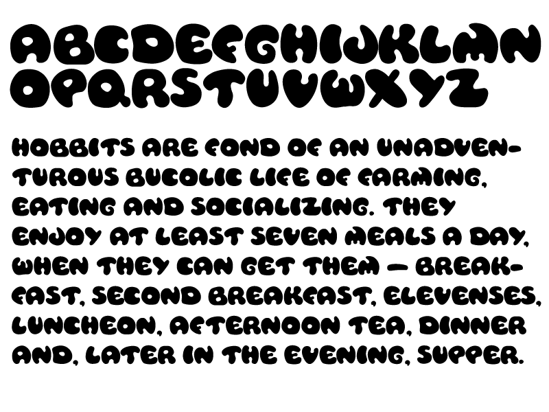
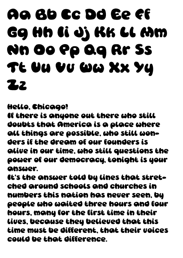
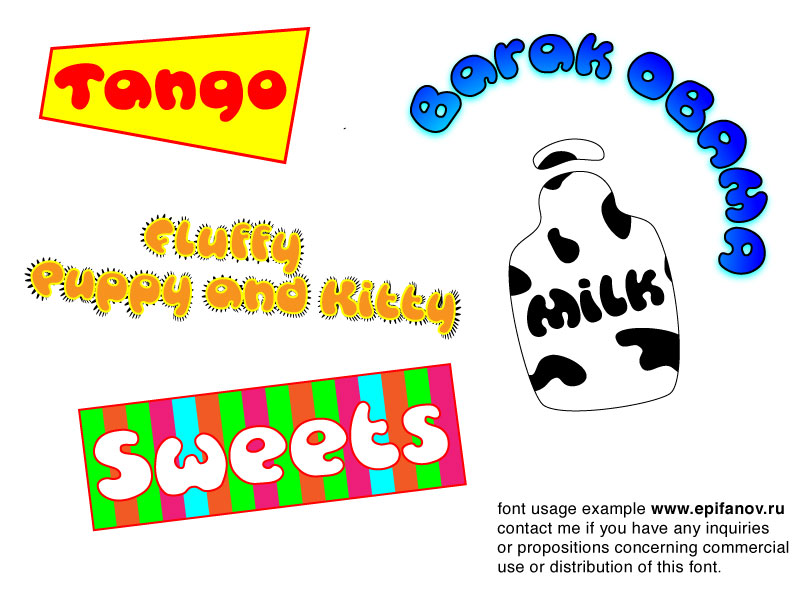
As you can imagine this font can be used in titles and logos that need to have a "cartoonish look".

Ready for your call :)
Mon — Fri, 2am — 8pm (EST)
US & EU support teams
We are back in: 1h 20m
Mon — Fri, 2am — 8pm (EST)
US & EU support teams
Junior Guru

Posted 29 December 2008 - 02:13 PM

Posted 29 December 2008 - 05:08 PM
Apprentice Designer

Posted 29 December 2008 - 05:49 PM
Apprentice Designer
Posted 06 January 2009 - 05:08 AM
Edited by a9609067, 06 January 2009 - 05:17 AM.
Posted 06 January 2009 - 07:11 PM

Member

Posted 07 January 2009 - 10:05 PM

Posted 22 January 2009 - 08:52 PM
Member
Posted 22 January 2009 - 09:57 PM
Posted 23 January 2009 - 09:18 PM
Thanks for your comment! I will defintely play with the letters more. Meanwhile here's an example of possible font usage. You do understand that it's a kind of joke about Obama, rightI definitely like the changes. The only things that look a little weird to me are the lowercase a, u and v.
a- i feel like a slight curve to the tail would help its shape.
u- i think the bottom indentation could be moved to the right a bit to help its shape.
v- i think the right tip should be less curved?
I'm not sure if these would actually improve the characters, but that's just my initial impression. I really like the font and especially like the speech you chose to display it
Apprentice Designer
Posted 27 January 2009 - 01:59 PM


0 members, 0 guests, 0 anonymous users

