Jump to content

  • Free consultations and support
  • Live chatClick Here for Live Chat
  • Call ico 1888-906-1888
    Phone support: Open

    Ready for your call :)

    Our business hours:

    Mon — Fri, 2am — 8pm (EST)

    US & EU support teams

    Phone support: Closed

    We are back in: 1h 20m

    Our business hours:

    Mon — Fri, 2am — 8pm (EST)

    US & EU support teams


Killer..?


  • Please log in to reply
&nsbp;

#1 Coy

Coy

    Elite Designer

  • Designer
  • 2534 posts

Posted 12 May 2009 - 05:45 PM

Posted Image

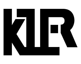
discuse...

Edited by Coy, 12 May 2009 - 07:55 PM.


#2 BurakUeda

BurakUeda

    Junior Member

  • Designer
  • 19 posts

Posted 17 May 2009 - 02:35 PM

I can see the letters of "killer" just because you said it.
Otherwise, probably I couldn't tell.
Maybe thats just me though...

#3 .:FMD

.:FMD

    Senior Member

  • Designer
  • 188 posts

Posted 17 May 2009 - 08:14 PM

Yeah, I see KIR or K1R I over look the LL and the E


Its good that you are practicing and playing like that. It definitely will get the creativity flowing.

#4 Coy

Coy

    Elite Designer

  • Designer
  • 2534 posts

Posted 18 May 2009 - 05:32 PM

yeah I wasn't sure I liked it much either. Was kinda going for a hidden thing in a sorta abstract looking design.

my other version looked like this.
Posted Image

#5 QuirkDesign

QuirkDesign

    Apprentice Designer

  • Designer
  • 30 posts

Posted 24 May 2009 - 08:54 PM

Aesthetically I think I prefer the first one, but I wouldn't have known it represented killer if you hadn't told me. :)

Seems a little unbalanced on the right side. The left half looks great.

Maybe a subtle graphic element within the design to indicate killer / killing?

#6 jmgarrido

jmgarrido

    Apprentice Designer

  • Designer
  • 13 posts

Posted 25 May 2009 - 10:54 AM

maybe this letters needs some red blood effect. i think that will be a good contrast

#7 atondex

atondex

    Senior Member

  • Designer
  • 247 posts

Posted 25 May 2009 - 04:35 PM

I like the second one. Why don't you try to differentiate the other letters also, as you did with the e and r, by putting some space between them ?

Try to extend the r so that it's baseline is the same as the other letters, and see how that looks like.

Hope that helps !

#8 Coy

Coy

    Elite Designer

  • Designer
  • 2534 posts

Posted 26 May 2009 - 05:26 PM

Aesthetically I think I prefer the first one, but I wouldn't have known it represented killer if you hadn't told me. :)

Seems a little unbalanced on the right side. The left half looks great.

Maybe a subtle graphic element within the design to indicate killer / killing?


I actually wanted it to not be really noticable until you heard the name then walla you can see it.

maybe I could add a knife or something..?

maybe this letters needs some red blood effect. i think that will be a good contrast


I could add blood dripping into a little pool under it. lol

I like the second one. Why don't you try to differentiate the other letters also, as you did with the e and r, by putting some space between them ?

Try to extend the r so that it's baseline is the same as the other letters, and see how that looks like.

Hope that helps !


I kept the R off the base line on purpose for the possiblity of an extra name or .com.. something like killer gaming or killer profits.. something that trails off extending out from the name a bit. I'll post a verison showing this.


0 user(s) are reading this topic

0 members, 0 guests, 0 anonymous users